Responsive Web Design or Mobile App
•
0 likes•1,080 views

Responsive Web Design or Mobile App - Joomla!Day™ Bangkok 2013

Recommended
More Related Content
Viewers also liked
Viewers also liked (13)
Similar to Responsive Web Design or Mobile App
Similar to Responsive Web Design or Mobile App (20)
Responsive Web Design or Mobile App
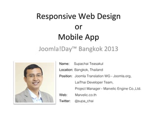
- 1. Responsive Web Design or Mobile App Joomla!Day™ Bangkok 2013 Name: Supachai Teasakul! Location: Bangkok, Thailand! Position: Joomla Translation WG - Joomla.org, ! " "LaiThai Developer Team, ! " "Project Manager - Marvelic Engine Co.,Ltd.! Web: !Marvelic.co.th! Twitter: !@supa_chai!
- 2. การใช้งานและสถิติ 46.4% ของผู้ใช้โทรศัพท์เป็นมาร์ทโฟน! 22.4% ของเจ้าของมาร์ทโฟนใช้ iPhone! ! ในฝรั่งเศส จากผู้ที่มีมาร์ทโฟน! ! 90% ของผู้เข้าเยี่ยมชมเว็บไซต์ มาจากมาร์ทโฟน! และ! 70% ได้เข้าไปดาวน์โหลดโปรแกรมมาใช้งาน!
- 4. การออกแบบเว็บที่ตอบสนองได้ มีชุดเครื่องมือ และเทคนิคในการจัดระเบียบข้อมูล จากพารามิเตอร์ของอุปกรณ์ ! (คอมพิวเตอร์ตรวจสอบ, มาร์ทโฟน, แท็บเล็ต, โทรทัศน์, ฯลฯ .)! ภาพประกอบจากหนังสือที่ตีพิมพ์โดย Ethan Marcotte, 25 พฤษภาคม 2010!
- 5. การออกแบบเว็บที่ตอบสนองได้ RWD จะมีอยู่ในเทมเพลตมากที่สุด ในรุ่น Joomla 2.5 และ natively ใน! Joomla เทมเพลต 3.x!
- 6. การออกแบบเว็บที่ตอบสนองได้ RWD ในส่วนติดต่อของผู้ใช้ (หน้า) และ! ผู้บริหาร (Back-end) Joomla 3.x!
- 7. การออกแบบเว็บที่ตอบสนองได้ Joomla 3.x จะมี Bootstrap responsive framework ซึ่งประกอบไปด้วย CSS & JavaScript!
- 8. การออกแบบเว็บที่ตอบสนองได้ ด้วย Bootstrap, เราเพียงเรียกใช้ CSS ด้วยคลาสที่ต้องการ เพื่อนำเสนอเนื้อหาของ เราเพื่อให้ได้ผลลัพธ์เป็น responsive! <img alt="Logo" class="visible-desktop" src="/images/logo.png">!
- 9. หันมาเขียน CSS แบบ less จะทำให้สนุกขึ้นกว่าเดิม hAp://lesscss.org/
- 10. The dynamic stylesheet language.! ไฟล์.less = CSS valid + variables! Variables
- 11. The dynamic stylesheet language.! Mixins
- 12. The dynamic stylesheet language.! Nested Rules
- 13. The dynamic stylesheet language.! Functions Operations
- 14. Preboot is a comprehensive and flexible collection of LESS utilities. Its original variables and mixins became the precursor to Bootstrap. Since then, it's all come full circle.! Brief history! Preboot was originally released in March 2011 under the name Bootstrap.less. Sensing the need for a larger and more comprehensive framework, I copped the name and created Bootstrap based on the original variables and mixins work here. To avoid obivous naming issues, I renamed this Preboot and essentially didn't touch the project for two years.! ! Fast forward two years and I'm backporting many of Bootstrap's variables and mixins back into Preboot as v2.! ! Disclaimer: Preboot v1 (Bootstrap.less) was released under a Creative Commons license and is still available. Preboot 2 is now under MIT.! ! Visit site : getpreboot.com! Mark Otto! Twitter : @mdo! http://markdotto.com/ !
- 15. การออกแบบเว็บที่ตอบสนองได้ นำเสนอผ่าน CSS3 ใส่ code ใน head ถึง /head ด้วย! ! link href=mobile.css type=text/css media=screen and (max-device-width:480px) rel=stylesheet/!
- 16. การออกแบบเว็บที่ตอบสนองได้ Source : http://www.splio.com/responsive/10_basic_tips_about_responsive_design_fr.pdf!
- 17. การออกแบบเว็บที่ตอบสนองได้ Framework templates ที่นิยมใน Joomla! • • • • • • Warp Framework! Zen Grid Framework! Helix Framework! Morph framework! Construct Template Framework! Jyaml Framework! • • • • • • JV Framework! Vertex Framework! Wright Framework! Expose Framework! YT Framework! Leo Framework! และอาจมีอีก...!
- 18. Design for Web first !
- 19. Adjust to Mobile
- 20. Supports Mobile?
- 21. Media Viewport!
- 22. Mobile first !
- 24. Adjust Media Queries /* Large desktop */ @media (min-‐width: 1200px) { ... } /* Portrait tablet to landscape and desktop */ @media (min-‐width: 768px) and (max-‐width: 979px) { ... } /* Landscape phone to portrait tablet */ @media (max-‐width: 767px) { ... } /* Landscape phones and down */ @media (max-‐width: 480px) { ... }
- 25. Site with mobile version Configured subdomain: http://m.domainsite.com! ! Advantages: - Version optimized for faster loading time! - SEO: caching mobile pages! ! Make Your Website Work Across Multiple Devices: http://www.google.com/think/multiscreen/!
- 26. Applica`ons iOS Development: Objective-C! Android Development: Java! ! ! Or! hAp://phonegap.com/ SOLUTION: Develop HTML5! and PhoneGap or Titanium! PhoneGap: portability application on android, iOS, windows phone, Blackberry!
- 28. ตัวอย่างเช่น: MOBILEJOOMLA.COM Mobile Joomla! is the best way to display your Joomla! site on iPhone, iPad, Android more w/ up to 4x better performance compared to responsive and other mobile templates.! http://www.mobilejoomla.com/!
- 29. Processing images .htaccess + file php = adap`ve image Adaptive Images detects your visitor's screen size and automatically creates, caches, and delivers device appropriate re-scaled versions of your web page's embeded HTML images. No mark-up changes needed. It is intended for use with Responsive Designs and to be combined with Fluid Image techniques.! http://adaptive-images.com/!
- 30. Processing images Photo galleries with adap`ve picture: OZIO Gallery iPhone Nokia iPad PC 320x480 360x640 768x1024 normale 150px × 225px 177px × 265px 448px × 673px 641px × 962px http://www.opensourcesolutions.es/en/ext/ozio-gallery.html! 14kb 19kb 98kb 170kb
- 31. Useful links • Test: http://emulateurmobile.com/! • Re-Tester: Module user agent for Firefox! • Observe: - stats of your sites over several years: ! http://httparchive.org/! ! Probe: • Integrate an offline cache html5 for navigation off line on your mobile: http://appcache.rawkes.com/!
- 32. QUESTIONS?
- 33. Thank You