
Recommandé
Contenu connexe
Tendances
Tendances (20)
En vedette
En vedette (20)
Similaire à Scatter plots
Similaire à Scatter plots (20)
Plus de swartzje
Plus de swartzje (20)
Dernier
Dernier (20)
Scatter plots
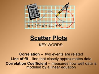
- 1. Scatter PlotsScatter Plots KEY WORDS: Correlation – two events are related Line of fit – line that closely approximates data Correlation Coefficient – measures how well data is modeled by a linear equation
- 2. Scatter PlotScatter Plot • A scatter plot is a graph of a collection of ordered pairs (x,y). • The graph looks like a bunch of dots, but some of the graphs are a general shape or move in a general direction.
- 3. Positive CorrelationPositive Correlation • If the x-coordinates and the y-coordinates both increase, then it is POSITIVE CORRELATION. • This means that both are going up, and they are related.
- 4. Positive CorrelationPositive Correlation • If you look at the age of a child and the child’s height, you will find that as the child gets older, the child gets taller. Because both are going up, it is positive correlation. Age 1 2 3 4 5 6 7 8 Height “ 25 31 34 36 40 41 47 55
- 5. Negative CorrelationNegative Correlation • If the x-coordinates and the y- coordinates have one increasing and one decreasing, then it is NEGATIVE CORRELATION. • This means that 1 is going up and 1 is going down, making a downhill graph. This means the two are related as opposites.
- 6. Negative CorrelationNegative Correlation • If you look at the age of your family’s car and its value, you will find as the car gets older, the car is worth less. This is negative correlation. Age of car 1 2 3 4 5 Value $30,000 $27,000 $23,500 $18,700 $15,350
- 7. No CorrelationNo Correlation • If there seems to be no pattern, and the points looked scattered, then it is no correlation. • This means the two are not related.
- 8. No CorrelationNo Correlation • If you look at the size shoe a baseball player wears, and their batting average, you will find that the shoe size does not make the player better or worse, then are not related.
- 9. Correlation • Measures the relative strength of the linear relationship between two variables • Unit-less • Ranges between –1 and 1 • The closer to –1, the stronger the negative linear relationship • The closer to 1, the stronger the positive linear relationship • The closer to 0, the weaker any positive linear relationship
- 10. Scatterplots Which scatterplots below show a linear trend? a) c) e) b) d) f) Negative Correlation Positive Correlation Constant Correlation
- 11. Scatter Plots of Data with Various Correlation Coefficients Y X Y X Y X Y X Y X r = -1 r = -.6 r = 0 r = +.3r = +1 Y X r = 0 Slide from: Statistics for Managers Using Microsoft® Excel 4th Edition, 2004 Prentice-Hall
- 12. Year Sport Utility Vehicles (SUVs) Sales in U.S. Sales (in Millions) 1991 1992 1993 1994 1995 1996 1997 1998 1999 0.9 1.1 1.4 1.6 1.7 2.1 2.4 2.7 3.2 1991 1993 1995 1997 1999 1992 1994 1996 1998 2000 x y Year VehicleSales(Millions) 5 4 3 2 1 Objective - To plot data points in the coordinate plane and interpret scatter plots.
- 13. 1991 1993 1995 1997 1999 1992 1994 1996 1998 2000 x y Year VehicleSales(Millions) 5 4 3 2 1 Trend is increasing. Scatterplot - a coordinate graph of data points. Trend appears linear. Positive correlation. Year ↑ SUV Sales ↑ Predict the sales in 2001.
- 14. Plot the data on the graph such that homework time is on the y-axis and TV time is on the x-axis.. Student Time Spent Watching TV Time Spent on Homework Sam Jon Lara Darren Megan Pia Crystal 30 min. 45 min. 120 min. 240 min. 90 min. 150 min. 180 min. 180 min. 150 min. 90 min. 30 min. 90 min. 90 min. 90 min.
- 15. Plot the data on the graph such that homework time is on the y-axis and TV time is on the x-axis. TV Homework 30 min. 45 min. 120 min. 240 min. 90 min. 150 min. 180 min. 180 min. 150 min. 90 min. 30 min. 120 min. 120 min. 90 min. Time Watching TV Timeon Homework 30 90 150 210 60 120 180 240 240 210 180 150 120 90 60 30
- 16. Describe the relationship between time spent on homework and time spent watching TV. Time Watching TV Timeon Homework 30 90 150 210 60 120 180 240 240 210 180 150 120 90 60 30 Trend is decreasing. Trend appears linear. Negative correlation. Time on TV ↑ Time on HW ↓