
Recommandé
Contenu connexe
En vedette
En vedette (18)
Similaire à Garr Reynolds' PowerPoint Tips
Similaire à Garr Reynolds' PowerPoint Tips (20)
Dernier
Dernier (20)
Garr Reynolds' PowerPoint Tips
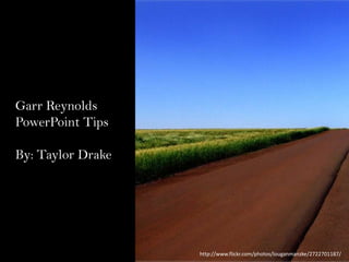
- 1. Garr Reynolds’ PowerPoint Tips By: Taylor Drake http://www.flickr.com/photos/louganmanzke/2722701187/
- 5. Use High Quality Graphics http://www.flickr.com/photos/stevewall/3632440776/
- 7. USE APPROPRIATE CHARTS Number of students visiting Nazareth by season 800 700 Number 600 500 400 300 200 100 0 fall winter spring Season summer
- 10. Use Audio or Video Scott Drake
- 11. Spend Time in the Slide Sorter http://www.flickr.com/photos/joyoflife/3272255486/
Notes de l'éditeur
- Do not fill your slide up with text. People came to the presentation to hear you speak, not read your slides and then hear you read them.
- 1 in 5 children are physically abused. Use simple numbers and then you can describe what they mean. If you list all of the statistics, no one will listen to you.
- Do not use transitions on every slide, and do not use the very elaborate ones.
- They look crisp. Low quality graphics that are stretched look cheesy.
- The audience has seen them before. Fresh, new backgrounds for slides will keep the audience engaged.
- Do not put too much info into charts. Make it simple with as little data as possible.
- Color evokes feelings, so people will stay engaged.
- Fonts communicate subtle messages.
- Videos give concrete examples.
- You can see how your PowerPoint is progressing and can decide if any changes need to be made.