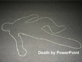
Death by PowerPoint
•Télécharger en tant que PPTX, PDF•
9 j'aime•4,165 vues

This document provides tips for creating effective PowerPoint presentations. It suggests that most PowerPoint presentations are boring and ineffective, relying too heavily on bullet points and clip art. The document recommends keeping presentations simple with few slides, short time limits, large font sizes, and telling a clear story. It also advises practicing presentations and focusing on ideas, facts, processes, and feelings rather than just words. The overall message is that PowerPoint should be used to enhance conversations or presentations, not replace them, by following some basic design principles.

Recommandé
Contenu connexe
Tendances
Similaire à Death by PowerPoint
Plus de The Circuit
Plus de The Circuit (15)
Dernier
Dernier (20)
Death by PowerPoint
- 3. Seriously? You can do better
- 4. How most peopleuse PowerPoint
- 5. How most people lookusing PowerPoint
- 6. How most people feel about PowerPoint
- 7. PowerPoint should feel like this
- 8. PowerPoint could be the most powerful tool on your computer… but it’s not - Seth Godin
- 9. Forgive them Father, for they know not what they do. and the Lord said it was bad.
- 10. “Relax, all right? My old man is a television repairman, he's got this ultimate set of tools. I can fix it.”
- 11. Life’s too short for death by PowerPoint
- 12. Do’s, Don’ts, Hacks, Tips, Tricks, Tactics, & Techniques for betterPowerPoint
- 13. presentation or conversation presentation or conversation
- 14. nobody wants to watch you reading
- 16. WHATTHEFONT?
- 17. One logo is enough
- 19. “If you feel tempted to use a picture of two hands shaking in front of a globe, put the pencil down, step away from the desk, and think about taking a vacation or investigating aromatherapy.” – Nancy Duarte
- 20. Cut the Clip Art
- 21. The Others Us 14 g Them a h b d More NOISE e c i f CONFUSION
- 22. Make charts & graphs Meaningful Charts & Graphs 99% suck
- 23. Kids today consume 5 times more fast food than kids in 1970 1970 2009
- 24. 30% eat fast food every day You’re supersizing us
- 25. BLAM! POW! WHOOSH! ZING! NO SOUND EFFECTS or ANIMATIONS! SOCK!
- 26. keep it simple stupid
- 27. Simple tips from: Seth Godin
- 28. 0 bullets 1 point 6 words words, words, words, words, words, words.
- 29. Simple tips from: Guy Kawasaki
- 30. 10 slides 20 minutes 30 pt Font abc Guy Kawasaki
- 32. 20 slides 20 seconds 6.6 minutes
- 33. step by step
- 34. decide where you’re going
- 35. write it down, and draw it up
- 37. outline
- 38. storyboard
- 39. 3 deliverables
- 41. Ideas Ideas Facts Facts The Human Brain Process Process Feelings Feelings
- 42. Practice
- 43. check yourself
- 44. Find your voice
- 45. have fun
- 46. Thanks! David E. Bowman Marketing Manager, LUCRUM http://lucruminc.comhttp://davidebowman.com
- 47. Photo Credits http://www.flickr.com/photos/annguyenphotography/3268547290/sizes/l/ http://www.flickr.com/photos/perfectoinsecto/1593972902/ http://www.flickr.com/photos/visualpanic/1996389857/sizes/l/ http://www.flickr.com/photos/powi/2185809467/sizes/o/
Notes de l'éditeur
- Who here uses PowerPoint?Who regularly watches people use PowerPoint?Why is PowerPoint so bad?Why is such a useful tool so misunderstood?
- People use PowerPoint as a teleprompterThey stand up and read bullet after bullet, word by wordPowerPoint is a visual tool.
- I had an MBA professor that did this for a full semesterOnce, projector broke, and he just stopped class for a ½ hourCompletely awfulSee if all the timeIf you are just going to type something up and read, use a word processor and email it. I can read it myself.
- As business professionals we are forced to endure an endless stream of bad presentationsThey eat up our time, they insult our intelligence, and they kill our creative spiritWe hate to watch them, and we really hate to be forced to give them
- I am here to help you today. I am going to offer you simple tips and guidelines for using PowerPointSome come from learning from mistakes that I have made, and I have made them allSome come from reading books, blogs, and watching a lot of people presentThese are not difficultThese are not expensiveThese tips can make you a better communicator, a better presenter, and a more successful professional
- The most valuable thing we have is time.Don’t waste your time or that of others with bad powerpoint presentations
- Sometimes the best presentation is no presentation at allSales meetings, small discussions, intimate meetingsBig presentations dominate a conversationsFigure out what is more appropriate first.Sometimes it is better to just relax and talk.
- Seriously, Proving you are literate is not the makings of a great presentationThis is not just information, it is entertainment. It needs to hold people’s attention
- Never say never. You want to create an agenda slide? Fine.Limit the use of bulletsIf you have to make 4 points, use 4 slides.If you need to remember your talking points, use notes.
- Comic Sans,Yellow font on white backgroundALL CAPSFont is a design elementUse it consistently, think about what works well.If you want Comic Sans – fine – own it and make it awesome.Make font a conscious decision
- What if I introduced myself every time a new slide was put up?People know who you are, what you do.If you must use logo repeatedly, do your best to minimize its presenceWatermark it, shrink it, embed it in funny places in slides
- TemplatesThe template is not the message. Templates can be noisy, ugly, and interfere with your pointMany companies mandate templates. If possible use the least offensive slides from your template offerings – Try blank slideIf not mandated, use blank slides.
- Photos – There are so many great sources for photos. Use your imagination, find the right photosAvoid cliché’s and tired imagery.Istockphoto.comFlickr creative commons – sort by interesting
- Clip art is cheesy.If you are going for hokey, cheesy, clip art is perfectIf you are really trying to get a point across lost the clip art.Istock photo, other sites have great vector art, illustrations – try that
- Charts and graphs are supposed to make it easier to understand a concept.If a chart is complicated, put it in a handout that you leave behind with detailedwritten explanation
- For presentations make the point obvious, memorable, meaningfulIf there are 60 data points in the printed chart, show the 5 most relevant on the slideYou want people to remember what you said, not be confused by it
- Please no more animationNo more sound effectsWhizzing wordsClapping handsBells, buzzers, dings… all are terrible
- Less is more..You don’t have to be Pixar or Walt Disney, If you are effects, animate, and more.Otherwise, just keep it simple.
- Author, blogger, and presenter Seth Godin wrote the book on PowerPoint – Really Bad PowerPointHere are a few highlights.
- Keep it simple
- Guy Kawasaki, Apple evangelist, author, blogger, entrepreneur, venture capitalist offers his tips for better PowerPoint in business pitches with his 10/20/30 method
- 1 Problem2 Your solution3 Business model4 Underlying magic/technology5 Marketing and sales6 Competition7 Team8 Projections and milestones9 Status and timeline10 Summary and call to action
- PechaKucha nights are popping up across the countryConcise presentation styleForces focus and clarityConstraints of time and slides enhance creativity
- Putting together a good presentation can be done with some simple steps.
- Ask questions who, what, where, when, why, What is the most important point I need to convey?What is the audience like?What is the venue like?How much time do I have?Visit slideshare.com and see what other presenters are doing & saying
- Don’t start in PowerPoint
- Something great about taking pen in hand. Tactile. Just sketching and drawing ideas.Post-its make them moveable, disposableIf you can’t fit idea on post-it note, not a good slide
- Write it out or type it up. Get a basis for what you are doing. Main pointsSupporting detailsThis will guide your creative process and keep you focused.
- Print blank slides in handout view – 6 slides per pageCreate your own storyboard templatePlace slides in order that makes sense
- Slides – obviousNotes – slides that you (the speaker) can seeHandouts – Factual material, rich data, supporting information for presentation. This is where bullets, lists, and paragraphs belong.
- Must play to your strengths, tap into your knowledgeBalance that with the needs and interests of the audienceHow do you find that balance?
- Ned Herrmann – story of HerrmanHow we think? How can data support this?Upper and Lower BrainLeft and Right BrainQuadrant A – Blue – Critical Analysis, Facts, Technical Accuracy, Goals & Objectives, DataQuadrant B – Green – Details, Time, Step by step, Action plans, Risk ManagementQuadrant C – Red – Open, Expressive, Emotional, Feelings, Empathy, ExpressionsQuadrant D – Yellow – Minimal Details, Exploration, Metaphors, Overview, Innovation, New, Imagination,Look to incorporate the right balance of this for your audience while still being yourself
- Can be difficult at first, particularly if you are used to using PowerPoint like most people doNeed to be prepared, engaged, and fully presentLess verbal cues, more visual cuesPractice makes perfect, practice builds confidence
- Hyperlinks, internet access, fonts, version of powerpoint, backup of presentation, location, connections for av, audioAsk questions, show up very early, carry adapters, cords, back-upsSo many ways a presentation can go wrong – do what you can to prevent problems.
- Tailor your presentation to the audienceWatch other great presenters - TED You Tube ChannelPresent, Present, PresentEventually you will come into your ownPlay to your strengths – funny, smart, energetic, musicalUse your tools to make it your own.
- People are terrified of public speaking, but it can be funFear of public speaking (Glossophobia) 2. Fear of death (Necrophobia) 3. Fear of spiders (Arachnophobia) 4. Fear of darkness (Achluophobia, Scotophobia or Myctophobia) 5. Fear of heights (Acrophobia) 6. Fear of people or social situations (Sociophobia) 7. Fear of flying (Aerophobia) 8. Fear of open spaces(Agoraphobia) 9. Fear of thunder and lightning(Brontophobia)10. Fear of confined spaces(Claustrophobia) Use tools like PowerPoint to enhance what you do. All of what I have said is debatable. None of it is hard and fast commandments. Read books like Presentation Zen by Garr Reynolds, & blog by same name. Break rules when you want to and need to, but use them as principles for better presentations. There is no Best Way or Right Number of Slides.Be yourself, find your voice, and share your brilliance with the world.