
Recommandé
Contenu connexe
Tendances
En vedette
En vedette (18)
Similaire à Evaluation
Similaire à Evaluation (20)
Plus de thomasrayner
Plus de thomasrayner (20)
Dernier
Dernier (20)
Evaluation
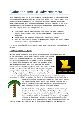
- 1. Evaluation: unit 18- Advertisement This is an evaluation to my Unit 18. In the unit we had to make and design an advertising company and then we had to make a product so we can advertise it. We had a choice of water, nature bar or chewing gum. My group we had luke hall, Nathan bland, William Mathews and Thomas biggsrayner.My group and I all chose to do water because it was easy for us to relate to for all of us are involved in sporting clubs in and outside of school and keeping hydrated in physical activities is crucial. The programs that we used during this topic are… Prezi- we used this in our presentation so it would give the impression that we were organised and it will make it easier to present because we were using humour in our presentation Premier pro- we used this to edit our advert for us to show to our audience Photo shop- we used this to make our final bottle logo and company logo. We also used this to create our bus, train and website banners If im honest I personally think that it is appealing to the sporting and exercising audience because of our logo. Annotating our logos and slogans We chose to make our logo this way is because it looked sharp and slick so it was eye catching because the contrast of the two colours (black and yellow) so the audience will look at it and want to read what it is so it will get our product more noticed also because those two colours have such a good contrast with each other it makes people more alert just like what people will be like after drinking our water and that is key to keen sports men/women because when you are alert during physical exercise they want to be able to reach the best of your abilities. We also chose the shape of our logo by getting the ‘Y’ and the ‘L’ of ‘yester lagoon’ and we put them together so then it will give the basic shape of it. We also made it a darker yellow ate the bottom and made it lighter at the top because in our presentation we said that our water has natural electrolytes (that’s our USP) and that electrolytes sink to the bottom so we thought that we include this in our logo. The reason we chose this font in our slogan is because it is sharp and it sticks out so it appeals to the audience. We put the dots to separate each word so it makes you read and think of them individually so it gives them inspiration to buy our drink and achieve their goal. We chose to have our company logo as a palm tree because our company is based in the Caribbean so we thought that this fitted quite well and it is a happy and joyful image to look at so this gives the costumer faith in investing there money to us to advertise their product. The reason we spelt palm ‘parm’ is because we thought that it was quirky and that it makes us different from everyone else by saying that we don’t care about the little problems in life and this fits in quite well with The reason why we choses our company slogan ‘easy’N’stressless’ is
- 2. because it makes the costumer trust us more and relives them because it is saying let us do the work and it will be easy and stress less for them. The reason we replaced ‘N’ with and is because it is inferring that we are easy going with the way our company work. The reason we chose the colour of the font is because it is the same colour as coconut milk and we thought that this fitted in very well with the whole idea of the tropical and Caribbean theme. Presentation and order on prezi while we were making our prezi we took in to consideration the colour scheme. We thought that this was a very important factor for our pitch because this will engage the audience and make it look interesting so they would want to read it so we carried on with the yellow and black because it looks smart and something that we would all be proud to present and the words on the prezi are easy to read so everyone at the back could read along with ease because the two colours clash together so much so they have the full potential to know what our product is about and why we done it in that way. we wanted to make the start of or presentation clear, simple yet effective linking in with the idea in what our advertising company is about (easy and stress-less) also we wanted to make it big so everyone In the room would know who we are The main reason why we used prezi is because when going on to our next point it flows very slow and comforting so it gives a subliminal reason to read on because no one wants to read something fast and jagged so we thought this was the best programme to use. In our presentation we thought that it was important to show our website, magazine and bus banners and we went through why we made it how it is. For our magazine and our bus logo we tried to make them look similar because then parm and
- 3. yesterlagoon would be a more recognised company. We also used the beach scene to represent our competition that if you match 4 bottle tops to the code on the computer you will Win a trip to the Caribbean even thought is it didn’t say anything about the competition on the adverts we thought it would represent our company well. Another thing that made our company look a bit more fun and interesting was the beach scene and colour and made our company stand out from any others. However other companies like evian and Buxton which looked very boring and simple, although we thought about this because we know that simple can be affective we decided against this and made them to look this way. We also wanted bright colours so it will make and everyday tedious life more bright and happy by having brightly coloured adverts around the country. We also thought that it was important to get the two clubs that we would be hopefully sponsoring on here because these are two very well-known football teams (Fulham and Southampton) and also because they are not as expensive as teams at the top of the premiere league it wouldn’t cost a lot of our budget so we could spend more money of other ways of advertising to give us the best possible chance of getting even more well-known and recognised and also this would show how big we are in the marketing company and also it would appeal to not only the sporting audience it will also appeal to the men and women that support these two clubs because they will realise that there football heroes drink this water so they will want to drink it as well. In our group we decided to have mascots in our group with different meaning behind the The gladiators- they believed that it wasn’t manly enough to wear armour and when they drunk yester lagoon water they became strong and fearless The cowboy- smart and trustworthy to his friends and always making life changing decisions when needed to because when you drink yester lagoon water you will be able to think clearly and effectively The gangster- the street smart thug always knowing the information and whats going to happen next with his connections and also always finding ways to make quick and easy cash to buy yester lagoon water
- 4. Also in our presentation we wanted to go that extra step further by making a connection with the audience by dressing up and our four mascots because this way it gets the audience wondering about our water so they want to listen why we dressed up like this so that’s another reason why we put this information near the end. in our advert we wanted to touch and relate to a sensitive market… bullying. We thought that we would include this in our advert because this is a grossing audience and a potential market that no one has really explored. In our advert it is saying that confidence flows through your bones when drinking our water so you can the stand up to bullying. We put the bully in the film and a person in the backgrounds/ and out cast of society because that’s wat the main population of bully’s are. We also had the setting of the advert in a school because this is where the maturity of bullying happens. Self-evaluation As we worked well in a group and we all get along we found it easy to spread the work out evenly and we all made our own contribution in the group. I personally came up with all the ways that we can make it outrageous and different that no one has ever seen before, I also came with the ‘ yester lagoon logo and slogan’ and I finally gave some very rich and powerful advice on how we produced the final advert. We didn’t come up with a log/ time schedule because we thought that it was pointless and useless but we did have mind maps of what we were going to do and story bored on how we are going to shoot and film the advert, however looking back on it now I wish that we did have some kind of organisation because there where some bits that we could of done better eg; more detail and information. And also if we did have a schedule we could have been able to spared out our time more effectively so we could of not rushed a few things on the way such as the editing of the film and the story board of the advert. However I do not regret not havening a time schedule because we still got items done on time. Personal strengths and weaknesses Strength I had a very strong creative mind to the group I was a natural leader when we got in a problem I stood back and let everyone have a chance in what and how we done stuff in the whole of the unit 18 Weakness I kept on falling behind on the work so I slowed me group down a bit on the photo shop I got frustrated at times and took it out on my group mates
- 5. Pitch strengths and weaknesses Strengths We interacted with the audience with humour and eye contact The lay out of the way we presented our prezi was clear und understandable We always backed up our work with why we done this and why we had done that Weaknesses When talking and presented our pitch we spoke too fast and not as clear and I would of liked We had technical problems with the sound so it it didn’t run as smooth as we would have liked Strength We all made good communication on how and what we were doing Weaknesses Make a team schedule so we can stay on track and so we have a good idea of what and when we will do it so we can be more organised We were all committed to the group and we were willing to do anything to go the extra mile We all made a good effort to present and make our presentation because we all took an equal role in making it In conclusion to all of these strength and weaknesses I personally think that we all worked well and as a group and as individuals. There are still improvements to be made such as organisation and time keeping (time schedule) if we did this we would of abetter Members of the group: Thomas Biggs-Rayner, Nathan Bland, Luke Hall and William Matthews Their product: yester lagoon Grading Criteria P1, M1, D1 Comments Clear and confident Grade Distinction
- 6. Have they communicated information and ideas in discussions about media production with sufficient clarity to be understood P2, M2, D2 Have they used software to create their presentation? P3, M3, D3 Have they addressed and interacted with the audience appropriately P4, M4, D4 Have they presented information and ideas for media production appropriately in written formats with sufficient clarity to be understood P5, M5, D5 Have they checked their presentation for spelling, grammar etc presentation with good use of research Excellent use of powerpoint, photoshop, and premier Distinction Some eye contact with audience Much better, good use of script meant much better interaction, good use of vocabulary. Good use of humour to maintain audience attention. Great presentation with clear plan. Less text needed on some slides. Good attention to detail with marketing campaign (merit) Distinction Yes Distinction Distinction Action Plan (to improve grade): • To get a distinction you need to re-do a presentation ensuring you practise, use a script and most importantly interact with the audience effectively • Make more links to your costumes and props in your presentation • Presentation re-done, all areas for improvement were met I understand the contents of this action plan and realise that it is up to me to act on the advice given Assessor name: AJO Assessor signature Date: 21/11/13 This is criteria paper that our teacher filled in while watching us during our presentation. This is how we will get our final grade. There are different levels ofcriteria to get certain marks. We did ours twice because we were not happy with our first mark because we were off by one mark off of
- 7. getting a distension because we didn’t interact with the audience, so we opted to do another one making sure that we make more contact with the audience so we did just that. We decided to dance with the audience when we were announcing our competition so we interacted with the audience more. However in the student criteria sheet we got all good feedback however they said that we talked too fast and that leaded to non-clear indications on what we really wanted to get across however we still got the final overall grade of distinction for our presentation. The sheet below is the student criteria sheet that pupils observing us while we pitched our water filled out. Members of group. Their product. Target audience. Do you agree with the target audience? Strenght of product. Weakness of product. Out of 10 rate their advert How was the pitch? Clear? Concise? Tom biggs-rayner, will Mathews, Luke hall, Nathan Bland. Water – Yesterlagoon Fitness fanatics, keep sportsmen and women. Yes because their drink energises you. Good logo and costumes Spoke very fast. 9/10 Clear and included many points in detail but spoke a bit too fast. 1. First I knew I had to include the company logo(the parm tree) so adding it to our print advert was the first thing that I did. Then I neededto add a nice background around it so this will be visually appealing to the audience so they would want to know what this advert is advertising. 2. So then I added a beach scene to add to the Caribbean feeling of our company because this is where it is based, I did this by just using the box tool and made it yellow to give the impression of a bright sandy beach and a light blue box for a nice clear sky. I also put birds in the back ground because it will make it more appealing and so it will make it more detailed.
- 8. 3. Then I added our water company logo into the Middle of the shot because it needs to be the main Focus point of the poster because this is what we want thecustomer to remember and recognise our logo we thought that this was important because this will be the best way to get regular consumers( a more Steady sore of income 4. We added white fluffy clouds because although the So it makes the audience happy when they look At it, just what people will be like after drinking Our water. this tool was useful to get the shape of a picture because we just cropped it this is the main tool that we used because our advert is simple yet effective this is how we changed and got certain colours so we can get a good colour contrast with in the picture Conclusion In conclusion Ithink that overall unit 18 went very well because we met the task and we presented it well and worked great as a team, we created a good company that had a good ideas on how sale a new product to our target audience we also stated why we done this as well so we have solid evidence to back it up. There were a few improvements to be made within our group however I personally think that overall we worked and efficiently as a group.