
Recommandé
Contenu connexe
Tendances
En vedette
Dernier
Dernier (20)
Style sheet
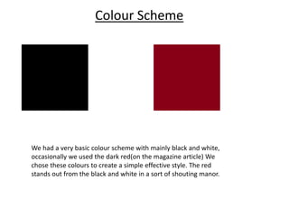
- 1. Colour Scheme We had a very basic colour scheme with mainly black and white, occasionally we used the dark red(on the magazine article) We chose these colours to create a simple effective style. The red stands out from the black and white in a sort of shouting manor.
- 2. Fonts We only used one font over all our media products, which was the Bebas font from dafont.com. We chose this font as it was all capitals and very bold which was typical of our genre as garage rock is quite bold and loud music.