Mobile first responsive web design
•
1 j'aime•1,259 vues
A short talk about our process behind designing "Hva koster Tannlegen?" for multiple screen sizes with a mobile-first approach.

Recommandé
Contenu connexe
Dernier
Dernier (20)
En vedette
En vedette (20)
Mobile first responsive web design
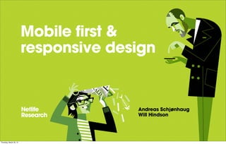
- 1. Mobile first & responsive design Andreas Schjønhaug Will Hindson Thursday, March 29, 12
- 2. Hva koster tannlegen? Thursday, March 29, 12
- 3. Choosing a dentist 1 - Quality 2 - Price 3 - Location Thursday, March 29, 12
- 4. Mobile first Thursday, March 29, 12
- 5. Thursday, March 29, 12
- 6. Thursday, March 29, 12
- 7. Thursday, March 29, 12
- 8. Tech slide! - HTML / SASS - COMPASS / JS - Sinatra on Ruby - Git Thursday, March 29, 12
- 9. <---- RESPONSIVIZING! ----> Thursday, March 29, 12
- 10. Thursday, March 29, 12
- 11. Thursday, March 29, 12
- 12. SASS TO THE RESCUE! Thursday, March 29, 12
- 13. $width-colspan-one: percentage(340px / 1140px); $width-gutter: percentage(20px / 1140px); .container { max-width: 1140px; width: 90%; nav { width: $width-colspan-one; } } Thursday, March 29, 12
- 14. Testing Thursday, March 29, 12
- 15. Thursday, March 29, 12
- 16. Thursday, March 29, 12
- 17. DR. EVIL TECHNIQUE Thursday, March 29, 12
- 18. DEMO Thursday, March 29, 12
- 20. Pros MOBILE FIRST - Prioritisation & focus - Avoid unnecessary content - Avoid mobile as an “aerthought” RESPONSIVE LAYOUT - Different layouts with the same base - Flexibility Thursday, March 29, 12
- 21. Cons MOBILE FIRST - Easy to forget about larger screens - Navigational conventions might not scale up - Content can be very streamlined, difficult to fill space RESPONSIVE LAYOUT - Loading unnecessary content - Developing is time intensive Thursday, March 29, 12
- 22. thanks! @willhindson @schjonhaug Thursday, March 29, 12
Notes de l'éditeur
- \n
- ## About (Andreas)\n- Forbrukerr&#xE5;det / portals\n- Tasks & user groups\nTELEPRISER og FINANSPORTALEN\n
- - "Quality" problem - our concept is about price & location\n- Deliver fully designed HTML prototype\n
- - "Quality" problem - our concept is about price & location\n- Deliver fully designed HTML prototype\n
- - "Quality" problem - our concept is about price & location\n- Deliver fully designed HTML prototype\n
- ## Mobile first (Will)\n- Inspired by Ethan Marcotte / mobile first\n
- ETHAN MARCOTTE\n\nLUKE WROBLEWSKI\n
- ETHAN MARCOTTE\n\nLUKE WROBLEWSKI\n
- - Started loosly sketching wireframes\n- Were forced to prioritise and be ruthless with content\n- Didn't think about the desktop site at this stage\n
- - Started prototyping early (Tech Slide)\n
- - SASS/COMPASS v useful for working out responsive widths + compass for outputting cross browser css3 prefixes.\n- Sinatra a lightweight framework for tying together the prototype.\n- Git for collaboration\n
- - SASS/COMPASS v useful for working out responsive widths + compass for outputting cross browser css3 prefixes.\n- Sinatra a lightweight framework for tying together the prototype.\n- Git for collaboration\n
- - SASS/COMPASS v useful for working out responsive widths + compass for outputting cross browser css3 prefixes.\n- Sinatra a lightweight framework for tying together the prototype.\n- Git for collaboration\n
- ## Responsive - Sizing up! (Will)\n
- - Desktop Cut'n'paste experiment\n- Content v stripped down, difficult to translate - introduced map\n
- \n
- - what is sass? Preprocessor for CSS\n- SASS calculate percentages and ems from px\n
- \n
- ## User tests (Andreas)\n- Tested 3 sizes, random order\n- Nodilus system\n\n
- \n
- - Generally successful, experience translated across screen sizes\n
- - "Very simple", easy to use (even DR EVIL managed)\n
- ## DEMO (Will + Andreas)\n*Functionality* (Andreas)\n- Initially wanted exactly the same content across all sizes, however quickly learnt that we needed to hide / load content depending on browser size\n- The process for finding a dentist ended quite different across different screens\n\n*Design:* (Will)\n- Link colours - large hit areas etc, translated also to desktop. Might be more difficult other way around!\n- Navigation - Changes in header, footer on mobile\n- Arrow conventions for expandable boxes & links, consistency\n\n*Technical:* (Will)\n- MEDIA QUERIES - base css + tablet & desktop\n- Matchmedia JS media queries\n- SVG x2 Media query\n\n- "Clean" HTML difficult - don't be afraid to use containers\n- Prototype not photoshop, sometimes easy to get stuck in code details.\n- Code changed often, leading to some bloat and unused code\n
- \n
- ## Pros (Will)\n- Prioritisation & Focus\n- Avoid unnecessary content which otherwise would have been suggested\n- Avoid mobile as an &#x201C;afterthought&#x201D;\n
- ## Pros (Will)\n- Prioritisation & Focus\n- Avoid unnecessary content which otherwise would have been suggested\n- Avoid mobile as an &#x201C;afterthought&#x201D;\n
- ## Pros (Will)\n- Prioritisation & Focus\n- Avoid unnecessary content which otherwise would have been suggested\n- Avoid mobile as an &#x201C;afterthought&#x201D;\n
- ## Pros (Will)\n- Prioritisation & Focus\n- Avoid unnecessary content which otherwise would have been suggested\n- Avoid mobile as an &#x201C;afterthought&#x201D;\n
- ## Pros (Will)\n- Prioritisation & Focus\n- Avoid unnecessary content which otherwise would have been suggested\n- Avoid mobile as an &#x201C;afterthought&#x201D;\n
- ## Pros (Will)\n- Prioritisation & Focus\n- Avoid unnecessary content which otherwise would have been suggested\n- Avoid mobile as an &#x201C;afterthought&#x201D;\n
- ## Pros (Will)\n- Prioritisation & Focus\n- Avoid unnecessary content which otherwise would have been suggested\n- Avoid mobile as an &#x201C;afterthought&#x201D;\n
- ## Cons (Andreas)\n- Easy to forget about larger screens\n- Navigational conventions might not scale up\n- Content can be very streamlined, difficult to fill space\n
- ## Cons (Andreas)\n- Easy to forget about larger screens\n- Navigational conventions might not scale up\n- Content can be very streamlined, difficult to fill space\n
- ## Cons (Andreas)\n- Easy to forget about larger screens\n- Navigational conventions might not scale up\n- Content can be very streamlined, difficult to fill space\n
- ## Cons (Andreas)\n- Easy to forget about larger screens\n- Navigational conventions might not scale up\n- Content can be very streamlined, difficult to fill space\n
- ## Cons (Andreas)\n- Easy to forget about larger screens\n- Navigational conventions might not scale up\n- Content can be very streamlined, difficult to fill space\n
- ## Cons (Andreas)\n- Easy to forget about larger screens\n- Navigational conventions might not scale up\n- Content can be very streamlined, difficult to fill space\n
- ## Cons (Andreas)\n- Easy to forget about larger screens\n- Navigational conventions might not scale up\n- Content can be very streamlined, difficult to fill space\n
- \n