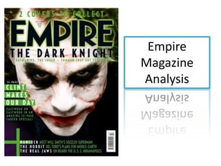
2. Colour – the main Masthead – it is
colours used are green, conventionally at the top
white and black. The of the magazine cover. It
colour green suggest is in capital letters, capital
power, this may imply letters help to highlight
that the model on the something; it is helping to
cover is going to be in make the masthead stick
power of the film i.e. the out.
main focus of the film.
The colours white and Layout – the layout out
black are traditional of the magazine is a “C”
colours which are shape which is one of
sometimes used to the popular layout types,
create a contrast, the the magazine has used a
use of this to make the conventional layout as
magazine more visually they know it will appeal
appealing. There is a to the audience.
small use of the colour
red on the models face General conventions –
which is a usual horror -Barcode
convention, this will -Price
allow the audience to -Dateline
instantly recognise the -Flash
genre of the film.
3. Typeface – throughout the “Special” – this implies that the magazine is The same font has
including unique features which are not usually
whole magazine cover , present, this will make the audience feel that the
been used throughout
Empire have used capital magazine is worth the money even more the magazine which
letters, this may have been creates consistency,
done to make the text stand- as of too many
out to the audience. different fonts were
used it would distract
The cover line which anchor’s the audience from the
the main image is short , this main features of the
is as the film is widely magazine.
recognised around the world
and it wouldn’t need a lot of The colours green and
text for the audience to white contrast with
appeal film. The magazine has each other e.g. “Clint
challenged convention as the makes our day” has a
cover line is positioned green layer behind
directly under the masthead, the text which will
Empire is a well known direct the audience to
magazine so this wouldn’t the cover line as it
stop the audience from becomes more
purchasing the magazine. noticeable.
Will Smith’s name has been used on the cover “MEET WILL SMITH”, this will appeal to the
audience as he is a famous actor which they like. Also the word meet implies that it will be a
interview where the audience will find out the latest information about the actor.
4. The main image of the magazine is of The
Joker who is one of the main character of
the film, by using the main character of the
film on the cover the niche audience will
instantly recognise what film is the main
feature of the magazine.
The model is face is white with red cuts
(marks) around his face and the colour
black around his eyes. The model it
engaging with the audience by looking
directly towards the camera. The colour
black is conventionally used for a horror
genre as it creates a mysterious
atmosphere, it also conveys fear which is
the feeling the audience get when watching
a horror film. The colour of the models face
looks unusual, this will be a key element in
attracting the audience towards the
magazine. The red cuts looks like blood, this
is associated with danger , which is typically
seen in an horror genre as it conveys death
and power. The camera angle is a birds eye
view which normally makes the model look
inferior, this may give the audience a small
clue about who will be victorious in the end
of the film.
5. The Rule of Thirds – the models
eye are positioned on one the
lines, this has been done as the
audience instantly look at these
sections of the magazine first.
The left third of the magazine is
the first area the audience look at,
on this side there is one cover line
this gives the audience a feel
about what will be included in the
magazine.
The magazine hasn’t included a lot
on the left third as the main focus
is the main image, it takes up the
majority of the page highlighting
the importance of the image.
Considering that the main image is
that large, the magazine don’t
need to use as much text as the
main attraction of the magazine is
the image.