Understanding the difference between responsive and adaptive web design
•
0 likes•463 views

Understanding the difference between responsive and adaptive web design Visit Our website for related articles. www.writeawriting.com

Recommended
More Related Content
Recently uploaded
Recently uploaded (20)
Featured
Featured (20)
Understanding the difference between responsive and adaptive web design
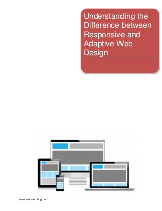
- 1. Understanding the Difference between Responsive and Adaptive Web Design www.writeawriting.com
- 2. Understanding The Difference Between Responsive And Adaptive Web Design Ever since the Almighty Google announced its stance towards responsive web design, the web development industry took a major shift in paradigm. Almost every client you meet wants their website to be compatible with mobile devices, and two major solutions are available for these requirements: Responsive Web Design and Adaptive Web Design. Even though Many people use the terms Adaptive Design and Responsive Design interchangeably when they actually are entirely different things. Read More Similarities Both Responsive and Adaptive design are meant to produce the same results: make a website that is compatible with any device. Irrespective of the screen size or resolution it is viewed with, the website should be optimized to provide the best possible experience to its users. Differences Responsive Web Design Responsive web design uses CSS3 media queries to find out the screen sizes and resolutions of the device being used. In Responsive Web Design, all decisions regarding the layout and presentation of the website are made at client-side. Entire available data and content is downloaded from the server irrespective of whether it will be displayed on the device or not. The data, the videos and images are fluid and flexible as they resize and reposition themselves on the run, depending on the changes made by the user on the device. Read More www.writeawriting.com
- 3. Adaptive Web Design Adaptive Design uses the concepts of Progressive Enhancement to define a set ofdesign methods that are user focused. In Adaptive, the decision of which data is to be fetched for the device is made at server side. The screen size is fed to the server, and it responds with that data that is suitable for the device it is being used on. Since we are not downloading any material that will remain unused, it saves a lot of time in downloading the content and loads much quicker as compared to Responsive Design. Read More Figure 1: Click Here To View Enlarge Image What To Choose? If you’re looking to target a wide group of audience, Adaptive Design is your safest bet. This is because Responsive Design is relatively new technology and people with phones that have older browsers would fail to view the proper website. As its con, adaptive design requires more effort on the developers part, and hence is expensive. However, what is true in one case doesn’t necessarily remain true in general. In most cases Responsive Web Design remains a better solution to developing device friendly websites. So unless you are making a website that has like a dozen call to actions on every page, you can safely use Responsive Design without sacrificing a lot on the efficiency. Read our supporting article on how you can make a successful website, and the key metrics for success with a local business website. Here is an info-graphic that superbly explains the differences between RWD and AWD. (Source : Mashable.com) Figure 2:Click Here To View Enlarge Image www.writeawriting.com
- 4. Related Articles: Facebook hashtags to promote your business online. A Newbie’s Guide to Promoting Your Business on Social Media Creative Tips That Will Help You Sell Anything On Social Media! E-book by writeawriting An Ultimate survival guide for Writers, Bloggers, Social Media Mavens, Business Experts and Marketing Guys. Follow us on www.writeawriting.com