Frequency Tables and Line Plots Visually Display Numerical and Categorical Data
•Download as PPT, PDF•
2 likes•2,066 views

When the items being tallied are numbers, a line plot can be used to visually display numerical data. A line plot uses X marks above a number line to show the frequencies. For example, a line plot of the number of books students read shows the frequencies of students who read 1 book, 2 books, and so on up to 7 books. A frequency table organizes categorical data into categories and displays the frequency of each category. For example, a frequency table asking students' favorite color would have categories for different colors and show how many students chose each color. Analyzing frequency tables and line plots can identify outliers, clusters, or gaps in the data distributions.

Recommended
More Related Content
What's hot
What's hot (20)
Viewers also liked
Viewers also liked (20)
Similar to Frequency Tables and Line Plots Visually Display Numerical and Categorical Data
Similar to Frequency Tables and Line Plots Visually Display Numerical and Categorical Data (20)
More from Cinnaminson Public Schools
More from Cinnaminson Public Schools (20)
Frequency Tables and Line Plots Visually Display Numerical and Categorical Data
- 1. Data: Frequency Tables and Line Plots
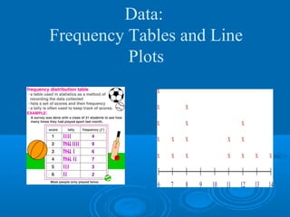
- 2. Vocabulary Data - information, often given in the form of numbers or categories. Frequency Table – a table that displays the number of times each item or category occurs in a data set. Line Plot – a number line diagram that uses X marks to show the frequencies of items being tallied.
- 3. Line Plot Example Students at a Party
- 4. Books Students Read Last Month (numerical) # of Books Tallies Frequency 1 llll 5 students 2 llll 5 3 llll l 6 4 ll 2 5 6 7 llll 4
- 5. Making a Line Plot Is a visual of the frequency distribution. Line plots are NOT used for categorical data. Draw a number line whose scale starts at or before the minimum data value and stops at or after the maximum data value. Use a consistent increment.
- 6. Completed Line Plot - When the items being tallied are numbers, a line plot can be used to visually display numerical data. A line plot uses X marks above a number line to show the frequencies. The X marks above the number line show X the frequencies. X X X The Number Line X X X X shows the number X X X X of books read. X X X X X X X X X X 1 2 3 4 5 6 7 Number of Books Read
- 7. Making a Frequency Table Categorical data: data that can be placed into categories. Categorical question: What is your favorite color?
- 8. Completed Frequency Table- Favorite Color (category) people Color Tallies Frequency Blue llll 5 Red lll 3 Yellow l 1 Purple ll 2 Orange llll 4 Green Black ll 2
- 9. Variability in Data Distributions Outliers-Unusually high or low values in a distribution. Clusters-An group of data values with higher frequency than surrounding values. Gaps-Areas in the scale where there is a lack of data values.
- 10. Analyze the Data Now look at the Frequency Tables and the Line Plots from your notes to see if you can identify any outliers, clusters or gaps.