1. Q (G- POP/ROCK):
Colour Scheme: Targeted at a mature teen/ young adult audience, the colour scheme goes with many
shades of white and grey, consistently sticking to one primary colour that is a bright scarlet. the clever
use of using the vast contrast of shades to the bright colour of red not only give the general look of the
magazine an essence of maturity and professionalism, but the red is very useful on when the magazine
is trying to signify something; the main example being that that the red square that is part of the
magazines logo helps to illuminate to the reader (and potential buyer) of the actual masthead- the bright
colour red acting as a bright beacon, consisting of its connotations of danger, help to raise and stimulate
curiosity for the reader. Red is also used for the main subheadings and the occasional plug line- this
again is used to highlight and tempt the reader to important information that is most likely to please the
buyer.
The shades of silver, grey and white add a sense of simplicity to the cover. we are not bombarded with
adverts, or a multitude of colours, something one might see in TOTP magazine, but these colours are
relaxing and easy on the eye. I even noticed that without fail every Q magazine front cover has a simple
plain white background, for the image of the main artist (in this case ADELE) speaks for itself and thus,
invite people to pick up and buy the magazine.
When it comes down to making my own magazine, I really do admire there less for more idea. I feel by
using their selected colour scheme they really have the correct perspective of the audience, something
that really does matter to the majority, I being one of them. I will definitely try and take inspiration from
Q's clever use of colours.
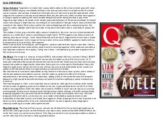
The Photo: The image is a close up of singer ADELE, and already tells me a number of things. ADLEE
is a very distinguished, artist, this being the reason why she takes up most of the front cover, for Q
know and understand the simple information that she alone will sell. Another point is that she is looking
towards her audience; digesting the information that is given to us through the Gratification theory this
helps the audience to see her as if she is one of them, we are not only entertained by her vocals, but
audience will feel welcomed by her approaching eye contact to the reader.
She also seems to have been represented as very feminine in this warm close up shot, with a series of
clichés and stressed connotations such as: how the make up, adds to the effect of her being
represented as a welcoming person to read about, adding to this is the careful decision of having her
dressed in a light purple dress with matching nail vanish this further amplifying a sense of welcoming
innocence.
The body language is, I feel, a very important key to note down. although she is looking at the reader,
full eye contact, suggesting a sense of confidence, her arm is pressed towards her mouth, this I think
leads to two suggestions. Either the editor has chosen for ADELE to touch her own lips so as a means
to encapsulate an essence of sexual arousal (the lips being used for kissing) or that the enclosed body
language suggests a shy persona that seems likeable to an audience (because she is shy, the body
language hinting that she is out of place, we, as a reader immediately posses dominance, and
inexplicably are tempted to pick up an dread the magazine.). Body language I feel is very important, and
when I come to taking photos of my own model/models for my own magazine, body language is
certainly something to consider and experiment with.
Plug/ Sell Lines: The plug/ sell lines as you can see are all relevant to the correct target audience, as
well as the correct genre such as Kith Richards. it be silly to have someone like ONE DIRECTION to be
on the front cover or even have an article on Q for they are aimed at a much younger audience, where a
son the other hand Q is aimed in a fairly opposite direction.
2. KERRANG (G- PUNK/ROCK):
Colour Scheme: The magazine has chosen for to stick with two primary colours, being a bright scarlet and a an
alarming shade of yellow. The red connotes an idea of danger, as we associate the colored with wounds and the
blood of battle; immediately we as readers at once associate this magazine to be aimed of a male audience.
However, I would think that the yellow balances out the readership of both genres, as the yellow is more of a
warm and feministic colour. Yet others would argue that bright colour yellow connotes the idea or urgency and
emergency as these are the colours that we often see when there is a situation of great importance, such as the
lights of a speeding colour, which add to this idea of danger and destruction, thus the idea of a masculine quality.
Yet like the majority of magazines the choice of one or two colours are supported with a series of shades. The
most dominant shade on the cover is black. This choice of shade makes sense as the genre of Kerrang!
magazine is of course rock- so as having the classic rock and roll colour, gives the magazine a very stereotypical
gritty masculine quality that instantly helps to establish that genre through any reader whom views the front cover.
Each colour and shade is specifically place don the magazine so as to help highlight a certain type of text or
image. For example the actual masthead of the magazine is highlighted in the simple shade of white, cast against
a red/ black background so as to illuminate the great importance the masthead (for the name of the actual
magazine is very importance as it s the first piece of text of which any reader, or even possible audience member
will judge the magazines) first impressions being vital when the publishing of magazines are concerned.
The Photo: The main image on the front cover is of a solo artists , whom we can instantly tell is of great
importance, not because he is most likely a distinguished artist in the genre of rock, but he is the cover article and
has been placed directly in the middle with a close focus on his face to highlight this. If we look through the
perspective of mise-en-scene we see that he is looking towards the audience, revealing that is acknowledging
them. This simple act of looking towards the reader helps him to be placed in a positive perspective as well as a
more likeable one. The make-up, although seen as unusual for a boy, helps to add to the oddity that will draw the
reader in for the unusual, as well as classic rock artists often having make-up such as the popular rock band The
Kiss. He has his lips pushed to one side as he looks towards the audience so as to reveal a hint of rebellion of
which the rock genre is famously associated for- if you even look closely you can see a piercings in the lips which
highlights how this artists is in with the current trends which will want many readers to pick up and purchase the
magazine for they want to be associated with the magazine and that artists for he can be seen as ‘trendy’.
Like the make –up the hair is black, as well as long and overgrown which suggests to the audience that he does
not want to fits with the norm of society, nor (in typical ‘rock n’ roll fashion) care much for abiding the rules and the
laws. I feel that audiences will like this as it gives a classic example of a figure that is so associated with the rock
genre will particularly be effective between teens and young people for it will give them an ideal rocker, as for
someone to strive towards.
Plug/ Sell Lines: Plug/ Sell lines include 'Green Day' and UKs Biggest Gig guide' these are all relevant to the
target audience who adore their music and are most likely saving up to attend a concert with their friends to share
in their deep love of music. It is of the greatest importance that I aim my plug lines and sell lines to my correct
audience as it is shown in the example above. Now although it seems I should do three music magazine covers, I
feel it is more beneficial to look at the other side of the world of front covers and to see just how much these
codes and conventions can vary.
3. Top of The Pops (G- Pop):
Colour Scheme: TOTP’s magazine is perhaps the most variable colourful music magazine there is. The
colours seen on the front cover are pink, turquoise, yellow and purple, all helping to draw in and generate
the full majority of young girls of which is the priority target audience for the magazine- the colours all
connoting young feminine colours. Yet there are some similarities that can be seen throughout all of the
magazines in this presentation. For example the main sell line ‘Battle of the fittest’ being highlighted in an
illuminating shade of yellow while a clear pink box boards around the text; this proving that the colour
scheme of any magazine is ever important and immediately helps to highlight and signify to the reader of
the most important features of that certain issue of magazine. If we look towards the masthead of TOTP’s
we see that between ‘Top’ and ‘Pops’ we see the disco ball in between that helps to join the masthead
together. This reveals to the young audience, that just like a disco (of which we gain the connotations of
through the use of semiotics) the girls whom read this will have just as much fun as attending a disco or
going out to a party, attracting each young female reader in wanting to buy the issue. To add on the
boarder of the masthead white stars are highlighted through the pink boarder. Through the study of signs
(* SEMIOTICS) this demonstrates of the wondrous glamour of which the magazine provides, attracting the
female audience as well as subtle suggesting that this magazine is the one and only whish of a TOTP’s
reader, as in a ‘whishing star’. If we look towards the bottom right we see the symbols of hearts as the sell
line speaks of Union J the heartthrob band whom every girl is supposed to fancy; yet the hearts around
there names encourage this. Especially since the main cover article is about Union J, then encouraging the
readership of love-sick girls t love Union J, this will thus make them want to buy and read the issue to
read more about the ‘crush’ they have on those artists.
The Photo: The two Heart-throbs are staring straight at the reader ( which is most likely to be of a young
girl) resulting in making them feel loved, adored and even possibly special for they feel as if they are
gaining the attention of there idols of whom they value dearly. To add to the attractiveness of the actual
artists they have also been seen as friendly and trendy by the way of which they are close together
suggesting a warm appealing brotherly bond. We also notice on how they are dressed in fashionable
clothes so as to appeal to the perspective of a young girl (whom stereotypically cares very much about
fashion and how it is worn) yet because these young boys are wearing fashionable clothes (as well as the
in fashionable style of hair) this will further add to thee attractiveness of the teen boys and thus help to
generate a profit of the love-struck girls and teens. Other secondary images including Justin Bieber, Rita
Ora; TOTP’s using the same concepts so as to gain there readership to buy the magazine by either having
boys to appeal for the attractiveness, or woman’ girls so as to be appealing role models/idols.
Plug/ Sell Lines: the main sell line that links to the cover feature ‘Battle of the Fittest’ is a pun on words as
In not meaning its traditional view as in health, but rather on the current colloquial term of ‘Fit’ now
meaning ‘good-looking’ so as to excite the audience. Yet the secondary sell lines of ‘Bieber confessing’ or
‘Kimberly: I Was always teased’ are not music related, nor are the other majority of sell lines; this
encapsulates to us that the young audience may not even care for musical talent, but on image and
character.