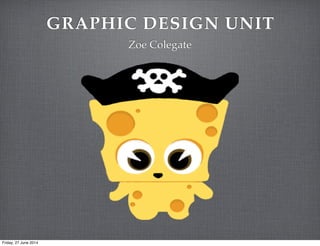
3. TARGET AUDIENCE
ANALYSIS
I would place Captain Cheddar down the bottom because it’s a niche/casual game, it’s not a hardcore game
because there’s no killing or exploring aspects to this game. It involves very little skill and knowledge to play.
Friday, 27 June 2014
4. CAPTAIN CHEDDAR IOS
APP IDEAS
Gameplay/screenshot
Title as text Language as image
Character/action Abstract/iconic
Symbolic/thematic
Friday, 27 June 2014
7. APP ICON FEEDBACK
AfterBefore
Scott: The changes made complimented the layout of the icon, for instance, the black ring added around
it captain cheddars hat, as well as the title and ‘B’ logo. The adjustment made to the title with the white
outline also helps to create a title that pops out more and is less bland. The positioning of the ‘big crown
media’ logo feels quite random, but i think it would of been hard to find a suitable place for it, so it may
of looked better without it.
Friday, 27 June 2014
8. APP ICON COLOUR
IDEAS
I tried lots of different colours, some of them I kept with the theme and others I used different colours that are not connected to the
game in any way. My favourite is the second one along, the colours are not exactly matching the game but are the same shades
Scott: I really like the first two colour designs, they match the underwater theme and stand out.
Ollie: I love the top first and the two third colour designs, I think the third pair along go with the pirate theme.
James: I like the bottom first one, it goes with the sea theme and makes captain cheddar stand out.
Friday, 27 June 2014
9. WALLPAPER DESIGN
My wallpaper is relevant to the game, it
has Carl The Crab who features at the bottom of
the sea bed during the game and the bubbles
which you see above the fish. I have
matched the colours well together giving
the background a lighter colour so the
bubbles and the crab stand out.
I created wallpapers back in my first year,
I could use whatever images you wanted in
this wallpaper as it wasn’t for a
certain project. It didn’t go too well however,
I’ve learnt from that and still
managed to create a good wallpaper for
Captain Cheddar.
First attempt at wallpapers
Friday, 27 June 2014
10. FIRST WALLPAPER
I think my reaction to this
wallpaper is it looks a little
cheap, even though simple
was my main goal for this
project I think it would look
much nicer if there was more
going on.
Client feedback: I love the
crab, he’s cute and fun and
the children will love him. I
think the background
could be a nicer colour,
maybe a pink or a green.
Maybe put more detail
around the crab.
Friday, 27 June 2014
11. FINAL WALLPAPER
I took the clients feedback in
mind and changed the
background colour to green, I
think this suits the theme of the
game much better. I have kept
the crab and the bubbles and this
time added one of the fish that is
also in the game and some
seaweed that is placed at the
bottom of the sea bed
Client feedback: This looks
amazing, I love the way you’ve
placed the crab and the fish
around the title ‘Captain
Cheddar’. There is more detail
in this wallpaper but you’ve
still kept the simplistic side to it
as well, well done.
Friday, 27 June 2014
13. DIRECT POSTER DESIGN
I've kept the
background the same
colour as the one in the
Captain Cheddar game
so it matches the theme
and people will
recognise it. I think
there's something
missing that could
make the poster look a
lot better so I've
gathered feedback from
peers:
Client Feedback -
The poster would look
more professional with
a border. Add a banner
around the 'Download
on app store now!' Give
the background more
detail, sand or beach
stones as the
background to make it
look more interesting
and stand out.
Taking the feedback
into mind I have
created a new poster
which I think looks
much better and more
professional.
Friday, 27 June 2014
14. BILLBOARD DESIGN
The main idea for this
billboard design is to catch
peoples eyes when driving
along or walking through the
city, they will see this billboard
and become curious of this
game and hopefully search for
Captain Cheddar in the app
store.
Client Feedback: I think this
billboard design will look great
out in Cambridge, Captain
Cheddar stands out against the
blue and the bubbles give the
new audience who haven’t
seen this game before an idea
that it’ll be a water themed
game. I think more detail
would look much better,
maybe add some of the fish.
Friday, 27 June 2014
15. FINAL BILLBOARD
I think this billboard is
a lot more eye catching
than my previous one,
with the fish it adds a
lot more colour to it.
Client Feedback: I like
the way you’ve brought
the fish from the game
onto your billboard but
still using Captain
Cheddar in the corner
so people can recognise
what game it is.
Friday, 27 June 2014
16. GRAPHIC DESIGN
EVALUATION
I’m comparing my app to pre-school adventure island, not only is this a similar game
with similar target audiences but it’s also a similar design, in both our apps we have
made it clear that it is pirate themed and a cartoon styled game. The pre-school
adventure island app is a lot more colourful than my app design and also looks more
child friendly.
The wallpaper on my right is from the game Animal Crossing,
both of our wallpapers use characters from our games so the
wallpaper is relatable an is recognised. Both of our wallpapers
have writing on it however mine is more frequent as the Animal
Crossing wallpaper isn’t a repeating pattern.
My billboard is very different to the Call Of Duty
billboard, mine has kept the cartoon theme and Call Of
Duty has made the main image a real person instead of
using images from the actual game.
Professional productsMy products
Friday, 27 June 2014
17. GRAPHICS DESIGN
EVALUATIONMy products
SUGGESTED IMPROVEMENTS
When creating the first drafts for my app icon I was told Captain Cheddar looked lost and the
Big Crown Media logo looked like it had been dumped on the icon without thought as to where
it should be put. I took on board this information and created a thick black line around the main
circle of the image and created 4 thin lines to not only give the icon a beer barrel look to it but to
also line the Big Crown Media logo at the bottom.
Could add some detail around the outside of the app (the red area)
For this project I got feedback on the background colour of my wallpaper, I got told I should
consider changing the background to a green which I have done and it looks so much better.
I think I could add a bit more detail around the right hand side of the crab and above the
yellow fish. My previous wallpaper there were too many gaps and it just looked cheap and too
simple.
My first draft for the billboard was still nice but didn’t involve much detail or colour, I got
given feedback and added more detail and colour which I gained from the fish that are in the
Captain Cheddar game.
I wasn’t too keen at first to add the fish onto the billboard but now I’ve made it and seen the
final image I’m glad I listened to my feedback and made these changes.
Friday, 27 June 2014
18. TRANSFORMATIONS - FEEDBACK AND
AMENDMENTS
On the left is my first design for my
wallpaper, feedback said it was too
simple and needed more detail but still
kept the simplistic look to it. I played
around with the characters on photoshop
and created my final design which is still
a little more detailed than my 1st design
but still very simplistic.
From my feedback I got told to add more
colour into my billboard, which I did and
looks a lot better. The second image is a
lot more eye catching.
Friday, 27 June 2014
19. MATERIALS, SOFTWARE
AND PERIPHERALS USED
Photoshop played a big part in my graphic design project, I only used
photoshop to create all my designs. I used it to create my wallpaper and I
created the fish, Captain Cheddar, bubbles and the crap all on this software
as well. This programme is brilliant, it’s so easy to use once you learnt the
basics, I love it! 5/5
Friday, 27 June 2014
20. FITNESS FOR PURPOSE
You can see from the left I have made my
wallpaper as my desktop for my laptop, I
think it looks really cool. I think many
people would download this for their
desktop as it’s free. It’s not too crazy and
you can still see your app icons for all your
other work on your desktop as well.
Friday, 27 June 2014