The Essentials of PowerPoint Color Theme
•
397 j'aime•84,002 vues

This document provides tips for using color themes and fonts effectively in PowerPoint presentations. It recommends keeping alignments precise and using basic solid colors with hints of accent colors for a minimalist style. For a cartoonish style it suggests using eye-catching contrasting colors in harmony. A corporate style should use a straight layout with one mature color that stands out and complements neutral colors.

Recommandé
Contenu connexe
En vedette
En vedette (11)
Similaire à The Essentials of PowerPoint Color Theme
Similaire à The Essentials of PowerPoint Color Theme (20)
Plus de 24Slides
Plus de 24Slides (20)
Dernier
Dernier (20)
The Essentials of PowerPoint Color Theme
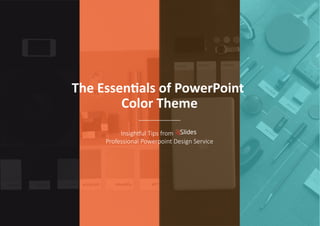
- 1. The Essentials of PowerPoint Color Theme Insightful Tips from Professional Powerpoint Design Service
- 2. MINIMALIST
- 3. A L I G N M E N T keep your alignment precise
- 4. Use only basic, solid colors and add a hint of a different color to bring out a certain style COLOR
- 5. Helvetica FONT Gotham Calibri Light Roboto Open Sans
- 6. CARTOONISH
- 7. Feel free to use eyecatching and contrasting colors but ensure that when combined, they’re still in harmony When using 3 or more colors, set the color intensity from one of the colors
- 8. You may use random layout
- 9. Make your icons dynamic and curvy instead of having prominently sharp edges To keep your design organized yet still attractive, choose one point of interest to stand out Give your presentation a fun twist by applying various colors for your text
- 10. CORPORATE
- 11. Use a straight layout Remember, straight or simple doesn’t necessarily mean boring!
- 12. Keep your design neat and uncluttered as it will likewise impact attractiveness
- 13. Pick only one c olor to stand out thr oughout your presentation When selecting colors, use one with a mature color tone (e.g. one that’s not too bright)and can easily complement neutral colors
- 15. Select at least two or three colors compositions
- 16. Apply a contrasting background and foreground Set the layout to be dynamic yet not too crowded nor cluttered
- 17. Bring out a trendy style by looking for the free form among objects
- 18. Brought to you by