8. Precision is my Inspiration by RAYMOND WEIL Genève http://inspiration.raymond-weil.com/
101
9. 7. NON-STANDARD NAVIGATION
Navigation is among the most important pieces of every single website.
No content would be reachable without properly designed navigation that
answers the questions “where am I?” and “where can I go from here?”.
We got used to either a top, left or right menu. They’re patterns used since
the beginning of the web. Something changed in 2013 though. Designers
started to play with the concept and come up with really creative solutions.
Some of them are more usable (bottom navigation), some less (usage of a
keyboard in navigating through a website), but all in all this is an interesting
and popular trend that’s changing the way the Internet looks.
Take a look at the 15 best examples of non-standard navigation elements.
102
25. 8. FIXED NAVIGATION
Setting a position fixed for the navigation bar isn’t something new. It’s
doable since CSS2 introduced absolute, relative and fixed positions for html
elements. However, in 2013 fixing the navigation has been rediscovered in a
twofold way:
• responsive websites often use fixed navigation bars to improve
the navigation capabilities on a small screen;
• fixed navigation bars with additional transitions add a dynamic
feeling to the website.
The progress of technology (larger screens and bigger resolutions) has
justified the fixed position of the navigation and honestly we’re hoping it
will become a standard in 2014.
Enjoy 15 great websites that are leading the fixed revolution!
118
26. DesignTAXI - Driving you to bright ideas for the past 10 years http://designtaxi.com/
119
41. 9. METRO GRID
The Metro UI name has been officially buried because of a possible trademark dispute. Microsoft offered “Windows 8-style UI” instead but the
design world somehow refused to use it (sounds like product placement,
doesn’t it?).
It didn’t kill the trend though. Together with the pinterest-like grids, metro
grid has become extremely popular in 2013 and certainly will remain popular in 2014. Designers started to love websites and web applications full
of nicely crafted boxes. Appealing, simple aesthetics almost dominated the
Internet.
Choosing 15 nice implementations of the “Metro Grid” wasn’t an easy task,
but we managed to do it. Enjoy!
134
56. MVA - SPACE SHOWER MUSIC VIDEO AWARDS http://mva.jp/
149
57. 10. MIX-AND-MATCH TYPOGRAPHY
2013 popularized a typography style that we previously knew rather from
fancy t-shirts than websites - mixing and matching several styles of fonts.
The complex art of choosing the right font is stretched to the extreme in
this trend.
Neck-breaking typography aerobatics will certainly be with us in the near
future. It’s too powerful a brand-shaping tool to disappear.
Watch the 15 best examples of Mix-and-Match Typography and be amazed!
150
58. Forefathers Group | The New Design Frontier http://forefathersgroup.com/
151
72. Al Taglio | Pizza au poids et à la coupe http://www.altaglio.fr/
165
73. 11. CLARITY AND SIMPLICITY
Clarity and Simplicity are always in fashion. In 2013 however this became a
major trend. Connected to the “content centric” approach and the flat design, the clarity and simplicity of an interface become a complete, powerful
thing.
It’s design at its best. Thoughtful, efficient and...simple.
Enjoy!
166
88. Substrakt - Branding, Print, Design, Digital Web & Mobile. Birmingham & London http://substrakt.co.uk/
181
89. 12. COOKIES WARNINGS
The European Union gave designers a huge headache in 2013. Cookie warnings are now obligatory for all European websites. That’s an unwanted trend
that will certainly be very popular in the next couple of years.
Nothing we can do about it apart from...getting used to it.
182
90. Home - this is true. http://www.truedigital.co.uk/
183
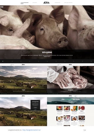
91. Lexus Cars Europe | Hybrid Cars | New and Used Lexus Cars http://www.lexus.eu/index.tmex
184
93. Conclusion
2013 is the year of smart, aesthetic and simple design. 2014 will be no
different. Responsive web design will be even more powerful. Flat Design
will be even more popular (since the arrival of iOS7). The clarity and simplicity of content-centric websites will be all over the place.
Who knows, maybe this is the golden age of the Internet. The design of
2013 is mature, focused on its purpose and certainly rewarding for the eyes
of users.
The only thing that can destroy 2014 for all of us is the growing popularity
of transitional interfaces. While CSS transitions are great and in the hands of
talented designers can add much desired interactivity to the UI, it’s easy to
overdose them.
186