
Recommandé
Contenu connexe
Tendances
Tendances (20)
En vedette
Similaire à Double page spread analasis
Similaire à Double page spread analasis (20)
Plus de Barney Thurgood
Dernier
Dernier (20)
Double page spread analasis
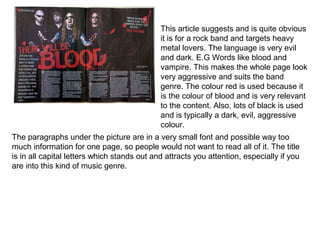
- 1. This article suggests and is quite obvious it is for a rock band and targets heavy metal lovers. The language is very evil and dark. E.G Words like blood and vampire. This makes the whole page look very aggressive and suits the band genre. The colour red is used because it is the colour of blood and is very relevant to the content. Also, lots of black is used and is typically a dark, evil, aggressive colour. The paragraphs under the picture are in a very small font and possible way too much information for one page, so people would not want to read all of it. The title is in all capital letters which stands out and attracts you attention, especially if you are into this kind of music genre.
- 2. I Quote from the double page spread “ People think I’m an attention seeker, but I’m just honest”. Which is trying to seek attention by using all different size fonts and spacing the letters unevenly apart. The whole page looks attention seeking. The picture is very clear and in good lighting with her red checked shirt standing out from the bright white background. Her hands are on her hips showing confidence and attracting attention. There is a neat red, black and white colour scheme throughout the page. Even her clothes and makeup are matching the colour scheme. There is lots of information at the bottom of the page which could possibly be too much but it may appeal to the more formal style of readers.
- 3. The main picture is a famous rock star trying to look cool. This will help the magazine sell as the title is about him talking about style. The picture gives you a idea of his style and makes you want to look like him. The colour scheme is black, white and pink. His tattoos match the colour scheme and make him look a lot tougher. It is rather Unusual having pink in a magazine colour scheme unless it is aimed at teenage girls. I think it works in this double page spread because it talking more about fashion than rock music. also this page looks a bit camp or like something a teenage girl would have pined up on their bedroom wall. The border of white dots that look like small lights make him look more like a star and almost gives the affect he is under the spot light.
- 4. What I learnt • Have one big picture with the writing on and around it instead of having lots of smaller pictures. • To have lots of information on the page • Have a colour scheme