The document summarizes the design elements used on the front cover, contents page, and a double page spread of a magazine. On the front cover, a sans-serif font creates a modern feel while serif font attracts fans of the featured artist. Color, layout, and a full-body photo of Katy Perry appeal to a young adult audience. The contents page uses structured layout, bold fonts, and photos to entice readers. The double page spread features a large photo of Nicki Minaj surrounded by text in pink and black fonts, utilizing color and design to match her powerful feminine image.
Mattingly "AI & Prompt Design" - Introduction to Machine Learning"
Modern Magazine Front Cover Typography, Layout, Colour and Images Analysis
1. Front Cover
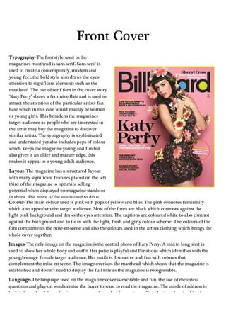
Typography- The font style used in the
magazines masthead is sans-serif. Sans-serif is
used to create a contemporary, modern and
young feel, the bold style also draws the eyes
attention to significant elements such as the
masthead. The use of serif font in the cover story
‘Katy Perry’ shows a feminine flair and is used to
attract the attention of the particular artists fan
base which in this case would mainly be women
or young girls. This broadens the magazines
target audience as people who are interested in
the artist may buy the magazine to discover
similar artists. The typography is sophisticated
and understated yet also includes pops of colour
which keeps the magazine young and fun but
also gives it an older and mature edge, this
makes it appeal to a young adult audience.
Layout- The magazine has a structured layout
with many significant features placed on the left
third of the magazine to optimize selling
potential when displayed on magazine stands or
in shops. The route of the eye is used to draw
attention to the masthead and the photo of Katy
Perry and then down to the cover line. The
organised structure of the magazine re-alliterates
the sophisticated yet fun feel that the magazine
conveys and makes it appeal further to a
teen/young adult audience.
Colour- The main colour used is pink with pops of yellow and blue. The pink connotes femininity
which also appeals to the target audience. Most of the fonts are black which contrasts against the
light pink background and draws the eyes attention. The captions are coloured white to also contrast
against the background and to tie in with the light, fresh and girly colour scheme. The colours of the
font compliments the mise-en-scene and also the colours used in the artists clothing which brings the
whole cover together.
Images- The only image on the magazine is the central photo of Katy Perry. A mid to long shot is
used to show her whole body and outfit. Her poise is playful and flirtatious which identifies with the
young/teenage female target audience. Her outfit is distinctive and fun with colours that
complement the mise-en-scene. The image overlaps the masthead which shows that the magazine is
established and doesn’t need to display the full title as the magazine is recognisable.
Language- The language used on the magazine cover is excitable and fun, the use of rhetorical
questions and play-on words entice the buyer to want to read the magazine. The mode of address is
both informal and formal as it comes across formal with mentions of ‘marketing plans ‘and ‘making
money from Facebook social games’ it also has an informal feel as it mentions ‘Mike Posner from
iTunes u to the top 10’ this shows that although the magazine is fitting for the younger generation it
also has a mature and sophisticated edge.
2. Contents Page
Typography- The typography on
the contents Page is mostly
understated, yet bold for headings
and crucial elements of the
contents page such as sub-titles.
The title is in capital letters which
connotes strength and solidness
and contrasts against the white
background.
Layout- The layout of the
contents page is structured, it
features the charts for top albums
and singles and also has a list of
what is featured on each page
with a short slug to give you a
snippet of information to lure the
reader in. Everything on the
contents page is very sharp and
clean cut, for example the photos
and the heading font. The sharp
effect gives the magazine an edgy
and cool feel which appeals to a
young and ‘hip’ audience. The
chart section breaks the usual
conventions of a magazines
contents page is something that
only billboard magazine offers. It
takes up the majority of the left
hand side of the magazine is
useful as it helps readers discover
new and relevant music. The
three pictures are numbered to
show what page in the magazine
they are relevant to which helps
to interest the reader and grab
their attention.
Colour- An array of colours are used to draw the eyes attention. The picture of Katy Perry features
colours like pink and purple which connotes femininity and is likely to attract the attention of women
and girls. The use of other colours such as blue and black also show that the target audience is general
and fits both men and women. The black and blue also gives a refined look.
Images- There are 4 pictures on the contents page, three of these are blocked together on the top third
of the page this gives a preview of the magazines contents and is useful as if the reader doesn’t want to
read the whole page they can find the number of the page that relates to the picture in the bottom left
hand corner and direct themselves straight to the page they are interested in.
Language- The language on the contents page is formal to inform the reader on the contents of each
page. It is short and snappy to give the reader some information to entice them to read on. The
language is mature and sophisticated as it talks about ‘music & money’.
3. Double Page Spread
Typography- The typography on the double page spread ties in with the celebrities style and uses a
mixture of both serif and sans-serif font. Half of the title is serif which gives a feminine and girly vibe,
and the other half is serif font which is bold and strong. The use of the two fonts portray Nicki minaj’s
image as it shows that she is a strong independent women. The colours also connote the same message as
they are black and pink which also projects femininity and power. The title ‘Nicki Minaj’ is the largest
font on the double page spread which draws the reader’s main attention to her. Bold and Capital lettered
font is used to highlight quotes and subtitles, this is effective as it allows the reader to skim read the main
points of the article and decide whether they want to read the full article.
Layout- The layout is structured and numbered into sections. An image of Nicki Minaj takes up a lot of
the spread and so does the bold and feminine title. The text is structured to fit around the image of Nicki
Minaj and is also structured into columns. The rule of three is used to concentrate and draw attention to
the central image.
Colour- The main colour of the double page spread is pink, this connotes femininity and also makes the
image of Nicki Minaj pop from the page. Pink attracts a young girl/ women audience and also fits with
mise-en-scene of the page. Nicki minaj’ outfit is bold and patterned which makes it pop from the
background. Her jewellery also ties in with the billboard logo and is fun and eye-catching. The overall
colour of the double page spread fits the demographic and psychographic of the audience.
Images- The only image on the page is the centre image of Nicki Minaj, this works well as her general
look compliments the colour and mise-en-scene of the double page spread. The image overlaps some of
the text which shows the importance of the image as it takes priority on the pages and reinforces her
powerful image.