
Recommandé
Contenu connexe
Tendances
Tendances (20)
Similaire à Katy Perry Album Advert Analysis.
Similaire à Katy Perry Album Advert Analysis. (20)
Plus de Emily Warner
Plus de Emily Warner (17)
Dernier
Dernier (20)
Katy Perry Album Advert Analysis.
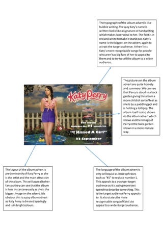
- 1. The typographyof the albumadvert islike bubble writing.The wayKaty’sname is writtenlookslike asignature orhandwriting whichmakesispersonal toher.The fontisin redand white tomake it standout. Katy’s name is the biggestonthe advert,againto attract the targetaudience.Itthenlists Katy’smore recognisable songsforpeople whoaren’tas big fansof her to appeal to themand to try to sell the albumtoa wider audience. The layoutof the albumadvertis predominantlyof KatyPerryas she isthe artistand the mainattraction of the album.Thiswill appeal toher fansas theycan see thatthe album ishers instantaneouslyasshe isthe biggestimage onthe advert.Itis obviousthisisa popalbumadvert as Katy Perryisdressed sparingly and isin brightcolours. The pictureson the album advertare quite homely and summery.We can see that Perryisstood ina back gardengivingthe albuma more childishsortof feel as she isby a paddlingpol and isholdinga lollipop.The albumitself isalsoshown on the albumadvertwhich showsanotherimage of Perryinthe back garden shownin a more mature way. The language of the albumadvert is verycolloquial asitusesphrases such as “#1” to replace number1. Thisappealstoa youngertarget audience asitis usingmore text speechtodescribe something.This isthe targetaudience Perry appeals to. It alsostatesthe more recognisable songsof Katy’sto appeal toa widertargetaudience.