3. 1
Why your brain needs
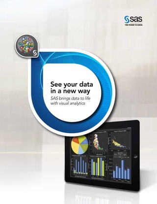
data visualization
The benefits of processing information through pictures
According to Research Scientist Andrew
McAfee and Professor Erik Brynjolfsson
of MIT, the amount of data that crosses
the Internet every second is greater than
all the data stored in the Internet just 20
years ago. This amounts to exabytes of
data being created on a daily basis.
If you tried to picture each individual data
value that is being generated just in your
company, your head would spin. The
human brain is incapable of processing
hundreds and thousands of variables at
once, let alone millions and billions.
Yet information can inform and enlighten
your business practices, direction and
vision. Fortunately, there is something
to help your brain not only imagine your
corporate information, but consume it.
Enter data visualization.
Data visualization is the representation of
data in a pictorial or graphical format. The
purpose of data visualization is to simplify
data values, promote the understanding
of them, and communicate important
concepts and ideas. Visualizations are
the single easiest way for our brains to
receive and interpret large amounts of
information. Data visualization gives
business users the ability to use
information intuitively, without deep
technical expertise. Even novice users
can create data visualizations that
are meaningful, such as pie charts, line
graphs, bubble charts and heat maps.
Advanced data visualizations support
more in-depth and complex analytics.
A visual tier that sits on top of the analyt-
ics program lets users view the results
of complex algorithmic processing. Not
only can they get insight into what’s
happened, they can forecast what might
happen, using rich graphics to quickly
derive business actions. The fact is, when
people transition from spreadsheets to
data visuals, they are able to register the
values they are seeing as a whole.
Consider the manufacturing director of
product reliability for an international
company that produces small motors,
like the ones you find in toothbrushes,
toys or cell phones. Each year the
company makes millions of vibrating
cell phone motors. One of the director’s
principal responsibilities is to determine
how reliable the cell phone motors will
be with each year of age. If the product’s
reliability falls short of the standards set
4. 2
Analise Polsky is a thought leader on the SAS Best Practices
team. The focus of her work is developing and delivering data
quality, data stewardship, culture and change management,
and data visualization best practices. She has also created
training materials for database and application products,
which she has presented to a wide variety of clientele in
multiple languages.
Figure 1: Multidimensional data about the cell phone motors can be sliced and
diced by applying filters on any level of a hierarchy, and forecasts can be
generated on the fly.
forth by the cell phone manufacturers
who use the motors, his company could
lose major contracts.
A traditional electronic spreadsheet can-
not visually represent the amount of data
that is collected on the age and reliability
of the cell phone motors. In print, the
spreadsheets would look like small
mountains on the director’s desk. In both
cases, the director would lose countless
hours poring over millions of rows of
data, and he would still be none the wiser
about his original question of the age of
the motor and its reliability.
Data visualization represents the data
in a way that the director can easily
interpret, saving him time and energy.
For example, Figure 1 shows the number
of units that correspond to each age
(represented by the color gradient) as
well as the reliability as the age of a unit
increases. In a matter of seconds, he
can see that units approaching 10 years
of age are approximately 40 percent
reliable. This visual simplifies the totality
of the data, instantly clarifying what is
happening with the reliability of the cell
phone motors.
Regardless of his computer expertise, the
director can quickly derive meaning from
the data that supports his job function.
When the visuals are generated only by
a technical user, on the other hand, it can
leave a lot open for interpretation.
Whether they work at the corporate head-
quarters or in the field, employees can use
data visualization tools to unite around
common visuals, inviting new conversa-
tions around data usage and decisions. In
the long run, this collaboration can save
time and help bridge some of the decision
gaps between business areas.
Mobile applications for tablets increase
the sharing and dissemination of data
visuals among business users. Web-based
applications unchain us from traditional
desktop applications and encourage mo-
bility and real-time interaction. Managers,
account representatives and executives
can all access visual reports and see key
performance indicators from anywhere.
Having a centralized access point for
important reports and indicators
minimizes the endless paper and email
trails that often result in miscommunica-
tion and misinformation.
There is no going back. The flow of data
will not shrink in the near future; in fact, it
will continue to grow exponentially. Time is
doing us no favors, and we may not always
have access to, or the resources for, all the
technical experts that we think we need.
Today we can use data visualizations and
the advanced analytics that supports them
to meet these challenges head on. IQ
online
Building reports with
SAS
®
Visual Analytics (video):
sas.com/iq-vareports
5. 3
Using visual analytics to
support evidence-driven
policy decisions
A discussion with the Australian Institute
of Health and Welfare
What types of injuries result in hos-
pitalization? How does dental care
in remote areas compare with that
available in urban regions? Is Australia’s
medical workforce growing to meet the
demands of society?
When Australian policymakers ask these
types of questions, the Australian Institute
of Health and Welfare (AIHW) supplies
the answers. As the country’s national
agency for information and statistics
about health and welfare, AIHW aims
to improve the well-being of citizens
through better use of information and
statistics. Governments and community
leaders use information from AIHW to
discuss, debate and design policies for
health, housing and community services.
Warren Richter, Senior Executive for ICT
and Business Transformation at AIHW,
recently took some time to discuss the
importance of visual analytics in the
policy development process, and to
describe how big data is affecting the
agency’s work.
Why is data exploration important
for the Australian Institute of Health
and Welfare?
Warren Richter: Our mission is clear:
Provide authoritative information and sta-
tistics to promote health and well-being.
That’s what we’re all about. We collect,
analyze, and disseminate information in
the areas of health, age-care services,
child-care services, housing assistance,
child welfare, and other community-
related sectors. We have also produced
some performance indicators and
targets for national agreements.
6. 4
Today, it’s not so much what we do
with analytics; it’s a question of what we
want to do. We have a long history of
linking large and complex data sets for
research and statistical purposes, and
we have recently become one of the
first two organizations accredited as an
integration authority under the very strict
Australian government arrangements for
integrating data sets containing sensi-
tive information about individuals. That
means, after approval by an independent
ethics committee, we are able to produce
detailed information for research and
analytical purposes. We take this role and
our responsibility to preserve privacy and
confidentiality very, very seriously. We
undertake around 90 data integration
operations every year, some of which are
extremely complex.
These accreditation arrangements
enable the Australian government to
make more data available for research
and analysis. This is going to be of great
benefit to the community over time. We
are using SAS
®
and SAS Visual Analytics
to explore this data.
There is a neat convergence of data and
capability here – a rigorous confidentiality
and accreditation arrangement to free
up data combined with the very exciting
capabilities of in-memory analytics
packages such as SAS Visual Analytics.
How does big data
influence your work?
Richter: Statistical agencies like ours have
dealt with big data for a long time, and
we can continue to do the traditional
analyses with existing tools. But the
availability of large and more complex
data sets is transforming what we are
able to do. In our case, it’s come about
not through the Internet, but through the
willingness of the Australian government
to make more data available for analysis
under strict conditions.
But getting data from the Internet is also
going to be relevant to us, because we
are starting to explore opportunities to
access real-time data as a byproduct of
administrative operations as they occur,
not just as they occurred in the past 12
months or so. Some statistical agencies
around the world are taking direct feeds
from point-of-sale terminals, for example,
so you’re measuring the economy as
it’s happening. We think there will be
opportunities to do similar things in the
health sector.
Why did you select SAS
for visual analytics?
Richter: It boiled down to value for
us: whether SAS Visual Analytics could
handle the size and complexity of the
data sets, whether it was easy to use, and
then, of course, whether it supported
the analytical techniques and visualiza-
tion approaches that we require.
Instead of focusing on every last whiz-
bang, push-button feature, it was more
important for us to be able to use SAS as
an extended platform so we can manipu-
late the underlying data sets and expose
the analyses behind the visualizations. It’s
about the value for money and enhancing
our existing data exploration capabilities.
Increasingly, we’re being asked by
government agencies to develop such
things as clearinghouses of information –
not exactly data warehouses but dash-
boards – that expose a particular sector
or area within a sector for access by
decision makers. SAS supports that vision.
We also want to support decision makers
and policy analysts in our client agencies,
such as the Department of Health and
7. 5
“We think we can help formulate better policy proposals
by giving a much more intimate relationship with, and a
better understanding of, the data. The ability to access
a very large and complex data set easily and to do a
what-if train of thought analysis together with our
clients is very exciting.”
Warren Richter, Senior Executive for ICT and Business Transformation at AIHW
Ageing. We need to work with agencies
on policy problems, providing them with
the data they need, when they need it,
and helping them draw insights from
that data with visualizations. We don’t
want to continue just doing what we’ve
traditionally done, which is to report on
something. We’re getting ready to
support them as they explore and under-
stand the data and to help them apply
the right analyses. We want to provide
even more value than we currently do.
Essentially, we aim to help analysts to get
the information they need in real time as
they do their jobs, rather than make them
wait 18 months for a report, which may
not even fully answer the question at hand.
Can you give a few specific examples
of policy areas that will be using SAS
Visual Analytics?
Richter: Increasingly, we’re supplementing
more of our publications and cubes with
visualization. And we plan to extend it to
develop some new service offerings for our
clients to support their decision making.
One area in which AIHW is already using
visual analytics is the development of new
approaches for presenting decision
makers with information about mental
health services. We are very excited about
the way we can quickly and easily pro-
duce dashboards with rich visualizations
from very complex and rapidly changing
data sets and make them available online.
We will be extending this capability to
other subject areas very quickly.
How might visual analytics be used to
identify new types of questions and
explore data differently?
Richter: You know, if you have a small data
set and you want to do some visuals using
old-fashioned, run-of-the-mill analytical
techniques, you can do that fairly eas-
ily. Even in a spreadsheet, you can run a
simple regression on a small data set, but
it’s not as easy when you’ve got a very
large and complex data set to explore. It’s
very valuable to be able to say, “Here’s
the data – bang – you’ve got it. Let’s start
to look at it without having to determine
what sampling or subsetting technique to
use, and determine if that is valid.” We just
don’t have to worry about that now.
Before visualization, you had to know
exactly what analysts were looking for
before you could build your cubes. Now
we can make the whole data set available
to everyone all of the time, subject to pri-
vacy and confidentiality considerations of
course. It’s terrific to be able to get some-
thing going very quickly across large and
complex data sets as they are created.
In conclusion, can you summarize your
long-term goals for visual analytics?
Richter: We want to use the data that
we currently have to shed more light on
issues, to describe the real world better
by using visualizations, and to support our
key clients directly via visual analytics as
they make policy recommendations and
formulations using real-world data as it is
created. We think we can help them
formulate better policy proposals by
giving them a much more intimate rela-
tionship with, and a better understanding
of, the data. The ability to access a very
large and complex data set easily and
to do a what-if train of thought analysis
together with our clients is very exciting,
and we are looking to develop this as an
ongoing high-value service. IQ
online
SAS Australia:
sas.com/australia
Looking at correlations in
SAS Visual Analytics (video):
sas.com/iq-vacorrelations
8. Retail group gains better
customer insight with
visual analytics
SM-MCI analyzes loyalty data to pinpoint key trends that
help boost merchandizing and promote customer loyalty
SM Marketing Convergence Inc. (SM-MCI),
an affiliate of SM Retail Group, operates
one of the largest customer loyalty
programs in the Philippines. The loyalty
program enables customers to earn reward
points when they shop with the SM Group
– and it also garners massive quantities of
customer purchase and spending data for
SM-MCI. In fact, SM-MCI’s current data
exceeds a billion transactions.
Big potential for key insights
With so much customer data at the ready,
SM-MCI knew it was sitting on a gold
mine that could yield tremendous
business insight – but the sheer size of the
data proved to be challenging when it
came to delivering useful customer
knowledge. The company needed a
better way to uncover and analyze the
information and then put it to use.
“We’re delighted that SAS continues
to be ever mindful of our needs and
commits these into the development
of new technologies in analytics.”
Baldwin C. Golangco, SM-MCI President and Chief Executive Officer
6
9. 7
Four ways
retailers can
use visual
analytics
1. Drive innovation. Visually explore
data to identify previously unseen
correlations and patterns that can
spark innovative ideas for attracting
new customers, growing existing
customers’ wallet share, and
retaining valuable customers.
2. Localize offers, pricing and
assortments. Explore sales,
demographic and customer loyalty
data to uncover hidden insights
that can be used to cater to
individuals with localized pricing
and assortments.
3. Enhance customer experience.
Share analytical insights with store
managers and associates who can use
the information to offer personalized
experiences to customers via
preferred channels.
4. Identify and solve supply chain
issues. Find hidden supply chain
problems by visualizing supply chain
data, sales transactions, call center
complaints, etc.
SM-MCI sought a solution that could
help boost merchandizing, improve
store operations and promote customer
loyalty. It chose to implement SAS Visual
Analytics, a powerful high-performance
solution providing in-memory analytics
and advanced data visualization for
business intelligence.
With the technology in place, SM-MCI
could look at patterns in spending, re-
wards redemption and customer loyalty.
The resulting insight would be delivered
to affiliate partners, who could then better
plan their sales and loyalty strategies.
A fast, intuitive solution
SM-MCI was faced with a huge
undertaking: It wanted to fully analyze
the more than 200 million customer
transactions that were generated on a
yearly basis across more than 500 stores.
Once SM-MCI learned what SAS Visual
Analytics could do, the retailer knew it
was the right solution for the job.
SAS not only has unmatched statistical
computing power and speed, it also offers
an intuitive interface that makes visualizing
the information even easier. Plus, it could
scale effortlessly from 200 million to
more than 1 billion transactions using
commodity hardware.
SAS Visual Analytics helped SM-MCI
analyze customer data and deliver
in-depth reports based on SM-MCI’s
big data insights. The technology could
get the job done without the burden
of extensive data planning or ETL
reprocessing whenever new variables
needed to be added. It was fast, efficient
– and delivered the in-depth analysis that
SM-MCI needed to meet its goals.
Better analysis leads to better service
With data compiled from its customer
loyalty program, SM-MCI uses SAS
Visual Analytics to understand buying
patterns and identify trends, which leads
to better service – and greater customer
satisfaction. Armed with this insight,
SM-MCI improves the customer
experience with relevant, timely offers
and promotions. It also can work to
acquire new members, reduce churn
and identify new up-sell opportunities.
“We have always regarded SAS as a
valuable business partner with the
dedication and support your team has
shown us over the years,” says SM-MCI
President and Chief Executive Officer
Baldwin C. Golangco. “We’re delighted
that SAS continues to be ever mindful
of our needs and commits these into
the development of new technologies
in analytics.” IQ
online
SAS Philippines:
sas.com/philippines
See it for yourself:
Demo SAS Visual Analytics now:
sas.com/iq-vademos
10. Envisioning the future
with data visualization
SAS Visual Analytics offers Euramax Coated Products
faster access to predictive decisions
striving to improve our processes and
detect root causes for discrepancies
in results.
“Confidence in the quality of our data
leads to more rapid and fundamentally
sound decisions.” SAS Visual Analytics
helps Euramax experience that confidence.
“With the completeness and the speed of
data that SAS Visual Analytics provides,”
Wijers says, “combined with its intuitive
interface, our analysts can, and will,
push themselves to get answers to
their questions.”
More dynamic exploration
Euramax Coated Products is a premium
coil coater, serving the European, Middle
East and Asian markets. Its three coil-
coating lines manufacture pre-coated
aluminum and steel for applications in
The leadership team at Euramax
Coated Products knows that the
company’s success can depend on
understanding and sometimes even
redefining the future.
One example of this vision? The
extraordinary color performance of the
world’s largest pre-coated aluminum
roof at Ferrari World in Abu Dhabi,
United Arab Emirates. The massive, red,
logo-shaped structure looks almost like
a futuristic ship has landed gracefully in
the desert terrain.
Another example is the company’s com-
mitment to business analytics and data
exploration. “Exploring data helps both
our analysts and our decision makers in
gauging the dynamics of our industry,”
says Peter Wijers, Euramax Business
Support Manager. “We’re consistently
architectural products, transportation
and corporate identity design.
Euramax’s pre-coated metals cover all
kinds of products, from building facades
to household appliances, working with
some of the most prominent brands in
the world.
The company’s objectives in employing
visual analytics were to:
• Gain more dynamic reporting and
exploration capabilities.
• Provide for more probing research.
• Enhance mobility, including the ability
to carry data out into the field and
share it with customers.
“We wanted to have our data available
at any time, to gain quicker insights and
8
11. 9
make better decisions, anywhere,” Wijers
says, and to be able to present data in a
variety of easy-to-grasp formats.
Euramax now employs SAS Visual
Analytics in multiple countries to improve
production operations and broaden its
research and for financial reporting, with
more applications being added on an
ongoing basis.
Drilling down
The most common problem with static
reporting, Wijers says, is that you can see
deviations in the end result but still don’t
know the causes. Requests to analysts
for detailed information take time and,
generally, the more detailed the results,
the more questions that are raised.
“Often an analyst’s gut feeling is right,
but he doesn’t have the means to easily
verify it,” he says. “SAS Visual Analytics
reporting tools allow users to quickly
and easily add filters or drill down to a
more detailed level of information.”
Focusing on the real causes
But sometimes those gut feelings are
wrong – and here, as well, SAS Visual
Analytics comes in handy.
Euramax uses Lean Six Sigma teams to
analyze and solve issues in processes in a
structured manner. While productive, this
process often reveals that expectations
and gut feelings can’t be proven.
“Sticking to those gut feelings can hinder
employees in their search for improve-
ment,” Wijers says. “While identifying
outliers, visual analytics allows you to see
correlations that weren’t expected, and
the focus can be put on the real causes.”
Road warrior-worthy
Equally important to Euramax is the
mobility of SAS Visual Analytics.
Many Euramax employees travel the
world and are regularly confronted
with the need for information instantly
on their mobile devices, often with no
Internet connection available.
“With SAS Visual Analytics, the key data
is stored with the reports, so access is
ensured 24/7, anywhere,” Wijers says.
Reports are also designed for the
individual user level, allowing Euramax
to set up a safe structure for access.
“Our people now have what they need,
when they need it,” he says.
Wijers is confident of the response as
Euramax continues to make SAS Visual
Analytics available to more employees:
“They’re going to be thrilled to have it.”
Freedom and flexibility of analysis
Wijers sees visual analytics as opening
up the opportunity to explore new
areas of efficiency and innovation – to
answer questions that haven’t previously
been posed.
“It’s a common fact that when analysts
take a lot of time in offering findings,
management’s motivation to request
different approaches to the analysis
wanes,” Wijers says. “But with SAS
Visual Analytics, once the data is loaded,
analysts are off and running, without the
need for any specialized support. With
that level of freedom and flexibility of
analysis, answers can be found much
faster, and with a higher degree of quality.
“The power and ease of use of SAS Visual
Analytics will allow our employees to
analyze data in a much more efficient way.
Now, knowing that all of the reporting
is based on detailed flat data, editing a
report and searching for root causes in
deviations will be easy to do.
“Once users understand the power that
SAS Visual Analytics offers, they’ll be
much more highly motivated to explore
the data and offer new insights.” IQ
online
SAS Netherlands:
sas.com/netherlands
Explore manufacturing data
in the SAS Visual Analytics demo area:
sas.com/iq-mfgdata
“With the completeness and the speed of data that SAS
Visual Analytics provides, combined with its intuitive
interface, our analysts can, and will, push themselves
to get answers to their questions.”
Peter Wijers, Euramax Business Support Manager
12. Free access to valuable
census data
The Statistics Center – Abu Dhabi makes data available
to constituents
“With the release of the SAS tools, many
users will have access to a large amount
of valuable census data. Users can now
customize statistical data to meet their
specific needs, which enables them to
make better-informed decisions –
leading to better use of resources and
greater efficiency.”
Adopting proven methods,
embracing new ideas
SCAD is an independent entity established
in 2008 as the main authority handling
official statistics in the Emirate of Abu
Dhabi. SCAD collects, classifies, stores,
analyzes and disseminates statistics for
the compilation of social, demographic,
economic, environmental and
cultural indicators.
The Statistics Centre – Abu Dhabi (SCAD)
was a newly created agency with a big
challenge – conducting a full population
census for the Emirate of Abu Dhabi, and
making large amounts of that census data
publicly available online.
SCAD needed a software solution that
could allow a broad range of users –
experts and otherwise – to access and
analyze the data. They decided that the
best software to meet their requirements
was SAS.
“SAS is recognized as an analytics
provider of choice for many statistical
offices globally,” says Ghanem
Al Mehairbi, Section Head of Statistical
Information Systems (SIS) at SCAD’s
Dissemination Department.
1
0
“This will lead to
better use of
resources and
greater efficiency.”
Ghanem Al Mehairbi,
Section Head of Statistical
Information Systems at SCAD’s
Dissemination Department
13. 1
1
SCAD has been able to adopt best
practices from international bodies and
leading national statistical organizations. It
uses the United Nations Economic Com-
mission for Europe’s Generic Statistical
Business Process Model as the underlying
framework for its statistical system, but
is eager to explore and implement new
and cost-effective methods to become a
world leader in statistical analysis.
SCAD has four main objectives: to
develop and organize a statistical
system for Abu Dhabi, to contribute
to the UAE’s national statistical system,
to provide official statistics related to
the conditions of Abu Dhabi society,
and to support decision makers in the
Emirate. “The end result is to make
useful information freely available and
easy to use,” says Al Mehairbi.
The role of this department is to reach
out to external users (including other
government agencies, businesses and
the public) with statistics that help
answer their questions. The SIS team
facilitates this by providing efficient
ways to access and analyze detailed
data through the use of specialized
software applications.
The 2011 census
In October 2011, SCAD conducted its
first census. It identified several features
to incorporate into the online statistical
tools that would be available to the
public, including:
• Ease of use/access. The solution
should not require training. It should
be intuitive and easy to understand by
a range of users. Users should not be
required to register or log in.
• Spatial representation. The census
data outputs needed to incorporate
some form of spatial representation.
• Sense of community. The ability to
learn more about local communities
through census data was a priority.
The chosen solution needed to
be able to “tell a story” about a
self-defined community.
• Extract and takeaway. As the Census
2011 data would be made available
electronically for the first time, SCAD
wanted to make it easy for users to
extract and take away the data for
further analysis.
• Confidentiality. The census must
protect the privacy and anonymity of
individuals, according to internationally
recognized standards.
• User skill levels. SCAD recognized that
people with different skill levels would
use the tools. Therefore any solution
would require a layered approach.
Better use of resources
SCAD used SAS software in the micro
and macro analysis of census data,
and as the primary tool for statistical
dissemination. In addition to using
innovative enumeration technologies
such as iPads, SCAD developed
innovative online tools in SAS for
thematic mapping and table building.
With thematic mapping, users can
select census data and display it over
a selected geographical area (such as
region, district or sector level). “Spatial
views of population characteristics can
support many types of decision making,”
says Greg Pole, Manager of the
Dissemination Department.
With community tables, users can go on
to create rich tabular information based
on the geographical census data. For
example, a property developer might
want to identify areas with a large
concentration of elderly residents in order
to decide where to situate new
retirement villages; a retail chain might
want to identify areas with large
numbers of family households to help
decide where to locate new stores.
“With the table builder, users can decide
how to present the information in a
meaningful way for decision makers, with
simple drag-and-drop functionality, in
English or in Arabic,” Pole says. “There is
an additional benefit from the develop-
ment of the SAS tools, and that is the
re-use of the applications for other
non-census data sets such as foreign
trade and the annual economic survey.”
In recognition of its effective and
innovative use of SAS software, SCAD
was the first government entity in the
Middle East to be awarded the presti-
gious SAS Excellence in Government
Award in the Middle East. The award
was presented in person by SAS CEO
Jim Goodnight. “It was very generous
of Jim to visit us,” said Al Mehairbi.
“He has had a positive influence on
staff in the SIS team and across
SCAD generally.” IQ
online
SAS Middle East:
sas.com/middleeast
Celebrate the International Year of
Statistics with SAS:
sas.com/statistics2013
14. Visualize this
How do you harness all of your data sources, make sense of billions of rows of data and display it in a way that
snaps the big picture into focus and brings trends to life?
Answer: SAS Visual Analytics. Designed with business users in mind, this new data visualization technology
allows you to spot trends, explore big data and go mobile. See for yourself in these examples or learn more
about visualizing data for your industry and your role at sas.com/iq-va
2. Explore big data.
Not an analyst? Not a problem – simply drag
and drop data categories onto the visualization
pane. In seconds, billions of records are analyzed
and intelligent auto-charting displays the best
visual for your data.
1. Spot trends and opportunities – instantly.
Your exploration uncovers a surprising trend: In three
regions, sales of Product A are up sharply, and now you
want to forecast demand. No need to call IT – just click
on “Forecast” and get an answer in moments, not days.
Want to add in sales information for other regions or
products? You can create hierarchies on the fly.
1
2
15. 3 ways to instantly analyze
billions of rows of data.
What can you do with
SAS®
Visual Analytics?
BANKING:
Calculate risk across entire portfolio:
Analyze risk factors at every transaction level –
in milliseconds instead of hours or days.
RETAIL:
Next best offer recommendation:
Look at all sales data, purchase history,
social media data and more to quickly
create well-targeted offers.
MANUFACTURING:
Drive better yield, utilization and satisfaction:
Proactively identify and resolve product
defects, production issues and inefficiencies.
TELCO:
Faster action against churn: Quickly identify
customers at the exact moment they consider
switching to a competitor, and take the best
action for retention. Bring m-commerce to life
through mobile marketing and advertising,
payments, transactions, loyalty programs
and coupons.
SAS Visual Analytics:
sas.com/iq-va
3. Go mobile.
You’ve compiled your findings; now drag and drop your
charts into a dashboard and simply publish to the Web and
mobile devices. Your colleagues can access and drill down
into your reports, collaborate using comments, and receive
updates seamlessly – anytime, anywhere.
1
3
16. Visualizing data makes
hearing it easier
Telecom Italia answers the call for speed
with visual analytics
“We need to be able to respond quickly
with new and improved offerings to our
customers, and to analyze the impact of
these offers for the foreseeable future,”
says Fabrizio Bellezza, Vice President of
National Wholesale Services and Head
of Market Development at Telecom Italia.
“Analysis that is valuable and makes sense
today may be irrelevant tomorrow. And
we need to see well beyond tomorrow.”
Know the competition
To understand how it stacks up to the
competition, Telecom Italia needed to
define and analyze key performance
indicators for mobile network voice and
data traffic.
In a fast-changing market filled with
devices and applications running on dif-
ferent generations of technology, what’s
As Italy’s largest telecommunications
provider, and with a notable presence
in Latin America, Telecom Italia always
looks for ways to improve customer
experience. That means delivering the
reliable service that subscribers expect
today – and knowing which offers they
will expect tomorrow.
Listen to the data
As part of a program to improve
customer experience for its 32 million
mobile subscribers, the company had
to extend and reinforce its ability to
monitor network service.
To make sense of the enormous amount
of unique and varied data at its disposal,
Telecom Italia turned to SAS for a way
to make wise decisions quickly based on
up-to-the-minute trends.
1
4
17. Top benefits
of data
visualization
tools
What benefits will you receive
from a data visualization package?
Respondents to a recent IDG research
study cited the following benefits:
• Improved decision making 77%
• Better ad hoc data analysis 43%
• Improved collaboration/
information sharing 41%
• Provide self-service capabilities
to end users 36%
• Increased ROI 34%
• Time savings 20%
• Reduced burden on IT 15%
Read more in the Market Pulse
report, Data Visualization:
Making Big Data Approachable
and Valuable:
sas.com/iq-datavizreport
relevant today might not be tomorrow.
And beating the competition means
always knowing the right offer for each
customer at the right time.
The solution
With SAS Visual Analytics, business
executives at Telecom Italia can compare
the performance between all operators
for a key indicator – such as accessibility or
percentage of dropped calls – on a single
screen for a quick overview of pertinent
strengths and weaknesses.
Using SAS, Telecom Italia adds in-memory
analytics and advanced data visualization
to the provider’s geomarketing system,
simplifying the decision-support and
operational processes that go into
technical and commercial planning.
“SAS Visual Analytics supports us in
identifying network shortcomings and
making fast improvements,” Bellezza
says. “It also allows us to calculate the
statistical correlations between various
KPIs for more effective further analysis.
“SAS Visual Analytics has allowed us
to identify profitable areas that we can
strengthen in terms of infrastructure
and services to be marketed.”
In-depth analysis of KPIs
A company whose leadership has always
understood the role of sophisticated
analytics in monitoring network traffic
and performance, in addition to spotting
trends, Telecom Italia has used SAS
since the 1990s.
SAS Visual Analytics allows Telecom Italia
to analyze a range of KPIs at different
levels of aggregation for both voice and
data traffic. These include accessibility,
drop rate, call setup time and data
throughput, and can be viewed on a
single screen.
1
5
“This gives us a rapid overview of areas of
competitive strengths and weaknesses,”
Bellezza says.
SAS Visual Analytics allows Telecom
Italia to analyze coverage of specific
areas and identify possible scenarios
as “make” or “buy,” prioritized by cost
and benefit.
It helps analyze customer behavior
and create a predictive model, forecast
services and evaluate the profitability of a
development area after an investment.
A user-friendly format
“When initially analyzing data, it’s
impossible to predict the questions
users may ask – and often even the
users themselves are unaware of them,”
Bellezza says. “SAS Visual Analytics
helps us gain insights by simplifying the
transformation of data and enabling us
to put it into a user-friendly format.”
As a result, decision makers get a more
comprehensive understanding of what’s
happening in the market, he adds.
“We’re very impressed in terms of the
usability and flexibility – and time to
market, too – of SAS Visual Analytics,”
Bellezza affirms. IQ
online
SAS Italy:
sas.com/italy
See what you can do with
SAS Visual Analytics:
sas.com/iq-playlist
18. Sparking questions
with visual analytics
“Our success is about asking more questions
and finding out the answers,” says head of analytics
she said. Read on to learn more about
Holmes and her team at XL Group.
How has the insurance industry
changed recently?
Kimberly Holmes: We’ve seen a major
shift in the risk paradigm over the last few
years. Risk is growing exponentially, and
there are big changes in the information
available, how customers operate,
and technology. XL is responding by
embracing advanced analytics.
Do you think the term “analytics” is
overused right now?
Holmes: The word analytics has become
ubiquitous over the last 10 years and is
used to describe everything from raw
data to management information, to
traditional actuarial analysis, to cutting-
edge advanced analytics. All of these are
Kimberly Holmes doesn’t want to put any
limits on what analytics can accomplish at
XL Group plc. As the Head of Strategic
Analytics, Holmes recently selected SAS
Visual Analytics to help the global
insurance and reinsurance operations
at XL Group meet that lofty goal.
We spoke with her at a recent SAS
event to learn more about the importance
of asking questions of your data and to
hear about the inspiration she receives
from visual representations of her
company’s data.
“Data visualization will enable us to clearly
communicate complex statistical insights
to our colleagues and encourage more
widespread use of analytics in business
planning and decision making across XL,”
1
6
19. 1
7
important, but to me, analytics is about
decision science and being innovative
in the data we use and the methods of
analysis we use to improve decision
making. It’s about being “the chief pattern
spotter” and developing creative feedback
loops of continual learning.
How does your group get “buy-in”
for analytics?
Holmes: One of the things we do from
day one in model development is to work
closely with the business. I actually think
most of the businesses that work with us
would say they had woefully underestimat-
ed the amount of time they would spend
with us and the decisions they would have
to make. We’re a facilitator for them. They
make most of the decisions and use our
guidance where needed. We work with the
business to develop a portfolio approach
to implementing analytics. It’s about
finding where in the market certain types
of risk are being overcharged compared to
where the prices should be and creating a
strategy out of that. Yes, there will prob-
ably be some tough conversations, some
rate increases and some non-renewals, but
when one door closes another opens. We
create a model implementation strategy
to generate more of the best business and
less of the worst business.
Why did you choose
SAS Visual Analytics?
Holmes: That was a very interesting day
when I saw SAS Visual Analytics for the
first time. I actually wished I had a tape
recorder in my brain for all the ideas that
went through my thought processes as I
was watching the demo. Going back to
the question of how we can get business
buy-in, SAS Visual Analytics embodies
the saying, “A picture speaks a thousand
words.” If we can show information visually
and communicate advanced statistical
concepts in a visual way, it will be much
more effective than if we present charts
and numbers and correlations. Just seeing
the demonstration about a fake toy
company made me think about a lot of
questions we could ask about our business
if we were using SAS Visual Analytics. This
is key. Our success depends on asking
more questions, finding the answers and
using that insight. If you don’t ask the
question, you’re not going to discover the
insight. What SAS Visual Analytics will do is
inspire more questions than we ever would
have asked before.
What types of unexpected outcomes
have you experienced using analytics?
Holmes: We rolled out four new multi-
variant predictive models in August for
one of our businesses. Fifty percent of the
variables in those models are totally new
variables that we weren’t considering
before, and these variables account for
over half of the power of those models.
What’s interesting is that sometimes the
reaction of an underwriter who’s been
underwriting for 20 years is “Well, I never
thought of that before.” Or, “How could
that be?” We send the message that even
if we can’t articulate what the causal
relationship in the variables is, the
correlation is there and we have to
believe it because it was based on
70,000 policies.
How might SAS Visual Analytics
help improve your analytics processes
even more?
Holmes: With SAS Visual Analytics, we’re
not going to be getting the abridged
version, the CliffsNotes. We’re going
to be getting the whole story, and it’s a
big story, telling us the why. That’s the
most important thing. Knowing what
happened is important, but if you don’t
know why things happened, you don’t
know what to do to make things better
going forward. IQ
online
How visual analytics inspires
more questions:
sas.com/iq-vainspire
“Our success depends on asking more questions,
finding the answers and using that insight …
What SAS Visual Analytics will do is inspire more
questions than we ever would have asked before.”
Kimberly Holmes, Head of Strategic Analytics, XL Group
20. Visual analytics helps solve
public complaints
Hong Kong government group gets faster results
to better understand needs of its citizens
In an effort to keep improving the quality
of public services, the Hong Kong
Efficiency Unit created its 1823 Call Center
to hear citizen complaints. With 300,000
complaints coming in each year, the call
center stays busy routing public feedback
to the right department for follow-up
action. By the time the call center had
collected a million complaints, the
Efficiency Unit knew it needed a more
efficient way to handle its big data.
So the Efficiency Unit turned to SAS
Visual Analytics for a high-performance,
in-memory solution for exploring all its
data quickly to spot patterns, identify
opportunities for further analysis, and
convey visual results via Web reports,
iPad
®
or Android tablet.
1
8
“We aim to serve citizens more
efficiently. The less time we spend
analyzing data, the more time we can
spend better understanding things.”
W.F. Yuk, Assistant Director, Hong Kong Efficiency Unit
21. 1
9
visualize big data to anticipate,
address public complaints
Given the substantial volumes of
complaints data the 1823 Call Center
receives, visualizing the data is critical
to drawing rapid insights that can
enable more informed decisions.
Using SAS Visual Analytics in extension
with SAS Text Analytics, the Efficiency
Unit is able to:
• Uncover hidden relationships between
words and sentences of complaints
information.
• Spot emerging trends, patterns and
public concerns.
• Produce high-quality complaints intel-
ligence for the departments it serves.
Moreover, senior management can gener-
ate and interact with reports, charts and
graphs via mobile devices to make more
informed decisions from any location. This
ultimately helps government departments
improve service delivery and develop smart
strategies that, in turn, help boost public
satisfaction with the government.
“We aim to serve citizens more efficiently
and timely,” says W.F. Yuk, Assistant Direc-
tor at the Efficiency Unit. “The less time we
spend analyzing data, the more time we
can spend better understanding things.”
From one month to a few minutes
Of the Efficiency Unit’s 100 employees, 10
analysts have been dedicated for several
years to using SAS to analyze government
data. The onslaught of big data meant
they needed a more effective and efficient
way to do their job.
“The traditional way of analyzing required
a lot of preparations, such as choosing
data and analyzing modules, and each
execution takes a few hours, or even the
whole day,” Yuk explains. “If the chosen
data is not ideal, it wastes a lot of time. A
larger analyzing module can even take up
to a month for the results to be delivered.
“With in-memory analytics, the Efficiency
Unit gains faster calculations that return
results in minutes – not the hours or days
that it used to take. Now that we can run
data with different combinations to analyze
each possibility, we get more comprehen-
sive results. Our staff no longer has to do
any preparation work.”
As a result of the improved level of quality
in decision-support data, the Efficiency
Unit created the Barrier-Free Project to
improve public accessibility for the elderly,
disabled and children.
Using population data and geographic
information from the Census and Statistics
Department, analysts can recommend
the best locations to install elevators,
for example.
“Our new analytic solution can simplify
results and send reports via email and
mobile devices, which means we do not
have to print and deliver hard copies
to each department,” Yuk says. “This
technology can help us better understand
the needs of our citizens.” IQ
online
SAS Hong Kong:
sas.com/hongkong
Read thought leaders’ discussions
on visual analytics:
sas.com/iq-vavoices
22. The secrets to
big data computing
How visual analytics plays a role
When SAS CEO Jim Goodnight talks
about the development of SAS
®
High-Performance Analytics, he always
starts with the customer. After all, it was
banking customer UOB in Singapore
that first approached Goodnight three
years ago about reducing the time it
took to calculate risk factors on the
bank’s full portfolio.
After that initial conversation with
UOB, Goodnight came back to SAS
headquarters in Cary, NC, and started
experimenting with risk calculations.
The risk problem he was addressing
was analyzing 20,000 risk factors for
thousands of possible market states.
“Looking at how many computations
had to be done, the rough estimate was
about 200 trillion operations,”
2
0
says Goodnight. Three years ago, chips
were running at 2 billion computations
per second, so Goodnight knew he
wasn’t going to solve the problem on a
single processor.
So he gathered 1,000 computers and
told each one of them to build 20 rows.
“Everything we do in statistics is a row
operation. That can be done by taking
the row you want to operate on to all
the other processors,” says Goodnight.
“That’s the secret to how you do big
data computing. You simply scatter it out
over 1,000 machines.”
Goodnight likes to tell this story when he
demos SAS high-performance and visual
analytics products along with Oliver
Schabenberger, lead architect for SAS
Oliver Schabenberger, Randy Guard and Jim Goodnight present SAS Visual Analytics.
23. 2
1
High-Performance Analytics and Randy
Guard, VP of Product Management.
“SAS has reinvented the way that we
view data yet again,” says Goodnight
while demonstrating some of newest
developments that RD is working on for
big data and high-performance analytics.
The UOB story is important not only for
showing the thought processes behind
developing SAS High-Performance
Analytics but also because it shows
the customer-driven aspects of the
development efforts.
During the presentation, it is clear that
the same customer-driven philosophy
continues today. Not only have the
high-performance development efforts
addressed problems that customers have
brought to SAS, says Schabenberger, but
the development has been done in such
a way that customers can still work with
SAS in the same ways they always have.
Instead of making customers learn new
coding techniques to work with big
data, SAS has re-engineered the high-
performance products on the back end.
“SAS Visual Analytics uses an entire
rack of blades and operates on a billion
records by allocating a million records to
each process,” says Schabenberger, “but
you interact with this large in-memory
“Some business users have appreciated that both
descriptive and predictive analytics are available in
one easy-to-use solution. This gives customers the
ability to expand the use of analytics in their
organization to business users who don’t have
advanced analytics degrees.”
Jim Goodnight, SAS CEO
platform the same way that you would
with Base SAS, and the results come
back to you as if you had executed on
your desktop.” And that’s doing logistic
regression on a billion records in memory
and in parallel.
Visual analytics on not-so-big data
After re-engineering most SAS pro-
cedures for the high-performance
environment, Schabenberger’s team
turned their attention to the next set of
customer requests, including, “What if I
don’t have a billion rows or 48 blades?
Can you bring this down in size?”
To that, Schabenberger says, “We went
big first. But we can also scale down.”
He then gave a demonstration of the
scaled-down version of the product. New
features for that release will include:
• The ability to partition data
as you load it.
• A new in-memory statistics procedure.
• A way to “bookmark” output
statements and pass them in-memory
to another location.
Guard concludes the demo with real-
world examples of SAS Visual Analytics
analyzing billions of records on the iPad.
One example is a fictitious report of
customers with drill-down capabilities
to view high rollers. This type of report
24. 2
2
SAS CEO shares visual analytics with customers
CEO Jim Goodnight has been showing
demos of SAS Visual Analytics on stage at
events and at customer sites over the past
year. We checked in with him to see what
the reactions have been.
What is your favorite part of the product
to demonstrate on stage?
Jim Goodnight: I like to select a data set
with 1.1 billion rows and about 50 variables
and then show how to create plots and
charts by just dropping variable names on
the screen. And it only takes about 2 sec-
onds, so I remind the audience that we just
did that on 1.1 billion records. Next, to build
charts and tables that you can drill down on,
I show how simple it is to define a hierarchy,
then build the charts and plots in seconds.
What are customers telling you about
SAS Visual Analytics?
Goodnight: The response from our cus-
tomers has been tremendous. They really
appreciate the ease of use and that SAS
Visual Analytics makes them self-sufficient.
They love the drag-and-drop interfaces,
which make data exploration and
visualization a possibility for anyone in
their organization.
How is it different from other products
they’ve used for visualization?
Goodnight: Many users have commented
on how easy it is to design reports that
look good and that show up well on
mobile devices.
Some business users have appreciated
that both descriptive and predictive
analytics are available in one easy-to-use
solution. This gives customers the ability
to expand the use of analytics in their
organization to business users who don’t
have advanced analytics degrees.
Hear more of what Jim Goodnight
has to say about visual analytics:
sas.com/iq-goodnightva
could be used by a customer service
advocate to review purchase histories
and preferences for top customers.
(See figure 1.)
Another example shows risk data,
including a summary of all capital returns
and a view of counterparty exposure via
a heat map.
Schabenberger concludes, “This is not
an in-memory database. It’s a very well
thought-out plan to deliver analytics as
quickly as possible. It doesn’t just allow
you to do things fast but to do things
smart. And it lets you attack problems
you could not do before.” IQ
online
Watch Jim Goodnight
demo SAS Visual Analytics:
sas.com/iq-ceodemo
Figure 1: This mobile report shows the casino’s high rollers and displays revenue
by source.
25. Data visualization
made easy
Learn to autochart and filter with visual analytics
John Wilder Tukey, a mathematician who
first coined the term “exploratory data
analysis,” was right when he suggested
that the idea of visualization helps us see
what we have not noticed before. That
is especially true when you are trying to
identify relationships and find meaning
in huge amounts of collected data. Sure,
analyzing the data can tell the story, but
wouldn’t seeing the results help you
more easily grasp the meaning?
Analyzing data and displaying the results
with graphs and charts makes patterns,
trends and outliers easily visible. For
example, what if you had data on
cell phone use? Using basic bar chart
techniques, you could likely spot some
interesting correlations. You might notice
that areas with certain types of networks
experience more dropped calls. Another
analytic visualization could show
opportunities for growth in a
particular region.
Analytic visualizations are critical to
gaining fast insights from your data. If
sophisticated analyses can be performed
quickly, even immediately, and results
presented in ways that showcase patterns
and allow for querying and exploration,
people across all levels of your
organization can understand and derive
value from massive amounts of data
faster than ever before.
Drag and drop – it’s an autochart
So, it’s clear to see the value offered
by data visualization. But what about
creating the visuals? Especially when
working with large amounts of data, it can
be difficult to decide which graph is best
to use. In SAS Visual Analytics, intelligent
autocharting produces the most
“The greatest
value of a picture
is when it forces
us to notice
what we never
expected to see.”
John W. Tukey, Exploratory Data
Analysis, 1977
2
3
26. appropriate visual based on what data
you drag and drop onto the visual palette.
If autocharting does not create the
exact visualization you had in mind, you
can select a specific visual to build.
However, when you are first exploring
your data, autocharts are useful because
they provide a quick view of the data.
This automation opens up the world of
visualization to business analysts and
nontechnical users, enabling them to
interactively explore and drill through
data and display it in many different
ways to answer different questions.
“What does this mean?” pop-up boxes
also make visualizing your data easier by
providing explanations of complex ana-
lytic functions that have been performed,
as well as identifying and explaining the
relationships between the data variables
that are displayed. (See figure 1.)
Filter for added focus
When working with massive amounts of
data, being able to quickly and easily filter
the data is important. What if you only
want to view data for a certain region,
product line or some other variable?
Filtering makes it easy to refine the infor-
mation you see. In SAS Visual Analytics,
you simply add a measure to the filter pane
or select one that is already there, and then
select or deselect the items to filter.
But what if the filter isn’t meaningful or it
skews the data in undesirable ways? One
way to better understand the composi-
tion of your data is to use histograms.
Histograms provide a visual distribution
of the data with cues for how the data will
change if you filter on a particular mea-
sure. This gives you an idea of the effect
a filter will have on the data before you
apply it to your entire analyses. (See figure
2.) Rather than relying on trial and error or
instinct, you can use the histogram to help
you decide which areas to focus on.
Share what you see
Creating data visualizations is all about
communicating meaning. So share your
ideas. Ask questions of others. Make
observations. Easy-to-use collaboration
capabilities promote idea sharing while
saving valuable time. You can easily
annotate screen captures of your visual-
izations and reports, then email them to
others, who can add their thoughts as
well. Or capture your comments via video
and audio, and share them that way.
Data visualizations are great for showing
and sharing information.
Figure 1: This cash flow analysis is displaying revenue, profits and expenses –
and forecasting each into the future. For more details, read the “What does
this mean?” pane.
2
4
27. Visualizing your data can be both fun
and challenging. If you are working
with big data, it is easier to understand
information in a visual instead of a large
table with lots of rows and columns.
However, with the many visually exciting
choices available, it is possible that the
visual creator may end up presenting the
information using the wrong visualization.
In some cases, there are specific visuals
you should use for certain data. In other
instances, your audience may dictate
which visualization you present. In the
latter scenario, showing your audience an
alternative visual that conveys the data
Figure 2: This visualization displays retail data by region. Histograms of the
data appear in the right panel to provide a quick overview of product lines
and distance.
differently may provide just the infor-
mation that’s needed for them to truly
understand what it all means. IQ
online
Data Visualization Techniques white paper:
sas.com/iq-datapaper
Stuart Nisbet is a Vice President of Research Development
for SAS. He directs the development of SAS Enterprise BI
and SAS Visual Analytics products, iOS mobile application
development, statistical and business graphics, device drivers,
reusable component libraries for all SAS solutions, the
SAS Output Delivery System, and the SAS Retail Space
Management suite.
Tips for
Generating
the Best
Visualizations
for Your Data
• Understand the data you
want to visualize.
• Determine what kind of
information you want to convey.
• Know your audience and how it
processes visual information.
• Use a visual that presents the
information in the best and
simplest form.
2
5