Eye-catching science: Finding the visual story in your data
•
4 likes•5,580 views

These slides come from our second #popupwebinar on using free tools to create infographics and datavisualisations to tell the story of your scientific data.

Recommended
More Related Content
Viewers also liked
Similar to Eye-catching science: Finding the visual story in your data
Similar to Eye-catching science: Finding the visual story in your data (20)
More from Future Earth
More from Future Earth (20)
Recently uploaded
Recently uploaded (20)
Eye-catching science: Finding the visual story in your data
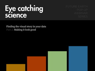
- 1. Eye catching science Finding the visual story in your data Part 2: Making it look good FUTURE EARTH POP-UP WEBINAR SERIES
- 2. Quick recap: • You’ve established where this graphic fits into your strategy • Established who’s going to consume it • Established how we’re going to deliver or publish it • Established the key messages it’s going to deliver • Established what tool/s we’re going to build it • Researched some good examples of how other people have solved their communications problem
- 3. In case you missed it: futureearth.org/blog/pop-webinars
- 4. Design = lining things up? • Aligning the physical & the metaphorical: - Your style with your message - Your metaphors with your story - Your heading sizes with each other - The positions of things - The visual style of any graphical elements you use with each other - Your colour choices with their meanings
- 6. Heading Heading Sub Heading Where do things go? Create a grid Align objects to grid Add items that you need. You can ‘span’ columns where necessary, but be careful…
- 7. Some grids can be very complicated, but more complicated = harder to use HeadingBlurb for the the page verit que aspis secusamusam harum aturiscite voluptaquod quam hitat. Sam quatem eicae cus as quiscii scimus ullut pore volorporum dolorro You can feel free to break away from your grid just make sure you have a good reason You can be but still respect the grid
- 8. Learn to love space
- 9. Chapter 2 Sub Heading20 0.1% 50000 Sub Heading Use open space to: Emphasise section breaks
- 10. Sub Heading Sub Heading Use open space to: Emphasise certain information
- 11. Type A Type B Use open space to: Group and separate information
- 12. Use open space to: Sub Heading Sub Heading 2 Sub Heading 3 Time to think Sub Heading 4 Allow time for the eye to rest in the document
- 13. You don’t have to fill every space, let your space work for you.
- 14. Learn to love alignment
- 15. When an object is too close to another object without aligning properly, it creates a kind of visual ‘stress’ which can distract your reader. Fix this stress either by moving the objects far enough apart that it disappears or align them properly. Example Text
- 16. When an object is too close to another object without aligning properly, it creates a kind of visual ‘stress’ which can distract your reader. Fix this stress either by moving the objects far enough apart that it disappears or align them properly. Example Text
- 17. When an object is too close to another object without aligning properly, it creates a kind of visual ‘stress’ which can distract your reader. Fix this stress either by moving the objects far enough apart that it disappears or align them properly. Example Text
- 18. When an object is too close to another object without aligning properly, it creates a kind of visual ‘stress’ which can distract your reader. Fix this stress either by moving the objects far enough apart that it disappears or align them properly.
- 19. When an object is too close to another object without aligning properly, it creates a kind of visual ‘stress’ which can distract your reader. Fix this stress either by moving the objects far enough apart that it disappears or align them properly.
- 20. When an object is too close to another object without aligning properly, it creates a kind of visual ‘stress’ which can distract your reader. Fix this stress either by moving the objects far enough apart that it disappears or align them properly.
- 21. Learn to love your text
- 22. Never stretch your text to fit a space. Fonts have been very carefully designed and stretching can ruin their visual balance. A A A
- 23. Avoid complicated effects. It is harder to make complicated effects look professional, so keep it simple, unless you have a good reason. It is also usually better to avoid complicated, gimmicky presentation effects.
- 24. Avoid complicated effects. It is harder to make complicated effects look professional, so keep it simple, unless you have a good reason. It is also usually better to avoid complicated, gimmicky presentation effects. This is more powerful.
- 25. Avoid body text that is too small, or too big. If your text is too small, it is difficult to read. If it is too big, it can also be difficult to read in large blocks This is too small for paragraph, or body text. Smaller text may be okay for things like image captions, image credits, footnotes etc, but if you make your text too small in a document, people will have to work too hard to understand the document.
- 26. Avoid body text that is too small, or too big. If your text is too small, it is difficult to read. If it is too big, it can also be difficult to read in large blocks This is too big for paragraph (or ‘body’) text. Larger text is great for headings and pull quotes, but not for long sections of text. It takes longer to read in a block and can limit your readers’ understanding
- 27. Avoid using ‘justified’ text in narrow columns. In wider columns it looks neat. In narrow columns it looks messy. Narrow columns a n d b i g w o rd s messy set to full justified alignment Hendundis aspitis d o l u t o m n i s t i o f f i c i m i , odiciusdam, sinum essin et asperatios restios exceper spidus qui volorum, s u n t i n t i l i q u i s molupta
- 28. Avoid using ‘justified’ text in narrow columns. In wider columns it looks neat. In narrow columns it looks messy. Narrow columns and big words messy set to full justified alignment Hendundis aspitis dolut omnisti officimi, odiciusdam, sinum essin et asperatios restios exceper spidus qui volorum, suntint iliquis molupta
- 29. Sick of your default fonts? google.com/fonts
- 30. “But which ones do I use?” labnol.org/internet/best-google-font-combinations/
- 31. Choose the right colour for the job
- 32. DANGER! image © Ard Hesselink Red might mean danger, food, love or heat...
- 33. GO! image © Jim O’Neill Green might mean ‘go’, nature, freshness or even poison...
- 36. BLACK LABEL BLACK LABEL BLACK LABEL Black might mean death, mourning, elegance or expense
- 37. Blue might mean calm, sincerity, trust, or royalty... image © Jim O’Neill
- 38. Choose a job for the right colour Use colour to: • Add emphasis and clarity to information • Highlight difference • Create relationships
- 39. A kind of default - everything has a different colour Type A Type B What if there are relationships we can highlight with our colour choice?
- 40. Try not to think of colour as a decoration, but as another information tool
- 41. Why some colours aren’t friends
- 42. Colours are close in TONE - not enough contrast is difficult to look at
- 43. Increased contrast - easier to look at
- 44. Still need help choosing your colours? color.adobe.com/explore
- 45. Choosing the right chart type for your data, example 1 fusioncharts.com/charting-best-practices/selecting-the-right-chart/
- 46. Choosing the right chart type for your data, example 2 extremepresentation.typepad.com/blog/2006/09/choosing_a_good.html
- 47. There are many other visualisation methods to consider, research is key informationisbeautiful.net/visualizations/the-billion-dollar-o-gram-2009/ informationisbeautiful.net/visualizations/billion-dollar-o-gram-2013/
- 48. Infographic design process example
- 49. Brief: Create some small infographics to complement a blog post on a legal report concerning governance in Peru Brief: Create a graphic or series of graphics to support blog piece on the findings of a legal report into governance jurisdictions in Peru. INTERACTIVE INFOGRAPHIC Complexity of Governance:The complicated multi-level, multi-jurisdictional landscape of Madre de Dios, Peru
- 50. RAW INPUTS “…”
- 51. STATE OWNED LANDS OIL PALM PLANTATION TIMBER CONCESSIO N REDD+ CONSERVATI ON PROJECT NATIVE COMMUNITIES SMALLHOLDER COMMUNITIES Regional Directorate of Agriculture (Titling) National Ministry of Agriculture (Regulation) Regional Directorate of Agriculture (Titling) National Ministry of Culture (Regulation) National Ministry of Forestry (Regulation) District Government (Permitting) National Ministry of Environment (Regulation) RAW INPUTS
- 52. RAW INPUTS
- 53. Process sketches
- 54. Process sketches
- 55. Process sketches
- 56. Process sketches
- 63. Did you miss the previous Future Earth pop webinars? futureearth.org/blog/pop-webinars