Udaipur Call Girls 9602870969 Call Girl in Udaipur Rajasthan
Insidious Poster Analysis
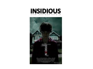
1.
2. Image
The main image is of a young boy which as he’s the
only character featured on the poster indicates that
he’s the main character or one of the main
characters. He is in his pyjamas which gives the
audience an insight into the film as he ‘travels’ in his
sleep which is one of the main plot devices. One of
his eyes seem to be miss shaped and you can slightly
see an image reflected in them giving the impression
that he is possessed.
The house in the background is shot at a low-angle
which unsettles the audience as it makes them feel
disorientated. The use of low-key lighting and dark
clouds above the house make it clear that this is a
poster for a horror film. The clouds are placed above
the house to give the impression that something bad
happens in there.
3. Film name
For audience members who know what the word
‘Insidious’ means the film name gives them an
insight into the films plot and also indicates that it’s a
horror film as it means ‘an intention to entrap or
beguile’. The writing is a simple, bold font, which is
common in horror film posters and is white so that it
stands out against the dark background of his
pyjamas. The fact that 2 of the letters are red makes
the name stand out even more and draws your
attention to it.
4. Tagline
The tagline is a clear indication of the genre of the
film being advertised, it reads ‘it’s not the house
that’s haunted’. As haunted objects and people are
related to horror films it makes it clear to the
audience that this is a horror film. It also tells us that
it’s a supernatural horror as it indicates that
someone is possessed/haunted, most likely the boy
featured on the poster.
5. Other features
There is a reference to the production
company/director where it says ‘from the makers of
paranormal activity and saw’. These are 2 wellknown horror films which were very successful and
popular so this would attract the same audiences as
those films. This also makes it clearer to the
audience that this is a poster for a horror film. The
font is the same bold, simple writing as the film
name and tagline, which is common in horror film
posters. The writing is also the same colour, white, as
most of the other text, this is again so it stands out
against the dark of the boy’s pyjamas.
6. Layout
The layout is quite typical of a poster as starting from
the top there’s the image, the reference to the
director/production company, the film name, tagline
and the credits at the bottom. Poster are often set
out in this order. However how the reference to the
director/production company, the film name and the
tagline are set out is quite different as they are very
close, fitting into each other – as one ends the other
starts. It’s quite a different structure but grabs the
attention of the audience.
7. Target audience
The film is a 15, so the target audience will be people
of ages 15+, mainly teenagers and young adults.
There will also be a target audience for those who
liked Paranormal Activity and Saw, they attract these
people by advertising the fact that this film is made
by the same people.