
Recommandé
Contenu connexe
Tendances
Tendances (18)
En vedette
Similaire à Magazine advert progress
Similaire à Magazine advert progress (20)
Plus de HollyHayne
Plus de HollyHayne (20)
Magazine advert progress
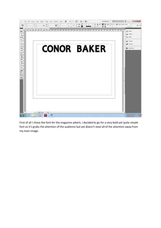
- 1. First of all I chose the font for the magazine advert, I decided to go for a very bold yet quite simple font so it’s grabs the attention of the audience but yet doesn’t steal all of the attention away from my main image.
- 2. Here I decided to move my text to the right hand side in preparation for my image and to really allow my image to stand out. Furthermore I also added to album name underneath, I did have ‘debut album’ written as well but I decided against that and wanted to keep it simple. ‘Shook Blues is not as bold from my main title as I really wanted my artists name to stand out to the audience.
- 3. Here I added my image to the magazine poster; I ensured that it covered the whole of the poster so that it really stood out to my audience. Furthermore I also made sure my artist was giving eye contact to the audience automatically creating a connection and really grabbing the audience’s attention.
- 4. Here I added text at the bottom of the poster. I used synergy by using the website address so the audience can get more information about the artist and I also let the audience know where they can pre order the album from. I decided to put the font in white with a black stroke to really highlight to the audience but not too in their faces.
- 5. Finally I decided to add the all-important release date to my magazine poster, in the same font etc. As the text below it to make sure it fitted in with the magazine poster whilst also standing out to the audience.