THE PRESENTATION DESIGN CRASH COURSE

Ever see great presentations on this site and wonder "How can I make slides like those?" This quick, insight-packed course will distill many of the major lessons I've learned designing presentations (20 or so of which have been featured on the Slideshare homepage for clients like Honigman Media and Group 8A) over the past half decade. The major areas of discussion include STORYTELLING | RHETORIC | DESIGN Each of these are rigorously examined using easy to understand examples and practical, actionable takeaways. Click through these slides and come out the other side a better presentation designer, guaranteed! I currently teach Digital Marketing at General Assembly and have given this lecture to nearly unanimous positive feedback. If you'd like to get access to this PDF or pick my brain about presentation design, marketing, etc... shoot me a line! EMAIL: Jig813@gmail.com TWITTER: twitter.com/JoeandTell LINKEDIN: linkedin.com/in/josephgelman

Recommandé
Recommandé
Contenu connexe
Tendances
Tendances (20)
En vedette
En vedette (20)
Similaire à THE PRESENTATION DESIGN CRASH COURSE
Similaire à THE PRESENTATION DESIGN CRASH COURSE (20)
Plus de Joseph Gelman
Dernier
Dernier (20)
THE PRESENTATION DESIGN CRASH COURSE
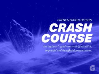
- 1. PRESENTATION DESIGN CRASH COURSEthe beginner’s guide to creating beautiful, impactful and thoughtful presentations.
- 2. HI! I WRITE ABOUT MARKETING/BRANDING FOR HONIGMAN MEDIA AND IDEON AND TEACH DIGITAL MARKETING AT GENERAL ASSEMBLY I’M JOE GELMAN
- 3. STORYTELLING RHETORIC DESIGN 1 2 3 3 ELEMENTS OF GREAT PRESENTATIONS
- 5. STORIES HUMAN BEINGS ARE NATURALLY RECEPTIVE TO
- 6. GREAT STORY FROM A YOUNG AGE, WE LOVE A
- 7. HARDWIRED THE HUMAN BRAIN IS TO CRAVE STORIES read the article →
- 8. “SHARED FICTIONS “HUMANITY’S ASTOUNDING ABILITY TO COOPERATE IS DUE TO OUR ABILITY TO BELIEVE IN watch the talk → – Dr. Yuval Harari
- 9. IN THE REAL-WORLD THERE ARE NO SUCH THINGS AS… MONEY BORDERS LAWS
- 10. IN THE REAL-WORLD THERE ARE NO SUCH THINGS AS… MONEY BORDERS LAWS THE STORIES WE TELL OURSELVES LIE AT THE HEART OF OUR SHARED IDENTITIES
- 11. IF IDEAS ARE LIKE VIRUSES STORIES ARE HOW WE MAKE THEM CONTAGIOUS
- 12. ALL MARKETERS ARE STORYTELLERS buy the book → … IT ONLY MAKES SENSE THEN THAT
- 13. ALL GREAT BRANDS ARE NOTHING MORE THAN GREAT STORIES
- 14. GREAT PRESENTATION SKILLS CAN HELP TELL YOUR STORY
- 15. HOW CAN YOU MAKE YOUR STORIES MORE EFFECTIVE?
- 16. YOU PAY ATTENTION TO THEIR SHAPE
- 17. “BASIC SHAPES “ALL GREAT STORIES THROUGHOUT THE HISTORY OF WRITING HAVE ALL SHARED ROUGHLY THE SAME watch the talk → –Kurt Vonnegut
- 18. START END GOOD BAD Recognize this story?
- 19. SIMILARLY, GREAT PRESENTATIONS ARE MADE BY JUXTAPOSING GOOD vs. BAD
- 20. “ALL GREAT PRESENTATIONS SHARE “AFTER LOOKING AT HUNDREDS OF PRESENTATIONS I FOUND THE SAME BASIC SHAPE watch the talk → –Nancy Duarte
- 22. COMPARE THE WORLD AS IT IS WITH WHAT IT COULD BE
- 23. I LOOKED AT A LIST OF THE MOST FAMOUS FIRST LINES IN LITERATURE AND FOUND THAT GREAT AUTHORS DO THIS TOO!
- 24. “All happy families are alike; each unhappy family is unhappy in its own way.” – ANNA KARENINA leo tolstoy
- 25. “It was a bright, cold day in April, and the clocks were striking thirteen.” – 1984 george orwell
- 26. THIS CONTRAST WILL MAKE YOUR MISSION CONVINCING
- 27. 2RHETORIC
- 28. “The purpose of design is to Inform and Delight” –Milton Glaser
- 29. “The purpose of presentation design is to Inform, Delight & Persuade”
- 30. RHETORICAL TRIANGLE ARISTOTLE DEVISED A SYSTEM CALLED THE
- 33. GREAT PRESENTATIONS NEED ALL THREE OF THESE ELEMENTS TO BE THROUGHLY CONVINCING
- 34. Would this ad make you want a Big Mac?
- 35. LOGIC ALONE WILL NEVER CONVINCE ANYONE!
- 36. IF IT DID, NO ONE WOULD SMOKE
- 37. THE TRUTH OF THE RHETORICAL TRIANGLE IS WHY ANTI-SMOKE ADS LOOK LIKE THIS
- 38. • BULLETS • KILL • ATTENTION
- 39. NOT JUST BECAUSE THEY ARE VISUALLY UNEXCITING…
- 40. …BUT ALSO BECAUSE THEY MISS 2/3 KEY APPEALS
- 41. GREAT STORYTELLING WILL APPEAL TO EMOTION
- 42. AND GREAT DESIGN WILL CONVEY TRUST
- 43. 3DESIGN
- 44. FIRST THINGS FIRST, LET’S COVER THE BASICS
- 45. COMPOSITION
- 46. NOTICE THE POINTS OF INTEREST WHERE THE LINES INTERSECT The Last Supper Leonardo DaVinci
- 47. THIS FRAMEWORK IS CALLED THE RULE OF THIRDS AND IT’S A GREAT WAY TO MAP OUT YOUR SLIDES
- 48. LOOK! I PRACTICE WHAT I PREACH!
- 49. MULTIPLY THE IMPACT OF YOUR POINTS OF INTEREST, BY GIVING THEM PLENTY OF BREATHING ROOM
- 50. MULTIPLY THE IMPACT OF YOUR POINTS OF INTEREST, BY GIVING THEM PLENTY OF BREATHING ROOM ALL THESE UNOCCUPIED SQUARES THIS IS REFERRED TO AS NEGATIVE SPACE
- 51. COLOR
- 52. THIS IS THE COLOR WHEEL. IT’S A CONVENIENT WAY FOR ARTISTS AND DESIGNERS TO DIAGRAM THE RELATIONSHIPS OF COLORS AND TO IDENTIFY HARMONIOUS PAIRINGS Fun Fact: The color wheel was first introduced by Isaac Newton in 1672 THE COLOR WHEEL
- 53. ANALOGOUS
- 54. THIS WORKS
- 55. COMPLEMENTARY
- 56. THIS WORKS
- 57. IN FACT, I USED A COMPLIMENTARY COLOR SCHEME FOR THIS PRESENTATION
- 58. CONTRAST
- 59. AS VISUAL CREATURES, HUMAN BEINGS ARE PATTERN-RECOGNITION MACHINES
- 60. SO WHEN A PATTERN IS BROKEN WE TAKE NOTICE: IT STANDS OUT BETTER
- 61. THE MORE WAYS YOU CAN CONTRAST THE BIGGER THE IMPACT WILL BE
- 62. THE DUTCH MASTER JOHANNES VERMEER INTUITIVELY UNDERSTOOD THE POWER OF CONTRAST. JUST LOOK AT THE DRAMA THE INTENSE LIGHTING OF THE FACE ACHIEVES BY BEING SET AGAINST A DARK BACKGROUND
- 63. I RAN A PHOTOSHOP FILTER THAT AVERAGED THE COLORS AND IT’S CLEAR JUST HOW BRIGHT THE FACE IS.
- 64. BUT LOOK AT HOW MUCH DARKER THIS COLOR LOOKS IN ISOLATION. THE CONTRAST OF THE BACKGROUND IS WHAT MADE IT IMPACTFUL. Looks much darker now, no?
- 65. TYPOGRAPHY
- 66. Serif
- 67. Sans Serif
- 68. QUALITY SERIFS Times New Roman Bodoni Georgia Garamond
- 70. Garamond 60pt goes great with Helvetica. Since Helvetica is very rigid and Garamond is calligraphic the contrast works nicely. Notice how neither one distracts from the other; instead the two fonts complement each other wonderfully. HELVETICA 120pt
- 71. Once you’ve set your type using a harmonious grouping of timeless fonts, accentuating this contrast with a nice complimentary color scheme simply sets your work over the top. HELVETICA 120pt
- 72. YOU MIGHT HAVE NOTICED THAT I DIDN’T USE THE TYPEFACES I RECOMMENDED
- 73. NEUE HAAS UNICA Iowan Old Style IN CASE YOU WERE CURIOUS, HERE ARE THE TYPEFACES I ACTUALLY USED
- 74. “Learn the rules like a professional, so you can break them like an artist.” –Pablo Picasso
- 76. MOST CRAPPY SLIDES SUCCUMB TO DATA OVERLOAD
- 77. ESPECIALLY WHEN IT COMES TO DATA VISUALIZATION STRIP ALL UNNECESSARY DETAIL
- 78. “The best design is as little design as possible.” –Dieter Rams
- 79. FOR TEXT, FOLLOW GUY KAWASAKI’S 6/60 RULE
- 80. NO MORE THAN SIX WORDS PER SLIDE NO LOWER THAN 60 POINT FONT* *I only broke this rule because I’m not giving the talk in person. Again, break rules only once you know ‘em well.
- 81. WHEN IN DOUBT TAKE IT OUT!
- 82. LOOK AT HOW DRAMATICALLY IMPROVED THIS SLIDE WAS ONCE IT WAS SIMPLIFIED SOURCE: Presentation Zen Garr Reynolds
- 83. Follow Write Me Connect THANKS FOR READING! KEEP IN TOUCH! JoeGelman.com