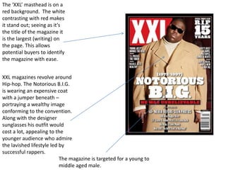
1. The ‘XXL’ masthead is on a
red background. The white
contrasting with red makes
it stand out; seeing as it’s
the title of the magazine it
is the largest (writing) on
the page. This allows
potential buyers to identify
the magazine with ease.
XXL magazines revolve around
Hip-hop. The Notorious B.I.G.
is wearing an expensive coat
with a jumper beneath –
portraying a wealthy image
conforming to the convention.
Along with the designer
sunglasses his outfit would
cost a lot, appealing to the
younger audience who admire
the lavished lifestyle led by
successful rappers.
The magazine is targeted for a young to
middle aged male.
2. Because the Notorious B.I.G. is
dead, his name (and content
associated in the magazine with
him) is in the largest font coloured
white to ensure substantial
awareness to the viewer. ‘R.I.P. 15
Years’ is likewise written the same
to make it obvious to the reader
that this particular issue is
important and a celebration of an
‘UNBELIEVABLE’ artist. The phrase
below the rappers nickname is
highlighted red with a black
background. The red – associated
usually with danger – in this case
represents importance and the
black background once again raises
visual awareness.
3. The black background of the magazine
creates an ominous feeling, and the slim
white border around the edges creates a
framed picture effect. The colours used
are also very masculine. In addition the
bold smooth text also conforms to a
masculine stereotype.
All the sub–story’s are also in white
and the contrast with the black
background allows for an easy read.
The font size is smaller as the story’s
importance is margined by the main
issue however capital letters broaden
the importance.
The stern facial expressions on The
Notorious B.I.G.’s face create an
intimidating presence of
superiority; one perceived to set
the mood of Hip-hop around the
period he was alive.
4. The baggie
jeans, t-shirt and
‘SOX’ hat
represent the
stereotypical
attire of young
black males from
poor
neighborhoods in
California
(Compton, Watts
etc.)
The graffiti on the
walls in the
background
emphasises
inner-city
Image of the artist on the right
features.
hand side of the page, illustrating
clearly what, and who the article Jewelry further connotes the
is about. It grabs the readers gangster image portrayed by
attention – it is the biggest thing artists in hip-hop.
on the page.
5. The article begins
with large gold text.
Not only does this
attract us but the
colour corresponds
with the verb
‘sweltering’.
The layout of the
page is fairly
basic, however
the contrasting
colours of white
and black have
been utilized
effectively in
order to increase
the attention on
Bold, black writing in a larger Two columns of writing certain pieces of
font makes it stand out. Its make the article text.
emphasis is necessary as it is an look ordered organised.
important quote relating to the
article.
6. Jadakiss’ body language gives an
impression that he ‘means business’ –
relating to the sub-heading, ‘Jadakiss
fills in all the blanks’. Black strips are
used for the background of the sub-
heading and writing below the picture.
Black is a very blunt colour and is
masculine, which allows the ‘expected’
male reader to relate to the magazine
more than a woman.
The text is on the right hand side
of Jadakiss, allowing for a more
presentable presentation. There
are 20 features listed – more
than enough for the reader to
be able to reach a first
impression of the magazines
content.
7. The masthead is clearly
visible. A plain feeling has
been created by using black
and white colours. Black
colour co-ordination (the
attire and writing) has been
used to emphasise the
desired masculine audience.
The style of writing reinforces
this.
The artist is wearing
jewelry, a common feature
of all hip-hop artists.
A basic layout ensures maximum
awareness of all features.