The document discusses revisions made to a music magazine cover page based on feedback. The artist felt the original photo did not clearly represent their genre of R&B and was blurry. The revised cover features a model dressed to portray the genre in a revealing style typically seen in R&B magazines. Subheadings were repositioned and worded more professionally. Further improvements could incorporate language techniques commonly used in magazines. The barcode was reduced in size based on feedback it was too large previously. Adding the price is still needed as a fundamental piece of information for potential buyers.
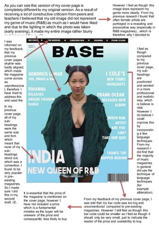
1. As you can see this version of my cover page is
completelydifferentto my original version. As a result of
receiving a lot of constructive criticism from peers and
teachers I believed that my old image did not represent
my genre of music (R&B) as much as I would have liked
and due to the lighting in which the photo was taken
(early evening), it made my entire image rather blurry
and lessened the quality.
However I feel as though this
image does represent my
genre more clearly. From my
previous reseach I found that
often female artists are
portrayed in a revealing and
provocative way (especially in
R&B magazines) , which is
therefore why I decided to
dress my model in such a way.
I feel as
though
compared
to my
previous
cover page,
my sub-
headings
are
positioned
and worded
in a more
professional
and realistic
way, which
is believe is
vital.
However I
do believe I
could
improve this
by
incorporatin
g a few
language
techniques.
From my
research I
did find that
the majority
of music
magazines
in general
did use the
technique of
language
techniques
(for
example
alliteration).
From my feedback of my previous cover page, I
was told that my bar code was too big and
unconventional compared to pre-existing
magazines. However I still feel as though this
bar code could be smaller as I feel as though it
should only be very small, just to indicate the
reader of the price and availability to buy.
It is essential that the price of
the magazine is mentioned on
the cover page, however I
have not included a price
which is a fundamental
mistake as the buyer will be
unaware of the price and
consequently less likely to buy
it.
I was
informed on
my feedback
that my
previous
cover pages
skyline was
badly aligned,
which made
the magazine
come across
as
unprofessiona
l, therefore I
have tried to
address this
and used the
grids to find
the right
spacing.
In my
previous
cover page,
all of my
sub-
headings
were the
same size
and font,
which
meant that
none of my
sub-
headings
stood out,
which was a
convention I
found to be
very popular
in pre-
existing
magazines.
So I made
sure I did
this in my
second
draft. I.E.
INDIA,
NEW
QUEEN OF
R&B