What I’ve Learned from 100 Responsive Emails | Lyris Blog
•
0 j'aime•408 vues

Andrew Kings talks about his learning’s from 100 responsive email designs and tips on implementation of responsive email design for email marketers. Visit http://blog.lyris.com/ to accelerate your digital & email marketing campaigns.

Recommandé
Recommandé
Contenu connexe
Dernier
Dernier (20)
En vedette
En vedette (20)
What I’ve Learned from 100 Responsive Emails | Lyris Blog
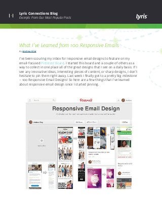
- 1. 1 Lyris Connections Blog Excerpts From Our Most Popular Posts What I’ve Learned from 100 Responsive Emails By Andrew King I’ve been scouring my inbox for responsive email designs to feature on my email-focused Pinterest Board. I started this board and a couple of others as a way to collect in one place all of the great designs that I see on a daily basis. If I see any innovative ideas, interesting pieces of content, or sharp designs, I don’t hesitate to pin them right away. Last week I finally got to a pretty big milestone – 100 Responsive Email Designs! So here are a few things that I’ve learned about responsive email design since I started pinning.
- 2. 2 Lyris Connections Blog Excerpts From Our Most Popular Posts What I’ve learned: Responsive email design still isn’t that common I know that responsive design on the Web and within email is all the rage these days, but the fact is that it still isn’t that common. For every 20 emails (maybe more) that I looked at, one was a responsive design. This is interesting considering that there is some fairly substantive evidence that loads of people read emails on mobile (47% in March 2014 according to Litmus) and it actually results in higher opens, clicks, and conversion rates! Our split testing with WSS Shoes showed a 17.5% uplift in click-throughs and a 7.8% uplift in conversions on mobile optimized emails. So why haven’t more email marketers embraced responsive email design? I think that there could be a few reasons: Lack of coding skills in-house Coding an HTML email can be hard enough. Making an email responsive as well is even harder! There definitely seems to be a lack of skilled HTML coders in the industry who can build fully responsive emails which look great across all email clients and devices. There are, however, lots of low-cost templates out there and agencies who can build responsive templates from scratch or optimize existing templates. At Lyris, we provide customers with responsive templates built into the platform, and we offer design and coding services if you want something custom-made. Lack of supporting stats Despite many email marketing software and service providers shouting about the number of subscribers reading emails on mobile, many companies just don’t have the ability to track what email clients and devices their subscribers are using. Industry stats are great, but they are aggregated over millions of emails and not necessarily close to what you will see with your database. So this is a reasonable objection. However, it’s actually fairly easy and cost effective to find out what clients and devices your subscribers are using, so contact us at Creative@lyris.com if you want to do this. It’s just aesthetic There is a feeling among many people that I’ve talked to that responsive email design is just aesthetic and doesn’t really have any impact on bottom line revenue. That just isn’t the case; there are numerous case studies which show that you will get a higher conversion rate with a responsive design. This makes complete sense if you think about it – 50% of your subscribers are reading on mobile devices, and if you haven’t optimized for mobile, that’s 50% of your subscribers who can’t read your email properly and are unlikely to convert. Obviously, email is just one piece of the puzzle here: your website also needs to be mobile-optimized and easy to use.
- 3. 3 Lyris Connections Blog Excerpts From Our Most Popular Posts Not all responsive emails are created equal Responsive design is extremely flexible – think of something that you want your email to do on a mobile device, and it’s probably possible! This is great if you’re a highly-skilled coder, and I’ve seen some amazing work in the past six months. Here are my top 5 favorites: The problem is that there are also a lot of responsive emails out there which don’t enhance the subscriber’s mobile experience at all. These designs often contain a lot of text within images, small links, and large amounts of text. Responsive email designers are becoming more innovative Most designers think of email as the Web’s ugly stepsister, and to be fair, Outlook and Lotus Notes don’t do email any favors here. However, I really believe that responsive design gives designers the opportunity to be truly creative and innovative within the email space, albeit confined within a few mobile devices. Here are a couple of emails which potentially show where email design is heading in the future: Envirofone’s dropdown menu: This is fairly complex coding which can make your email look, feel, and act like an app! 1. Sony Playstation – Grand Theft Auto V 2. Manchester City Football Club – Post Match Analysis 3. SmithMicro – Welcome email 4. NBC – Believe newsletter 5. Waitrose – Food for all occasions
- 4. 4 Lyris Connections Blog Excerpts From Our Most Popular Posts Expedia’s Apple and Google Play store banner: Most responsive email designs focus on hiding elements for mobile users, but this email from Expedia does the opposite by showing app store links to only those people who open on a small screen. Lastminute.com combines responsive email with live content: This email uses live email content to detect what type of device the subscriber is using at the time of open, and then serves a video if that device is capable of playing it. It also uses a responsive design to optimize the viewing experience for people on small devices like iPhones.
- 5. lyris.comCopyright © 2014 Lyris, Inc. All rights reserved. About Lyris Inc: Lyris (@Lyris ) is a leading global provider of digital marketing solutions that help companies engage with customers in more meaningful ways. Lyris products and services empower marketers to design, automate, and optimize data- driven interactive marketing campaigns that facilitate superior engagement, increase conversions, and deliver measurable business value. Lyris’ high-performance, secure, and flexible digital marketing platforms improve marketing efficiency by providing automated digital message delivery, robust segmentation, and real-time digital channel analytics. The Lyris solutions portfolio is comprised of both in-the-cloud and on-premises offerings – Lyris HQ and Lyris LM – combined with customer-focused services and support. More than 5,000 companies worldwide partner with Lyris to manage and execute sophisticated digital marketing campaigns across email, social, Web, and mobile channels. Learn more at www.lyris.com. Keep up with the latest industry trends, developments and best practices for continuously optimizing your digital marketing campaigns. Visit Lyris Connections Blog How should you go about implementing a responsive email design? 1. Track your subscribers and find out how many of them regularly open your emails on mobile devices and what devices are the most popular. There is no point in optimizing for Blackberry if only two people in your database are using them (sorry Blackberry users). 2. Decide if you want to optimize your existing template or if it would be better to come up with a new design from scratch. Some templates are naturally easier to optimize than others. Ask an experienced email designer and/or coder if you aren’t sure if your existing template can or should be optimized with responsive design. 3. Determine who will be editing your template on a regular basis and if they have the skills to update a highly- complex template. Some templates are much more involved than others when it comes to making updates. 4. Find someone with the skills to code the template properly. Remember that not all responsive emails are created equal, and not all coders will have the skills to create something that looks great across all email clients and devices. 5. Test your responsive email design on a subset of your database before rolling out to everyone. 6. Show your boss the uplift in opens, clicks, and conversions you’re achieving since implementing a responsive email design! Remember that Lyris can help you with any of your coding or creative design needs. Visit here for more info on how we can help you, or email us at Creative@lyris.com.