business_kpi_dashboard_showing_average_revenue_and_clv.pptx
•Download as PPTX, PDF•
0 likes•47 views
business_kpi_dashboard_showing_average_revenue_and_clv
Report
Share
Report
Share

Recommended
Recommended
More Related Content
Similar to business_kpi_dashboard_showing_average_revenue_and_clv.pptx
Similar to business_kpi_dashboard_showing_average_revenue_and_clv.pptx (20)
Quality Dashboard With Quality Index By Measures And Quality Index
Quality Dashboard With Quality Index By Measures And Quality Index
Social Media KPI Dashboard Showing Facebook Impression By Demographic Instagr...
Social Media KPI Dashboard Showing Facebook Impression By Demographic Instagr...
Project Status Kpi Dashboard Showing Delivery Roadmap And Resource Allocation
Project Status Kpi Dashboard Showing Delivery Roadmap And Resource Allocation
Manufacturing KPI Dashboard Showing Production Rate And Lost Units
Manufacturing KPI Dashboard Showing Production Rate And Lost Units
Retail Kpi Dashboard Showing Sales Revenue Customers And Out Of Stock Items
Retail Kpi Dashboard Showing Sales Revenue Customers And Out Of Stock Items
Project Status KPI Dashboard Showing Completed Tasks And Task In Progress
Project Status KPI Dashboard Showing Completed Tasks And Task In Progress
KPI Dashboard Showing Overtime Cost Gender Diversity Ratio
KPI Dashboard Showing Overtime Cost Gender Diversity Ratio
Risk Management KPI Dashboard Showing Overall Security Risk And Regulatory Co...
Risk Management KPI Dashboard Showing Overall Security Risk And Regulatory Co...
Procurement Purchase Orders And Cost Reduction Dashboard
Procurement Purchase Orders And Cost Reduction Dashboard
Supply Chain Management KPI Dashboard Showing Cost Reduction And Procurement Roi
Supply Chain Management KPI Dashboard Showing Cost Reduction And Procurement Roi
Audit KPI Dashboard Showing Audit Status Auditable Entry Risk Rating
Audit KPI Dashboard Showing Audit Status Auditable Entry Risk Rating
Compliance And Legal KPI Dashboard Showing Compliance Issues And Resolution Time
Compliance And Legal KPI Dashboard Showing Compliance Issues And Resolution Time
Recently uploaded
Saudi Arabia [ Abortion pills) Jeddah/riaydh/dammam/++918133066128☎️] cytotec tablets uses abortion pills 💊💊 How effective is the abortion pill? 💊💊 +918133066128) "Abortion pills in Jeddah" how to get cytotec tablets in Riyadh " Abortion pills in dammam*💊💊 The abortion pill is very effective. If you’re taking mifepristone and misoprostol, it depends on how far along the pregnancy is, and how many doses of medicine you take:💊💊 +918133066128) how to buy cytotec pills
At 8 weeks pregnant or less, it works about 94-98% of the time. +918133066128[ 💊💊💊 At 8-9 weeks pregnant, it works about 94-96% of the time. +918133066128) At 9-10 weeks pregnant, it works about 91-93% of the time. +918133066128)💊💊 If you take an extra dose of misoprostol, it works about 99% of the time. At 10-11 weeks pregnant, it works about 87% of the time. +918133066128) If you take an extra dose of misoprostol, it works about 98% of the time. In general, taking both mifepristone and+918133066128 misoprostol works a bit better than taking misoprostol only. +918133066128 Taking misoprostol alone works to end the+918133066128 pregnancy about 85-95% of the time — depending on how far along the+918133066128 pregnancy is and how you take the medicine. +918133066128 The abortion pill usually works, but if it doesn’t, you can take more medicine or have an in-clinic abortion. +918133066128 When can I take the abortion pill?+918133066128 In general, you can have a medication abortion up to 77 days (11 weeks)+918133066128 after the first day of your last period. If it’s been 78 days or more since the first day of your last+918133066128 period, you can have an in-clinic abortion to end your pregnancy.+918133066128
Why do people choose the abortion pill? Which kind of abortion you choose all depends on your personal+918133066128 preference and situation. With+918133066128 medication+918133066128 abortion, some people like that you don’t need to have a procedure in a doctor’s office. You can have your medication abortion on your own+918133066128 schedule, at home or in another comfortable place that you choose.+918133066128 You get to decide who you want to be with during your abortion, or you can go it alone. Because+918133066128 medication abortion is similar to a miscarriage, many people feel like it’s more “natural” and less invasive. And some+918133066128 people may not have an in-clinic abortion provider close by, so abortion pills are more available to+918133066128 them. +918133066128 Your doctor, nurse, or health center staff can help you decide which kind of abortion is best for you. +918133066128 More questions from patients: Saudi Arabia+918133066128 CYTOTEC Misoprostol Tablets. Misoprostol is a medication that can prevent stomach ulcers if you also take NSAID medications. It reduces the amount of acid in your stomach, which protects your stomach lining. The brand name of this medication is Cytotec®.+918133066128) Unwanted Kit is a combination of two medicines, ounwanted pregnancy Kit [+918133066128] Abortion Pills IN Dubai UAE Abudhabi
unwanted pregnancy Kit [+918133066128] Abortion Pills IN Dubai UAE AbudhabiAbortion pills in Kuwait Cytotec pills in Kuwait
VIP Call Girls Napur Anamika Call Now: 8617697112 Napur Escorts Booking Contact Details WhatsApp Chat: +91-8617697112 Napur Escort Service includes providing maximum physical satisfaction to their clients as well as engaging conversation that keeps your time enjoyable and entertaining. Plus they look fabulously elegant; making an impressionable. Independent Escorts Napur understands the value of confidentiality and discretion - they will go the extra mile to meet your needs. Simply contact them via text messaging or through their online profiles; they'd be more than delighted to accommodate any request or arrange a romantic date or fun-filled night together. We provide –(Anamika) VIP Call Girls Napur Call Now 8617697112 Napur Escorts 24x7
(Anamika) VIP Call Girls Napur Call Now 8617697112 Napur Escorts 24x7Call Girls in Nagpur High Profile Call Girls
Recently uploaded (20)
Call Girls Zirakpur👧 Book Now📱7837612180 📞👉Call Girl Service In Zirakpur No A...
Call Girls Zirakpur👧 Book Now📱7837612180 📞👉Call Girl Service In Zirakpur No A...
FULL ENJOY Call Girls In Mahipalpur Delhi Contact Us 8377877756
FULL ENJOY Call Girls In Mahipalpur Delhi Contact Us 8377877756
Business Model Canvas (BMC)- A new venture concept
Business Model Canvas (BMC)- A new venture concept
Quick Doctor In Kuwait +2773`7758`557 Kuwait Doha Qatar Dubai Abu Dhabi Sharj...
Quick Doctor In Kuwait +2773`7758`557 Kuwait Doha Qatar Dubai Abu Dhabi Sharj...
Call Girls Electronic City Just Call 👗 7737669865 👗 Top Class Call Girl Servi...
Call Girls Electronic City Just Call 👗 7737669865 👗 Top Class Call Girl Servi...
unwanted pregnancy Kit [+918133066128] Abortion Pills IN Dubai UAE Abudhabi
unwanted pregnancy Kit [+918133066128] Abortion Pills IN Dubai UAE Abudhabi
The Abortion pills for sale in Qatar@Doha [+27737758557] []Deira Dubai Kuwait
The Abortion pills for sale in Qatar@Doha [+27737758557] []Deira Dubai Kuwait
RSA Conference Exhibitor List 2024 - Exhibitors Data
RSA Conference Exhibitor List 2024 - Exhibitors Data
(Anamika) VIP Call Girls Napur Call Now 8617697112 Napur Escorts 24x7
(Anamika) VIP Call Girls Napur Call Now 8617697112 Napur Escorts 24x7
Uneak White's Personal Brand Exploration Presentation
Uneak White's Personal Brand Exploration Presentation
The Path to Product Excellence: Avoiding Common Pitfalls and Enhancing Commun...
The Path to Product Excellence: Avoiding Common Pitfalls and Enhancing Commun...
Call Girls Kengeri Satellite Town Just Call 👗 7737669865 👗 Top Class Call Gir...
Call Girls Kengeri Satellite Town Just Call 👗 7737669865 👗 Top Class Call Gir...
Call Girls In Majnu Ka Tilla 959961~3876 Shot 2000 Night 8000
Call Girls In Majnu Ka Tilla 959961~3876 Shot 2000 Night 8000
Call Girls Service In Old Town Dubai ((0551707352)) Old Town Dubai Call Girl ...
Call Girls Service In Old Town Dubai ((0551707352)) Old Town Dubai Call Girl ...
Chandigarh Escorts Service 📞8868886958📞 Just📲 Call Nihal Chandigarh Call Girl...
Chandigarh Escorts Service 📞8868886958📞 Just📲 Call Nihal Chandigarh Call Girl...
Marel Q1 2024 Investor Presentation from May 8, 2024
Marel Q1 2024 Investor Presentation from May 8, 2024
business_kpi_dashboard_showing_average_revenue_and_clv.pptx
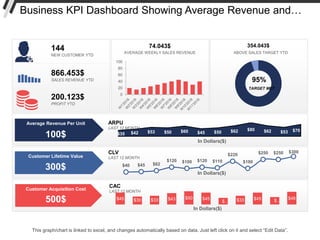
- 1. Business KPI Dashboard Showing Average Revenue and… $45 $30 $33 $43 $50 $45 $… $33 $45 $… $48 In Dollars($) CAC LAST 12 MONTH $35 $42 $53 $50 $60 $45 $50 $62 $80 $62 $53 $70 In Dollars($) ARPU LAST 12 MONTH $40 $45 $62 $120 $100 $120 $110 $220 $100 $250 $250 $300 In Dollars($) CLV LAST 12 MONTH Customer Lifetime Value 300$ Customer Acquisition Cost 500$ Average Revenue Per Unit 100$ AVERAGE WEEKLY SALES REVENUE 74.043$ 0 20 40 60 80 100 95% TARGET MET ABOVE SALES TARGET YTD 354.043$ 144 NEW CUSTOMER YTD 866.453$ SALES REVENUE YTD 200.123$ PROFIT YTD This graph/chart is linked to excel, and changes automatically based on data. Just left click on it and select “Edit Data”.
- 2. Instructions To Edit This Slide This slide has been made in PowerPoint using basic PowerPoint shapes, and all graphics are 100% editable in PowerPoint. You can change color, size and orientation of any element to your liking, and add/edit any piece of text anywhere.
- 3. All images are 100% editable in PowerPoint “Change color, size and orientation of any icon to your liking”
- 4. 1. Select the Graph and right click on "Edit Data“. 2. An excel matrix will automatically show up. 3. Enter the values based on your requirements and hit enter. 4. The Graph/Chart shape will automatically adjust according to your data, and anytime you change the value again. Edit Excel-linked Chart This is a Data Driven Chart/Graph and the shape automatically adjusts according to your data 1 2 3
- 5. Edit Color 1. Select the shape to change the color and Right click the object (click any object which you want to change color) 2. Choose Format Data Series in the dialog box. 3. Choose “Fill” in the Format Shape box then “Solid” or “Gradient” depending on the appearance of the object. Change colour as shown in the picture. 1 2 3
- 6. Select From Thousands Of Editable Icons On Every Topic These icons are available at the Icons section on www.slideteam.net