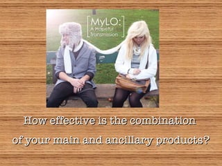
1. How effective is the combination of your main and ancillary products?
2. The concept The genre of the band is alternative rock and their target audience is mainly young adults and above. For my media project, I decided to adhere to certain conventions in order to clearly establish the genre of the artist. The album’s overall concept is ‘connection’ and communicating the band and their true selves to the audiences without pretences , and this should be expressed in not only the music video, but also the ancillary products as a whole. The media language used across all three products should be consistent with each other. A typical band, such as Coldplay or Phantom Planet, would include behind-the-scenes footage of themselves in their music videos in order to suggest a down-to-earth image. I wanted to show the band’s image through the video, in order to promote them. In order to get a feel of what my idea would look like, I researched bands such as Phantom Planet and Death Cab for Cutie (of whom I made a textual analysis on their music video ‘You are a Tourist’) and saw that they have a strong motif across their work, and often the band’s performance is the bigger focus. Coldplay also showed the kind of image I wanted the band to have. I saw consistency in their use of graphological elements such as fonts and themed images (typically of the band, but they also sometimes use concept art for their albums too)
3. For my digipak cover art, I used the lead singer as a model along with the girl and a long scarf ties them together. This connotes the concept of connection, though their body language suggests otherwise; they are looking away from each other. This could suggest a narrative side to the album; the band may have thought about the album through personal experiences that may have to do with this connection being disrupted, possibly an argument, breakup – this is open to the audience’s interpretation. The lens flare effect on the lead singer’s side of the image implies that he is looking for a solution to the problem. The iconographic use of the scarf adds a unique, artistic touch to the cover, and summarises the concept. Placing the artist and album title in the middle also emphasises the connection between the two people in the cover.
4. The inside of the digipak shows what the band is trying to communicate. These panels of the digipak show the band members. In conjunction to the video, it shows performances and ‘making-of’ images. The monochromatic colours and collage arrangement of the images connects the digipak with the music video as well as connoting the idea of memories being shared between the artist and the audience. The facial expressions of the members vary to show the audience different sides to them, and the candidness of the images show a down-to-earth image which the audience can be drawn to as they are not glamorous or exaggerated. This appeals to audiences as they want to be able to identify themselves with the artist.
5. The back panel of the digipak shows the tracklist, label and barcodes. This makes the product look more convincing. The use of the scarf in monochromatic colour gives consistency and therefore the image sticks to the audience’s mind. The ‘Thank You’ page makes the product all the more convincing and personal, just like the music video; artists tend to write these in their albums, and they thank particular people and the fans. I used convincingly handwritten fonts to create the messages and the signatures on this panel. The black and white background is simple and understated, making the messages stand out. The CD remains consistent with the iconography. The panel on which the CD rests on is clear, but one can see the back panel which uses the same image, making the centre of the scarf more significant. It is arranged in a way that appeals aesthetically to the audience as well as symbolising the concept of the album.
6. The magazine advert is simpler and more conventional. The main image is the cover art so that the audience can easily identify it if they want to purchase the album. The release date is shown in a big font, of which is consistent with the font I used in the digipak to show the names of the band members. Ratings by other music magazines allow the audience to judge whether they would like the album; album reviews are becoming more important in the present day, with consumers becoming pickier about their music and the impact of downloading and illegal filesharing. Because of these factors, consumers tend to rely on what others think about the album before they choose to really purchase the product. The running ink-like effect ties the advert to the digipak.
7. Representation Fans would be able to identify themselves with this artist because they represent a very organic rock band. Their low-profile image may also imply that they are just beginning to break into the industry. The band wear understated clothing (T-shirts and jeans), which is typical of an alternative group. The unkempt appearance of some of the members show that they don’t care about being decorated with a glamorised image, allowing the audience to identify themselves with them. Furthermore, the fact that the audience can see the members having fun and seemingly passionate about making music means that they can see their attitude towards their work. Personally, I prefer groups who are very much involved in the creative process of their music, therefore having this shown to the audience, I think, would be very appealing. Note that a female member is included, which means that it can appeal to female audiences; typically a rock band would presumably consist of only male members, but as time passed groups such as Paramore and Smashing Pumpkins emerged which challenged this idea. Overall, the representation of the group challenges the ideas of the mainstream market, which is what alternative, and rock music in general, is all about.
8. Conclusion All three products stay consistent with each other and work together to emphasise the concept of the album as well as representing the image of the artist. The success lies in the use of iconography within the digipak, linking the images used with the music video, both of which is then supported by the consistency of the magazine advert to promote the album. The different sides of the band (from serious and focused in their music to relaxed and having fun) are represented successfully within the music video, then supported by the digipak and magazine advert. It would have been better if the scarf’s significance was made more prominent in the music video as well, but nonetheless I found the combination to be quite successful.