2. PROJECT BRIEF
To design a cover for One Flew Over The
Cuckoo’s Nest for the Penguin Adult
Award.
‘One Flew Over The Cuckoo’s Nest’ is well
known both in celluloid and print, so it is
essential to come at it from a fresh angle.
Try to design a new cover for a new
generation of readers, avoiding the
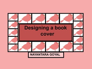
obvious clichés and steering clear of the
film promotional graphics. Originality is
key.
Audience: all readers both familiar and
unfamiliar with the text, male and
female.
3. Research Synopsis
Character
Characters
sketches
Themes
7. Through this cover I was trying to
show the submissive nature of
the wards and how they thought
they were actually crazy(the
brain with the orange bird on top
is symbolic of the wards). The
black bird flying is symbolic of
McMurphy’s rebellios nature.
8.
9. Here I’m trying to show all the
wards who submissively live in
the way they are told to live.
Through this I’m also trying to
portray the fact that they all
feel they are mentally ill and
therefore deserve or are meant
to be in the institution.
12. This covers shows how all
the wards are in the
institutuion and live in
accordance to the Nurse’s
rules but McMurphy does not
live by her rules hence there
is one brain on the cover with
a bird missing symbolic of
McMurphy and his refusal to
conform.
13.
14. This is my final concept.
The black bird flying is
symbolic of McMurphy’s
rebellious nature and
general fight for some
amounts of freedom as
opposed to the wards
who do whatever they
are told to do. The three
figures are symbolic of
the wards and their
submissiveness and
belief that they are
genuinely crazy.