
Recommended
More Related Content
Similar to Quality Analysis Tool PA .pptx
Similar to Quality Analysis Tool PA .pptx (20)
Recently uploaded
Recently uploaded (20)
Quality Analysis Tool PA .pptx
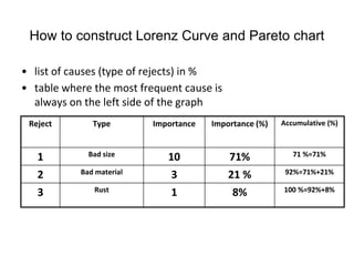
- 1. How to construct Lorenz Curve and Pareto chart • list of causes (type of rejects) in % • table where the most frequent cause is always on the left side of the graph Reject Type Importance Importance (%) Accumulative (%) 1 Bad size 10 71% 71 %=71% 2 Bad material 3 21 % 92%=71%+21% 3 Rust 1 8% 100 %=92%+8%
- 2. Use of PA in Inventory Management •
- 3. Statements I. • ABC analysis divides an inventory into three categories : – "A items" with very tight control and accurate records – "B items" with less tightly controlled and good records – "C items" with the simplest controls possible and minimal records.
- 4. Example of possible allocation into categories • A’ items – 20% of the items accounts for 70% of the annual consumption value of the items. • ‘B’ items - 30% of the items accounts for 25% of the annual consumption value of the items. • ‘C’ items - 50% of the items accounts for 5% of the annual consumption value of the items Beware that 20+30+50=100 and 70+25+5=100 !!
- 5. Example of possible categories allocation-graphical representation (4051 items in the stock)
- 6. Objective of ABC analysis • Rationalization of ordering policies – Equal treatment OR – Preferential treatment See next slide
- 7. Equal treatment Item code Annual consumption (value) Number of orders Value per order Average inventory 1 60000 4 15000 7500 2 4000 4 1000 500 3 1000 4 250 125 TOTAL INVENTORY (EQT) 8125 1. Value per order= Annual consumption/Numer of orders 2. Average inventory = Value per order/2 see next slide which is taken from EOQ simplified presentation
- 8. Carrying cost (will be presented next slide) 8 Resource- Taylor- Wikipedia To verify this relationship, we can specify any number of points values of Q over the entire time period, t , and divide by the number of points. For example, if Q = 5,000, the six points designated from 5,000 to 0, as shown in shown figure, are summed and divided by 6: