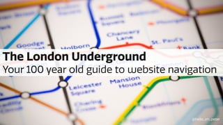
The London Underground. Your 100 year old guide to website navigation
•
1 j'aime•1,603 vues

The London Underground have been perfecting signage and wayfinding for the best part of 100 years. What can we learn from the underground for the digital space? A case study in how we applied it on one of our websites, MoreThan.com

Recommandé
Recommandé
Contenu connexe
En vedette
En vedette (11)
Similaire à The London Underground. Your 100 year old guide to website navigation
Similaire à The London Underground. Your 100 year old guide to website navigation (20)
Dernier
Dernier (20)
The London Underground. Your 100 year old guide to website navigation
- 1. The London Underground Your 100 year old guide to website navigation @hello_im_peter
- 6. Location Alphabet Time Category Hierarchy - Saul Wurman, Information Anxiety (1976) There are five ways to organise information: @hello_im_peter
- 10. @hello_im_Peter
- 11. @hello_im_Peter
- 12. @hello_im_Peter
- 13. @hello_im_Peter
- 14. @hello_im_Peter
- 15. @hello_im_Peter
- 16. @hello_im_Peter
- 17. @hello_im_Peter
- 18. @hello_im_Peter
- 19. Wayfinding “Better wayfinding means improving the ease with which people can navigate themselves to, from and within an interchange facility or zone.” Transport for London @hello_im_Peter
- 20. Wayfinding “Core principle(s) of effective wayfinding include adopting principles of progressive disclosure… - Selective supply of information when and where passengers need it.” Transport for London @hello_im_Peter
- 21. @hello_im_Peter
- 22. @hello_im_Peter
- 23. @hello_im_Peter
- 24. @hello_im_Peter
- 25. Quote Marketing Research Check Policy Change Renew Claim Contact Details Cancel Complain Proof of NCD Payment 0.71% 1.06% 1.2% 2.05% 2.26% 6.37% 7.22% 12% 22% 1.49% 5% 30% New Customers Current Customers @hello_im_Peter
- 27. @hello_im_Peter
- 28. @hello_im_Peter
- 29. @hello_im_Peter
- 30. @hello_im_Peter
- 31. @hello_im_Peter
- 32. @hello_im_Peter
- 33. @hello_im_Peter
- 34. @hello_im_Peter
- 35. @hello_im_Peter
- 36. Lost / Missing / Confused slide @hello_im_Peter
- 37. The myth of discoverability “Things that most people do, most often, should be prioritized first. Things that some people do, somewhat often, should come second. Things that few people do, infrequently, should come last.” Scott Berkun @hello_im_Peter
- 38. @hello_im_peter
- 39. @hello_im_peter
- 40. What can we group, sort, hide & displace to a more appropriate stage of the journey? How do we design this to suit both customer types? @hello_im_peter
- 41. Underground Line(s) Northern Direction(s) North Station(s) & connections Kings Cross [Victoria] Transport type @hello_im_peter
- 42. Progressive Disclosure “Progressive disclosure defers advanced or rarely used features to a secondary screen, making applications easier to learn and less error-prone.” Jakob Nielsen @hello_im_peter
- 43. Progressive Disclosure “Initially, show users only a few of the most important options. Offer a larger set of specialised options upon request. Disclose these secondary features only if a user asks for them, meaning that most users can proceed with their tasks without worrying about this added complexity.” Jakob Nielsen @hello_im_peter
- 44. @hello_im_peter
- 45. Products Product Hub Get a quote Learn More Manage Policy Claim Current Cust. Promos View, amend, cancel, renew etc FNOL journey Amended QuotePartner pages, News etc.Quote & buy journey @hello_im_peter
- 46. @hello_im_peter
- 47. @hello_im_peter
- 50. Results so far Sales conversion Pet X% uplift Visit to Sale Home X% uplift VTS Motor X% uplift VTS Online adoption for claims Pet X% uplift Home X% uplift Online account log in Motor X% uplift @hello_im_peter
- 51. “Things that most people do, most often, should be prioritized first. Things that some people do, somewhat often, should come second. Things that few people do, infrequently, should come last.” “Selective supply of information when and where passengers need it.” “There are five ways to organise information” Conclusion @hello_im_peter
- 53. @hello_im_peter
Notes de l'éditeur
- Slide 1: I’m going to talk to you today about the London Underground and how their way finding and signage has worked so well for so many years, then walk you through how we applied that to MoreThan.
- Slide 2: This is where I work.
- Slide 3: For once it’s not about this. Published in 1908, the map showed all the important central stations but it didn’t make it easy to find your way around. Station names had to be written in small text, often at odd angles so they could be crammed in between awkwardly twisting lines.
- Slide 4: Or the newer version, even though that was an IA master piece. Inspired by a circuit diagram, in 1931 Harry realised that organising things by their category rather than their location made them far easier to understand and use.
- Slide 5: Harry used Category, over Location for his map. I borrowed this off Chris How from his talk on IA a few years ago, go and look it up, it’s good.
- Slide 6: The real question is: -Even though we think of the tube map of being vitally important, the 270 available options aren’t the things they lead with. - How do LDN UNDGD get you to one of 270 stations?
- Slide 9: Still reminded of which line the station intersects with.
- Slide 10: Still reminded of which line the station intersects with which. Customers only need to know their start point, where to change and their destination. All the other information is just distracting.
- Slide 11: Customers only need to know their start point, where to change and their destination. All the other information is just distracting. Started layering on zone information.
- Slide 14: If you jump forward 80 odd years let me introduce you to my problem, Insurance websites. They like shouting about the sales side of things. Sometimes they even talk about existing customers. They also all sell slightly different things.
- Slide 15: This was ours..
- Slide 16: The stuff in blue is all targeted at new customers. The red bits are targeted at current customers. Everything else could apply to both. Analytics / call centre feedback were telling us that this wasn’t quite right.
- Slide 17: Survey prompted by analytics that kept showing users going to account area etc. not just ‘Get a quote’ button. Ran a survey on our homepage to add some qual to the quant. Sample size: 1,413 Survey sat on homepage, asked “Why have you come to Morethan today?”
- Slide 18: Eyeballed all the responses and grouped them (by category AND sub category). Actual values removed for shared version.
- Slide 19: When you add all those together…
- Slide 20: - So we have a potential way finding problem, but it wasn’t just the homepage, doesn’t get any better when you go down a level. - Makes completing customer tasks very challenging. - Thats a problem because expensive running skilled UK call centre, making it busy with ‘bad demand’ as well as reputation for future business.
- Slide 21: Present all the options. I’m not sure if there’s 270 like a tube map but there’s a lot. - Sales obsessed Content Frankenstein. At one point we put a ‘start new quote’ button on a claims journey. - Product, Sales, Compliance, Digital, Operations all looking to add content on the site. - Just Search for stuff with the search box? Apparently not!
- Slide 22: Hidden / Unexpected options: - 6 Products in the Nav instead of 9 (or more) - No way to communicate hierarchy or surface most popular products to the customers aside from hero image - Business vs Personal. Weird labels. Weird IxD (whole page is a tab?)
- Slide 23: Repetition of options: - Secondary nav options and main page. Dilutes / reduces significance of choices. Un-necessary options: - Main nav on product page (analytics said bad!) - New customer tasks Hidden options: - Customer Help. Very useful but perhaps not the phrase people are looking for.
- Slide 24: This left our poor customers feeling very confused. Grab your Content Strategist, your Designer, pop your IA hat on and ask yourself: - How do you cater for current customers (and their goals) without making the business shit themselves about new customers? SELL SELL SELL
- Slide 26: Shall we just make the login button bigger? - Do existing customer’s really just translate their goals to ‘login’? Shall we just ask them if they’re a new or existing customer when they land? - Didn’t test that well. - Doesn’t do a great job of promoting range of products / communicating hierarchy.
- Slide 27: Can we surface all the tasks / start task first? - Yes, but again no way to communicate products and product hierarchy. - System architecture problem…What about when all the products have wildly inconsistent online servicing? - Is that the right category? Back to the card sorting…
- Slide 28: Back to the window! Stick more post-its up! - Instead of all the options, what can we group, sort, hide, displace content to a more appropriate stage of the journey, - How do we design this to suit both customer types?
- Slide 29: - Like all the people who needed to get to one of 112 stations on the Victoria / Circle & district lines, start by showing something that resonates with everyone Next divide people off, it doesn’t matter if they see a few more options below that Carry on disclosing more relevant options (line change) - Offer re-assuring signposting where needed (Section of Victoria Line / Change).
- Slide 30: So what does that mean for the web?
- Slide 32: (This is a mobile view!) - Mobile first will force you to constantly consider priority and keep signposting clean & concise. - Start with just products first. Show all of them. Put them in order that we want to sell them and people want to find them. - Get people to relevant tasks. Group them with appropriate labels. Your content person will help you do that.
- Slide 33: Without prejudicing New over Current customers too much, get people to their desired task asap. 5 main groups of things people wanted to do online. Group, sort, hide, displace the content. Smash customer help in where it’s relevant.
- Slide 34: Desktop sized, high fidelity. Homepage, all the products on. Product Hub page, all the tasks.
- Slide 35: New - Homepage is basically just a menu. Unlimited space for products. No weird IxD for business / personal No search / link to customer help.
- Slide 36: No weird Header with un-necessary stuff. No Main product Nav. No hiding tasks behind Login (until absolutely necessary). No repeating all the options. Clear separation between current / new customer tasks.
- Slide 37: Popular tasks and some edge cases (from analytics). Tested internally and at coffee shop (about 5 rounds total) plus online Nav flows tests. User paused at homepage, followed by, click on desired product (I guess I’ll click here then). User progression at product ‘hub’ page. Quite quickly navigated through to required location.
- Thanks!