KST - Heuristic Analysis
•
0 likes•34 views

Heuristic Analysis of an app I redesigned

Recommended
More Related Content
Similar to KST - Heuristic Analysis
Recently uploaded
Recently uploaded (20)
KST - Heuristic Analysis
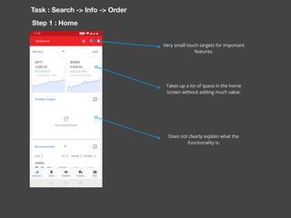
- 1. Takes up a lot of space in the home screen without adding much value. Very small touch targets for important features. Task : Search -> Info -> Order Does not clearly explain what the functionality is. Step 1 : Home
- 2. Requires the user to explicitly mention the type of security Task : Search -> Info -> Order Step 2 : Search
- 3. Too many options to choose from Task : Search -> Info -> Order Step 3 : Search
- 4. These two features are not required here. Task : Search -> Info -> Order Step 4 : Stock Info The scales are hard to read and there is no option for the user to change the time frame. These features are not optimised for mobile and are not used but they are present for marketing/business promotion reasons. Confusing toggle bar which adds no value. Gradient draws too much attention for a not so critical information. A spinner bar which is not used at all and is distracting.
- 5. More information can be provided. Task : Search -> Info -> Order Step 5 : Stock Info The button bar is overlaid over important information.
- 6. Task : Search -> Info -> Order Step 6 : Stock Info The colour coding does not signify anything
- 7. Task : Search -> Info -> Order Step 7 : Stock Info ( Futures ) Does not specify the last traded value and the volume of the specific futures contract
- 8. Task : Search -> Info -> Order Step 8 : Stock Info ( Options ) No indication about what the strike price is compared to the current price. This is not required here. This is not required here.
- 9. Task : Search -> Info -> Order Step 9 : Stock Info ( Options ) Very small target areas Adding a blue trade button to every put and call option is confusing and detrimental to understanding Lists LTP, Chg, Chg%, Price, trade button, OI, bid and ask - 16 variables !
- 10. Task : Search -> Info -> Order Step 10 : Order Screen Choosing one option does not disable the options that are logically not possible.
- 11. Task : Search -> Info -> Order Step 11 : Order Screen Multiple dropdowns with no linking between the two
- 12. Task : Search -> Info -> Order Step 12 : Order Screen Multiple dropdowns with no linking between the two
- 13. Task : Search -> Info -> Order Step 13 : Order Screen Confusing interface without any interlinking logic between elements