
Recommandé
Contenu connexe
Tendances
Tendances (16)
En vedette
Similaire à Dfferences in mastheads
Similaire à Dfferences in mastheads (20)
Plus de Rochella
Dfferences in mastheads
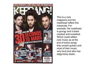
- 1. This Is a rock magazine and the masthead reflect this massively. For example, the masthead is grungy and it looks cracked and smashed. Which could reflect rock music as at the end of some songs they smash guitars and most of their music very loud and also has edgy/rocky beats.
- 2. This is ‘Top Of The Pops’which is a pop music magazine. The masthead font really reflects this because it is very playful and rounded and pop music is not grungy like rock music. As well as this the font is in lower case letters which makes it seem more innocent just like the music.
- 3. This Is ‘NME’ magazine which is music magazine for loads of different types of music. The masthead reflects this a lot because the masthead I simple and has block color with a thin white outline which does make hugely obvious which type of music it is and it could be any. For example it could be pop, R&B, rock, indie rock, indie etc.
- 4. ‘Vibe’ magazine which is based on R&B music and hip hop. The color of the masthead changes depending on the themes on the front cover and the colors and designs. This masthead reflects R&B and hip hop music because it is bold and punchy which could resemble the beat and melody of the music.