1. Reviewing Existing Products
Student Name: Sam Lount
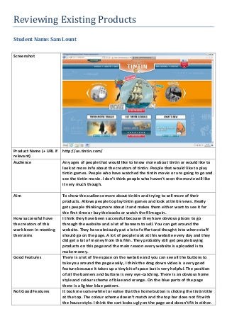
Screenshot
Product Name (+ URL if
relevant)
http://us.tintin.com/
Audience Any ages of people that would like to know more about tintin or would like to
look at more info about the creators of tintin. People that would like to play
tintin games. People who have watched the tintin movie or are going to go and
see the tintin movie. I don’t think people who haven’t seen the movie will like
it very much though.
Aim To show the audience more about tinitin and trying to sell more of their
products. Allows people to play tintin games and look at tintin news. Really
gets people thinking more about it and makes them either want to see it for
the first time or buy the books or watch the film again.
How successful have
the creators of this
work been in meeting
their aims
I think they have been successful because they have obvious places to go
through the website and a lot of banners to sell. You can get around the
website. They have obviously put a lot of effort and thought into where stuff
should go on the page. A lot of people look at this website every day and they
did get a lot of money from this film. They probably still get people buying
products on this page and the main reason every website is uploaded is to
make money.
Good Features There is a lot of free space on the website and you can see all the buttons to
take you around the page easily, I think the drag down video is a very good
feature because it takes up a tiny bit of space but is very helpful. The position
of all the banners and buttons is very eye-catching. There is an obvious home
style and colour scheme of blue and orange. On the blue parts of the page
there is a lighter blue pattern.
Not Good Features It took me some while to realise that the home button is clicking the tintin title
at the top. The colour scheme doesn’t match and the top bar does not fit with
the house style. I think the cart looks ugly on the page and doesn’t fit in either.
2. When you drag down the video it only goes down half way and shows the
bottom which does not match the pull down page. The whole website has
features that don’t fit in with the house style or have smooth colour
transitions. If you have no intention of seeing tintin the website is pointless for
you to use, because you can’t really expand knowledge or learn anything
relevant to your life.
Possible Improvements Make a home button at the bottom of every page, have the top bar the same
colour of the middle bar, take off the basket and add a nicer button that fits in
better with the house style. The page was boring to anybody who doesn’t like
tintin and I don’t really want to play any games or buy any tintin products.
Make the website less about the sales because to me it was obvious they were
trying to sell stuff to me and not trying to widen my knowledge and if I wanted
to buy something I could.
Possible elements for
use
I would use a drop down video but drag it to the bottom not half way. I would
use the bar at the bottom of the page which makes it simpler to get around the
whole page. I will use different clear buttons to get to other pages on my page
because I think that if a page is easy to get around people are more likely to
stay and they will probably want to come back again.
Elements to avoid I would defiantly not add a basket and facebook link at the top that sticks out
because it makes my website look like all it wants is money. I would prefer a
website that is more for adults of teenagers than basing it on such a young age
range because it will allow me to expand my ideas further and not have to
wory about using words that young children would not understand.