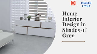
Gray is one of the maximum famous neutral colors for basic home interior design. The palette gives a spread of sunglasses and tones, starting from a cool, bluish grey to a warm taupe-like gray. Strive injecting those punches of colour thru the artwork, cushions, material and rugs.
2. How would
you use grey
in a home?
Grey is one of the most popular neutral colors for a
home. The palette offers a variety of shades and
tones, ranging from a cool, bluish grey to a warm
taupe-like grey. Introducing grey into your home is
fairly easy when it is paired with lighter colors like
blush pink, mint green or white.
3. As pink is one of the Pantone colours of 2016 (Rose Quartz, to be
more precise), it is already having its moment in the spotlight.
While it may seem like a difficult color to bring into the home due
to its reputation as an overtly girly shade, it works very well when
paired with grey.
4. How would you
make grey
appealing to a
younger
audience?
Grey can be perceived as a cold, or more
mature color but today, many youngsters are
opting for this color in their homes. To keep the
room below looking light and bright, various
shades of grey have been paired with white;
adding subtle golden tones through the wood
and flooring brings warmth to the room.
5. Today, grey is also a popular choice for
nurseries. Being a neutral color, it is the
perfect backdrop when paired with other
light colors and prints. Here, the textured
accessories and light-toned birch elements
create a beautiful, airy and whimsical
nursery for either a baby girl or baby boy.