The Elements of Design
•
42 j'aime•13,463 vues

this power point seeks to give detail information about the elements of design, providing a wide range of visual examples. It further seeks to provide an assessment item by virtue of questions. This power point also serves in the form of lessons, in that an element and its activities may be thought for one specific class.

Recommandé
Contenu connexe
Tendances
Tendances (20)
En vedette
En vedette (20)
Similaire à The Elements of Design
Similaire à The Elements of Design (20)
Plus de Rojay Chambers
Plus de Rojay Chambers (7)
Dernier
Dernier (20)
The Elements of Design
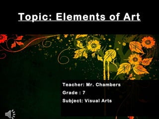
- 1. Topic: Elements of Art Teacher: Mr. Chambers Grade : 7 Subject: Visual Arts
- 2. What are the Elements of Art? •The Elements of Art are the components that guide Art creation visually. The elements of Art include: Line, Shape, Texture, Colour, Form and Space.
- 3. •A line is a path Created by a moving point in a particular space or area. Lines that are created by marking are one-dimensional (meaning flat) and vary in width, direction and length. What is a line ?
- 5. •Objective Line Design •This is an Art form that uses Lines to create artistic composition, with this type of design, the construction must have entities that can be identified.
- 6. •For example, a complex design filled with lines and an image of a plant, animal or object can be seen or singled out.
- 7. Video on Paper Quilling Examples
- 15. •Non-Objective Line Design •This Art form uses Lines to create art work that are abstract in nature.
- 16. •Non-Objective artwork are nonrepresentational and does not depict a person, place or thing; known or exist in the natural world.
- 17. Video on Paper Quilling Examples
- 22. End of Lesson 1 Lines, Type of Lines, Objective and Non-Objective Line design
- 23. Shapes
- 28. •A shape can be define as an outward construction or outline of an object or organism. •Shapes are flat in nature and has a width and height. What is a Shape ?
- 29. •Types of Shape •Geometric Shape •Organic Shape
- 30. •Geometric Shape are precise and mathematical in nature. Example of this include: • Circle •Triangle •Squares Geometric Shape
- 31. Geometric Shape
- 32. •Organic shapes has irregular outlines for object or organisms. Organic shapes are free flowing in appearance and are normally found in nature. Organic Shape
- 33. Organic Shape
- 44. Class work Instructions: 1. Create a design using only Geometric shapes 2. Your Art work must be objective.
- 45. Example of Geometric Shape Design
- 46. Class work Instructions: 1. Create a design using Organic shapes 2. There should be another organic shape design inside the first organic shape.
- 47. Draw your Organic Shape Design
- 48. Draw Organic Shapes inside the Design then colour it.
- 51. End of Lesson 2 Shapes, Type of Shapes, Geometric and Organic Shapes.
- 52. Colours
- 53. •Colour is the element of art that has many different pigment. •Colour is produced when light, striking an object, is reflected back to the eye. What is Colour ?
- 54. How are colours formed?
- 55. •Colours are formed when energies of light contain a large spectrum of pigment touches an area or an Object.
- 56. •When light touches an object, some of these energies are absorbed (taken in) by it, and others are reflected (cast back)
- 57. 1. Tint : a tint is the mixture of a colour with white, which increases lightness. (From darkness to lightness as white is added) Terms for Colours
- 58. 1. Shade : shade is the mixture of a colour with black, which reduces lightness.
- 59. 3. Value: Value is The lightness or darkness of tones or colours. White is the lightest value; black is the darkest.
- 60. Class work Task1: 1.Create a tonal value scale with 8 squares, demonstrating different shades
- 61. How it is done Step 1: Use your ruler and measure 8 inches across your page.
- 62. How it is done Step 2: Use your ruler and measure 4 inches on each sides downwards.
- 63. How it is done Step 3: Use your ruler and measure 8 inches below and connect the lines.
- 64. How it is done Step 3: Use your ruler and measure 7 points one inches apart. Then draw lines downwards to create 8 boxes.
- 65. Step 4: shade the created boxes with values raging from the darkest to the lightest.(Tint)
- 66. Task2: 1. Choose and draw an organic shape from nature and apply the principles to Tint. ( shade from the lightest to the darkest)
- 67. Home Work Find out what is the colour wheel and get a coloured picture of it and paste it in your scrapbook. Please take your paint set and at least two (2) blank sheets to the next class.
- 68. End of Lesson 3 Colour, Tones, Tints and Values
- 69. Colours
- 70. •Primary colour: These are pigments that exist by itself and can not be made by mixing other colours. The primary colours are: Types of Colour Red Blue Yellow
- 71. •Secondary colour: These are pigments that are formed by mixing two primary colours together. For example: BlueYellow + = Green
- 72. Yellow + = Orange Red + Blue = Purple Red Orange
- 73. •Tertiary or Intermediate colours: These are pigments that are made by mixing one primary colour with one secondary colour + =GreenYellow Yellow Green
- 74. Red + = Red Orange Blue + Green = Blue Green RedOrangeRed
- 75. •A circle with different coloured sectors used to show the relationship between colours: The Colour wheel
- 76. •These are Colours that are opposite to each other on the colour wheel are considered to be complementary colours . •The high contrast of complementary colours observed by the opposite positioning of the Primary colour as oppose to the Secondary colours. For example Yellow is a primary colour and it is the opposite to purple, a secondary colour. Complementary colours
- 78. •1.Red is the complementary colour for Green. •2. Blue is the complementary colour for Orange. •3.Yellow is the complementary colour Purple. The complementary colours are:
- 79. •Analogous colours are colours that are next to each other on the colour wheel. They usually match well and create a comfortable designs. •Analogous colour schemes are often found in nature and are harmonious and pleasing to the eye. For example, a series of blue blended with tones of green and yellow green. Analogous colours
- 81. •1. Red, Red Orange, Orange, and yellow orange. •2.Yellow, Yellow Green, Green and blue Green. •3. Red Violet, Purple, Blue Violet and Blue. Analogous colours
- 82. •Monochromatic colours are all the colours (tints, tones, and shades) of a single hue. Monochromatic colour schemes are derived from a single base Colour and extended using its shades, tones and tints. Monochromatic colours
- 86. Create a picture and Write your name in bold then use a monochromatic Colour scheme to complete the work. Class work (task 2)
- 90. Class work Task1: 1. Create a colour Mixed Image.
- 92. How it is done Step 1: Use your blank sheet of paper. Step 3: Apply the primary colours with paint on both sides of the paper. Step 2: Fold the paper in two (Equal halves).
- 94. How it is done Step 4: Fold the paper again and allow the colours to mix by merging. Step 6: After the paint has dried slightly, open the folded paper. Step 5: Allow the paint and paper to dry for a few minutes.
- 96. How it is done Step 7: Then allow the paper to dry completely. Step 9: Cut your design out and then place it in your scrapbook. Step 8: Draw a design or a shape of an object on the newly coloured paper.
- 99. End of Lesson 4 Types of colours: Primary, Secondary, Tertiary colours, The Colour Wheel and Complimentary, Analogous and Monochromatic colours .
- 100. Warm and cool Colours
- 101. Warm colours are pigments that are bright in nature and is generally a reminder of heat, Sunlight or something that is warm or extremely hot. The colours that normally used are: Warm Colours Red orange Yellow
- 102. Artist uses warm colours to evoke different moods, such as anger or to show a sense of pain. Warm colours may be use by itself as one colour or with a combination of all.
- 103. Artist also use warm colours in a symbolic way, for example, the colour yellow use to represent Hope, Warmth or the friendly deeds of people or someone having a good day.
- 104. Example of warm colours
- 105. • Example
- 112. Cool colours are pigments that or darker and subtle in nature. They give the impression of something cool and calm. They may evoke a sense of relaxing or evoke the mood of sadness, loneliness or depression. Colours are : Cool Colours blue Purple Green
- 113. Example of cool colours
- 122. Class work 1). Create two pictures, one using all the warm colours and the other using all the cool colours. 2). Ensure that the drawing is complete by painting or crayoning. 3). You must state what kind of mood it evokes.
- 123. End of Lesson 5 Warm and Cool Colours: The effects that it implies.
- 124. Form
- 125. •Form is one of the seven elements of Art. •Form is a three-dimensional •( 3 D) item or figure. That means the item or figures has more than two sides and can be examined all the way around. What is Form?
- 126. Artist normally create form by editing a shape. This is done when a variation of tones or various sides is added to a particular item in order to give the illusion of a third- dimension.
- 127. Forms are place in two categories Geometric forms which include mathematical related objects like cubes, cones and cylinders. Then there is Organic forms, which are free flowing and in most cases comes from nature.
- 128. Examples of Geometric Forms
- 129. Picture 1 is a Shape but Picture 2 is a form Square Cube
- 130. Sphere Picture 1 is a Shape but Picture 2 is a form Circle Sphere
- 131. Picture 1 is a Shape but Picture 2 is a form Triangle Cone
- 132. Picture 1 is a Shape but Picture 2 is a form Rectangle Cylinder
- 133. Organic forms: These are three dimensional objects that are free from mathematical laws and are irregular and unpredictable in nature. Organic forms can be created by man in the form of objects are illustrations. Organic forms they also exist in nature naturally, for example Sea shell or Stone.
- 134. Examples of Organic Forms From nature Rocks Sea shells
- 136. Examples of man made Organic Forms
- 137. Forms can exist in real life and can be illustrated by man. This is done when various tones or various dimension, is added to a drawn shape or design.
- 138. Activity 1 : answer these questions 1. What is form? 2. What are the two types of form? 3. Give two examples of organic form
- 139. Activity 2 : You will be drawing two big pictures and illustrate them as Organic forms. Use your pencil and draw any one of the picture that the teacher will instruct you to draw. Ensure that you use 4 different tones to your picture. From the lightest to the darkest
- 140. Example Organic form of a rose.
- 143. Picture that should be drawn : Label :Organic form of an animal
- 145. Activity 3 : Use a Organic form from nature and then create a picture from it. You must label the picture that you have used and the deign that you have made.
- 146. The organic Shape is a sea shell and the design is a dragon head.
- 148. Activity 4 :use the geometric Shapes to make a picture and label it as Picture made by Geometric forms.
- 152. End of Lesson 6 Organic and Geometric Forms.
- 153. Texture
- 154. Texture •Texture is an element of Art that refers to the way things feel, or look as if they might feel if touched. Texture generally refer to the way something feels or give the impression of how something would feel.
- 155. Type of Texture 1. Tactile or Actual Texture 2. Visual or Simulated Texture
- 156. (A)Tactile or Actual Texture Tactile texture is the actual quality of a surface, such as how rough, smooth, sticky, fuzzy, or soft an area is. Tactile texture is one you can actually feel with your hand, such as a piece of sandpaper, a wet glass, tree bark or animal fur.
- 157. Example Tactile or Actual Texture How do you think these would feel if you should touch?
- 163. (B)Visual or Simulated Texture Simulated texture is the illusion of an actual object or figure that has a unique texture. This type of texture is created by artist to appear like the real thing or give an impression, as if what is shown could be rough or smooth.
- 164. Example Visual or Simulated Texture Which is simulated and how does it look or seem like it would feel?
- 169. Actual or Tactile Texture Art work
- 170. Actual or Tactile Texture Art work
- 171. Simulated or Visual texture Art work
- 172. Simulated or Visual texture Art work
- 173. Class work Create 3 Simulated texture art, by drawing the following. 1.A bird for a feathery Texture 2. A reptile for a rough Texture 3.Cat for a furry Texture
- 174. Picture of a Bird with a feathery Simulated texture
- 175. Picture of a Reptile with a rough Simulated texture
- 176. Picture of a cat with a furry Simulated texture
- 177. Space
- 178. Space Space in Art is any area that is occupied or surrounding areas that is empty. Space is one of the seven elements of art that artist used to show depth and distance and it can be occupied or empty.
- 179. Types of space Negative and Positive space
- 180. Negative Space Negative space is the area that surrounds an object in a image. Negative space is the area that is not occupied by any unit and therefore is the empty field that surrounds a particular object or unit.
- 181. Example of Negative Space: A blank page that will be used for an Art work.
- 182. Positive Space Positive space is the field or area that is occupied by an object or unit. In other words any illustration or item that fill the gap of an empty space, is known as positive space .
- 183. The black outline or design of the wolf is occupying some of the negative space on the white area. The black outline is therefore positive .
- 190. Do you see the vase or the two heads?
- 191. The letter U and A or positive but the negative white space that surrounds the letters also form an S in the center of the two letters.
- 193. Class Work Design 2 negative and positive Artwork in the form of a silhouette. Switch the order of the colour that represent positive space. The design that is occupying the negative space should be jet black. The usage of black markers or jell ink pen is recommended.
- 194. Example of Class Work (positive space has a black outline)
- 196. Example of Class Work (positive space has a white outline)
- 200. 1. What is line? 2. List 4 types of lines 3. What is the difference between organic and geometric shape? 4. Define the term form and give one example of Organic form and one example of Geometric form. 5. Give a definition for texture and explain what is Visual texture and what is Actual texture. 6. What is Colour and explain what is Primary colours, Secondary colours? 7. Explain what is the difference between positive and Revision questions
- 201. The End