

Recommandé
Contenu connexe
Similaire à Audience feedback
Similaire à Audience feedback (20)
Plus de Sam Terry
Plus de Sam Terry (11)
Audience feedback
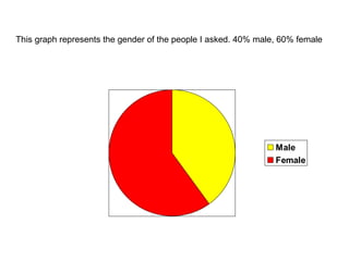
- 1. This graph represents the gender of the people I asked. 40% male, 60% female
- 2. This graph represents the amount of people who said yes or no to this question – Does the music genre relate to the type of music you listen to? 60% answered yes, 40% answered no
- 3. This graph represents the answers to this question – Do you like the colour scheme? 100% answered yes
- 4. This graph represents the answers to the question – Do you think the colour scheme is consistent throughout the magazine? Once again, 100% answered yes
- 5. This graph represents the answers to the question – Do you like the image on my front cover? Also, I asked the question – Do you think the image connotes an Indy/rock magazine? For both questions, 100% answered yes
- 6. This graph represents the answers to the question – Do you like the layout of my magazine? 80% answered yes, 20% answered no
- 7. This graph represents the answers to the question – Do you think my magazine looks professional overall? 60% answered in places and 40% answered yes
- 8. This graph represents the data collected for this question – On a scale of 1-5, what would you give my front cover? 5 being the highest. 60% answered 4, 40% answered 5
- 9. This graph represents the data collected for this question – On a scale of 1-5, what do you think of my contents page? 5 being the highest. 20% answered 3, 60% answered 4 & 20% answered 5
- 10. This graph represents the data collected for this question – On a scale of 1-5, what do you think of my feature article? 5 being the highest. 60% answered 4, 40% answered 5
- 11. This graph represents the answers to the question – Do the proportions of my magazine match professional ones in supermarkets? 100% answered yes
- 12. The graph represents the answers to the question – Would you buy this magazine If it was in a shop