SlideShare une entreprise Scribd logo
1  sur  13
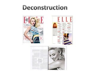
This magazine is aimed at females, I 
can see this by the light background 
and bold red font colour. Also the 
main image is sophisticated and not 
sexual therefore less likely attracting 
men if I take the male gaze theory 
into consideration. I would say the 
target audience is an older female as 
it has a mature look about it.
The main image is very mature and 
the outfit that has been chosen is 
very sophisticated meaning that it is 
aimed at an older female at the age 
of about 25-40 the makeup is quite 
subtle with a bright red lipstick 
which matches the colour scheme 
chosen for the front cover. They've 
used a blank facial expression with a 
laid back posture, this means its less 
likely to attract a younger audience.
The masthead uses the same font on 
every edition of this magazine they 
do, it is their brand identity, looking 
at this particular addition I can clearly 
see this is a well known magazine as 
the main image is overlapping and 
covering the masthead, which means 
people will already know which 
magazine it is without seeing all of 
the masthead. This edition is in red 
which ties in with the whole of the 
colour scheme throughout.
There are just the right amount of 
cover lines on the front cover to 
match their target audience, if 
there were too many and looked 
overly cluttered it may appeal to a 
younger audience as it wouldn't 
look as mature. They've changed 
between two fonts which makes 
certain cover lines stand out to 
others and they've also changed 
colours to divide the cover lines.
The layout itself is very mature as it 
isn't cluttered and is well oganised 
by using different colours and fonts. 
The colour scheme is also mature as 
its subtle and not too bright ir in 
your face, this means its less likely 
to attract younger teenage females 
as they're likely to go for pinks or 
purples and more likely to attract 
the older females with a gender 
mutual colour.
On this contents page the masthead is 
rather big and stands out more then 
anything on the whole page as it takes 
up about a quarter of the contents page, 
I like the look of this because it makes it 
looked more organised instead of being 
messy.
I love the layout of this contents page 
as it looks very organsied but not 
empty, there's a lot going on in this 
page, a lot of articles that are divided 
into categories within the contents 
page. This gives a mature look. On the 
left hand side it also has the Editors 
letter, I like the idea of putting this on 
a contents page with the page set into 
4 columns. The fonts used are basic 
fonts which makes it easy to read and 
looks more professional this way.
The contents page for this magazine has 
also followed the same colour scheme 
as the front cover, this shows continuity 
and looks more professional this way. 
The colour scheme is red white and 
black, however i think this colour 
scheme is a bit too plain for my target 
audience but fits the audience of Elle 
very well.
Elle only use 2 images on their 
contents page, this looks good because 
it looks more mature and not overly 
cluttered with images, I like how they 
have an image next to the editors note 
that fits well in the first column, the 
second image is the main image and 
takes up 2 columns which grabs the 
attention of the readers.
The colour scheme for this double 
page spread is just black and white 
which in my opinion looks too plain 
and wouldn't attract many people 
to want to read that article. 
However I like the layout of the 
main image taking up a whole page 
and the article on the other one, 
the pull quote grabs the attention 
of the readers as it is situated in 
the center of the page.
The article itself looks very long 
and is only in two columns, There 
is also no title to this article which 
doesn't look very professional. 
The start of the article has a drop 
cap which makes it look more like 
a book rather then a fashion 
article, overall doesn't look very 
appealing. The font they've used 
is very basic and easy to read and 
looks more mature this way, they 
have also put the pull quote in 
bold therefore makes it stand out 
even more
I love the main image of this 
double page spread, I think it 
looks very fashionable, I like the 
black and white effect however i 
don't think it would suit my 
magazine, it is a really nice pose 
that they've used as it isn't 
commonly used for magazines and 
is rarely used.

Contenu connexe

Tendances

Analysis of colours
Analysis of coloursAnalysis of colours
Analysis of coloursAmy Bradley
 
Analysis Of Front Cover Of Nme Music Magazine
Analysis Of Front Cover Of Nme Music MagazineAnalysis Of Front Cover Of Nme Music Magazine
Analysis Of Front Cover Of Nme Music Magazinechiaralcollu
 
Magazine Cover Analysis
Magazine Cover AnalysisMagazine Cover Analysis
Magazine Cover Analysishowardkadie
 
Magazine Mock Analysis
Magazine Mock AnalysisMagazine Mock Analysis
Magazine Mock Analysisjoechamberlain
 
Cousework Magazine Idea Analysis
Cousework   Magazine Idea AnalysisCousework   Magazine Idea Analysis
Cousework Magazine Idea Analysiskamvirk
 
Becky double page spread magazine analysis
Becky double page spread  magazine analysisBecky double page spread  magazine analysis
Becky double page spread magazine analysisCharis Creber
 
2nd Magazine Analysis
2nd Magazine Analysis2nd Magazine Analysis
2nd Magazine Analysisguestfc5932c
 
Draft Magazine Analysis
Draft Magazine AnalysisDraft Magazine Analysis
Draft Magazine Analysisasmediab15
 
Contents Page Research
Contents Page ResearchContents Page Research
Contents Page Researchbeckyjay26
 
Double Page Spread Analysis
Double Page Spread AnalysisDouble Page Spread Analysis
Double Page Spread Analysisdjardine94
 

Tendances (20)

Analysis of colours
Analysis of coloursAnalysis of colours
Analysis of colours
 
Analysis Of Front Cover Of Nme Music Magazine
Analysis Of Front Cover Of Nme Music MagazineAnalysis Of Front Cover Of Nme Music Magazine
Analysis Of Front Cover Of Nme Music Magazine
 
Magazine Cover Analysis
Magazine Cover AnalysisMagazine Cover Analysis
Magazine Cover Analysis
 
Magazine Mock Analysis
Magazine Mock AnalysisMagazine Mock Analysis
Magazine Mock Analysis
 
Mag
MagMag
Mag
 
Masthead designs
Masthead designsMasthead designs
Masthead designs
 
Cousework Magazine Idea Analysis
Cousework   Magazine Idea AnalysisCousework   Magazine Idea Analysis
Cousework Magazine Idea Analysis
 
Becky double page spread magazine analysis
Becky double page spread  magazine analysisBecky double page spread  magazine analysis
Becky double page spread magazine analysis
 
Stylesheets
StylesheetsStylesheets
Stylesheets
 
2nd Magazine Analysis
2nd Magazine Analysis2nd Magazine Analysis
2nd Magazine Analysis
 
Draft Magazine Analysis
Draft Magazine AnalysisDraft Magazine Analysis
Draft Magazine Analysis
 
Contents Page Research
Contents Page ResearchContents Page Research
Contents Page Research
 
Drafting
DraftingDrafting
Drafting
 
Brand guidelines
Brand guidelinesBrand guidelines
Brand guidelines
 
.
..
.
 
Stylesheets
StylesheetsStylesheets
Stylesheets
 
FONTS
FONTSFONTS
FONTS
 
Fanzine pages
Fanzine pagesFanzine pages
Fanzine pages
 
Music magazine analysis
Music magazine analysisMusic magazine analysis
Music magazine analysis
 
Double Page Spread Analysis
Double Page Spread AnalysisDouble Page Spread Analysis
Double Page Spread Analysis
 

Similaire à Fashion Magazine Deconstuction

Double Page Spread Deconstruction
Double Page Spread DeconstructionDouble Page Spread Deconstruction
Double Page Spread Deconstructionabbyrevell
 
Codes and convention of double page spread
Codes and convention of double page spread Codes and convention of double page spread
Codes and convention of double page spread 08WaittA
 
Research and planning all 3
Research and planning all 3Research and planning all 3
Research and planning all 3ReecebahiaGAD
 
Creating for an audience
Creating for an audience Creating for an audience
Creating for an audience hayleylou11
 
Music magazine analysation
Music magazine analysationMusic magazine analysation
Music magazine analysationBethanyPhilippa
 
Music magazine analysation
Music magazine analysationMusic magazine analysation
Music magazine analysationBethanyPhilippa
 
Magazine pre-production stage.pptx
Magazine pre-production stage.pptxMagazine pre-production stage.pptx
Magazine pre-production stage.pptxSrdjanVasic5
 
Task3 smash hits analysis
Task3 smash hits analysisTask3 smash hits analysis
Task3 smash hits analysisdenhamj1
 
Magazine resarch powerp 2 final
Magazine resarch powerp 2 finalMagazine resarch powerp 2 final
Magazine resarch powerp 2 finalJessica Smith
 
Magazine resarch powerp 2
Magazine resarch powerp 2Magazine resarch powerp 2
Magazine resarch powerp 2Jessica Smith
 
Deconstructions
DeconstructionsDeconstructions
Deconstructionsoliviadoug
 
Task2 mojo analysis
Task2 mojo analysisTask2 mojo analysis
Task2 mojo analysisdenhamj1
 

Similaire à Fashion Magazine Deconstuction (20)

Double Page Spread Deconstruction
Double Page Spread DeconstructionDouble Page Spread Deconstruction
Double Page Spread Deconstruction
 
Codes and convention of double page spread
Codes and convention of double page spread Codes and convention of double page spread
Codes and convention of double page spread
 
Research and planning all 3
Research and planning all 3Research and planning all 3
Research and planning all 3
 
Creating for an audience
Creating for an audience Creating for an audience
Creating for an audience
 
Music magazine analysis
Music magazine analysisMusic magazine analysis
Music magazine analysis
 
Music Magazine Analysis
Music Magazine AnalysisMusic Magazine Analysis
Music Magazine Analysis
 
Music magazine analysation
Music magazine analysationMusic magazine analysation
Music magazine analysation
 
Music magazine analysation
Music magazine analysationMusic magazine analysation
Music magazine analysation
 
Magazine pre-production stage.pptx
Magazine pre-production stage.pptxMagazine pre-production stage.pptx
Magazine pre-production stage.pptx
 
Task3 smash hits analysis
Task3 smash hits analysisTask3 smash hits analysis
Task3 smash hits analysis
 
In style front cover
In style front coverIn style front cover
In style front cover
 
Textual Analyasis
Textual AnalyasisTextual Analyasis
Textual Analyasis
 
Magazine resarch powerp 2 final
Magazine resarch powerp 2 finalMagazine resarch powerp 2 final
Magazine resarch powerp 2 final
 
Magazine resarch powerp 2
Magazine resarch powerp 2Magazine resarch powerp 2
Magazine resarch powerp 2
 
Textual analysis
Textual analysisTextual analysis
Textual analysis
 
Deconstructions
DeconstructionsDeconstructions
Deconstructions
 
Task2 mojo analysis
Task2 mojo analysisTask2 mojo analysis
Task2 mojo analysis
 
Evaluation Question 1
Evaluation Question 1Evaluation Question 1
Evaluation Question 1
 
Textual analysis
Textual analysisTextual analysis
Textual analysis
 
Draft
DraftDraft
Draft
 

Dernier

AUDIENCE THEORY -CULTIVATION THEORY - GERBNER.pptx
AUDIENCE THEORY -CULTIVATION THEORY -  GERBNER.pptxAUDIENCE THEORY -CULTIVATION THEORY -  GERBNER.pptx
AUDIENCE THEORY -CULTIVATION THEORY - GERBNER.pptxiammrhaywood
 
4.16.24 21st Century Movements for Black Lives.pptx
4.16.24 21st Century Movements for Black Lives.pptx4.16.24 21st Century Movements for Black Lives.pptx
4.16.24 21st Century Movements for Black Lives.pptxmary850239
 
Choosing the Right CBSE School A Comprehensive Guide for Parents
Choosing the Right CBSE School A Comprehensive Guide for ParentsChoosing the Right CBSE School A Comprehensive Guide for Parents
Choosing the Right CBSE School A Comprehensive Guide for Parentsnavabharathschool99
 
Difference Between Search & Browse Methods in Odoo 17
Difference Between Search & Browse Methods in Odoo 17Difference Between Search & Browse Methods in Odoo 17
Difference Between Search & Browse Methods in Odoo 17Celine George
 
Global Lehigh Strategic Initiatives (without descriptions)
Global Lehigh Strategic Initiatives (without descriptions)Global Lehigh Strategic Initiatives (without descriptions)
Global Lehigh Strategic Initiatives (without descriptions)cama23
 
Inclusivity Essentials_ Creating Accessible Websites for Nonprofits .pdf
Inclusivity Essentials_ Creating Accessible Websites for Nonprofits .pdfInclusivity Essentials_ Creating Accessible Websites for Nonprofits .pdf
Inclusivity Essentials_ Creating Accessible Websites for Nonprofits .pdfTechSoup
 
Virtual-Orientation-on-the-Administration-of-NATG12-NATG6-and-ELLNA.pdf
Virtual-Orientation-on-the-Administration-of-NATG12-NATG6-and-ELLNA.pdfVirtual-Orientation-on-the-Administration-of-NATG12-NATG6-and-ELLNA.pdf
Virtual-Orientation-on-the-Administration-of-NATG12-NATG6-and-ELLNA.pdfErwinPantujan2
 
Influencing policy (training slides from Fast Track Impact)
Influencing policy (training slides from Fast Track Impact)Influencing policy (training slides from Fast Track Impact)
Influencing policy (training slides from Fast Track Impact)Mark Reed
 
Like-prefer-love -hate+verb+ing & silent letters & citizenship text.pdf
Like-prefer-love -hate+verb+ing & silent letters & citizenship text.pdfLike-prefer-love -hate+verb+ing & silent letters & citizenship text.pdf
Like-prefer-love -hate+verb+ing & silent letters & citizenship text.pdfMr Bounab Samir
 
Grade 9 Quarter 4 Dll Grade 9 Quarter 4 DLL.pdf
Grade 9 Quarter 4 Dll Grade 9 Quarter 4 DLL.pdfGrade 9 Quarter 4 Dll Grade 9 Quarter 4 DLL.pdf
Grade 9 Quarter 4 Dll Grade 9 Quarter 4 DLL.pdfJemuel Francisco
 
THEORIES OF ORGANIZATION-PUBLIC ADMINISTRATION
THEORIES OF ORGANIZATION-PUBLIC ADMINISTRATIONTHEORIES OF ORGANIZATION-PUBLIC ADMINISTRATION
THEORIES OF ORGANIZATION-PUBLIC ADMINISTRATIONHumphrey A Beña
 
Culture Uniformity or Diversity IN SOCIOLOGY.pptx
Culture Uniformity or Diversity IN SOCIOLOGY.pptxCulture Uniformity or Diversity IN SOCIOLOGY.pptx
Culture Uniformity or Diversity IN SOCIOLOGY.pptxPoojaSen20
 
Visit to a blind student's school🧑‍🦯🧑‍🦯(community medicine)
Visit to a blind student's school🧑‍🦯🧑‍🦯(community medicine)Visit to a blind student's school🧑‍🦯🧑‍🦯(community medicine)
Visit to a blind student's school🧑‍🦯🧑‍🦯(community medicine)lakshayb543
 
Transaction Management in Database Management System
Transaction Management in Database Management SystemTransaction Management in Database Management System
Transaction Management in Database Management SystemChristalin Nelson
 
MULTIDISCIPLINRY NATURE OF THE ENVIRONMENTAL STUDIES.pptx
MULTIDISCIPLINRY NATURE OF THE ENVIRONMENTAL STUDIES.pptxMULTIDISCIPLINRY NATURE OF THE ENVIRONMENTAL STUDIES.pptx
MULTIDISCIPLINRY NATURE OF THE ENVIRONMENTAL STUDIES.pptxAnupkumar Sharma
 
USPS® Forced Meter Migration - How to Know if Your Postage Meter Will Soon be...
USPS® Forced Meter Migration - How to Know if Your Postage Meter Will Soon be...USPS® Forced Meter Migration - How to Know if Your Postage Meter Will Soon be...
USPS® Forced Meter Migration - How to Know if Your Postage Meter Will Soon be...Postal Advocate Inc.
 
How to Add Barcode on PDF Report in Odoo 17
How to Add Barcode on PDF Report in Odoo 17How to Add Barcode on PDF Report in Odoo 17
How to Add Barcode on PDF Report in Odoo 17Celine George
 

Dernier (20)

AUDIENCE THEORY -CULTIVATION THEORY - GERBNER.pptx
AUDIENCE THEORY -CULTIVATION THEORY -  GERBNER.pptxAUDIENCE THEORY -CULTIVATION THEORY -  GERBNER.pptx
AUDIENCE THEORY -CULTIVATION THEORY - GERBNER.pptx
 
4.16.24 21st Century Movements for Black Lives.pptx
4.16.24 21st Century Movements for Black Lives.pptx4.16.24 21st Century Movements for Black Lives.pptx
4.16.24 21st Century Movements for Black Lives.pptx
 
Choosing the Right CBSE School A Comprehensive Guide for Parents
Choosing the Right CBSE School A Comprehensive Guide for ParentsChoosing the Right CBSE School A Comprehensive Guide for Parents
Choosing the Right CBSE School A Comprehensive Guide for Parents
 
Difference Between Search & Browse Methods in Odoo 17
Difference Between Search & Browse Methods in Odoo 17Difference Between Search & Browse Methods in Odoo 17
Difference Between Search & Browse Methods in Odoo 17
 
FINALS_OF_LEFT_ON_C'N_EL_DORADO_2024.pptx
FINALS_OF_LEFT_ON_C'N_EL_DORADO_2024.pptxFINALS_OF_LEFT_ON_C'N_EL_DORADO_2024.pptx
FINALS_OF_LEFT_ON_C'N_EL_DORADO_2024.pptx
 
Global Lehigh Strategic Initiatives (without descriptions)
Global Lehigh Strategic Initiatives (without descriptions)Global Lehigh Strategic Initiatives (without descriptions)
Global Lehigh Strategic Initiatives (without descriptions)
 
Inclusivity Essentials_ Creating Accessible Websites for Nonprofits .pdf
Inclusivity Essentials_ Creating Accessible Websites for Nonprofits .pdfInclusivity Essentials_ Creating Accessible Websites for Nonprofits .pdf
Inclusivity Essentials_ Creating Accessible Websites for Nonprofits .pdf
 
Virtual-Orientation-on-the-Administration-of-NATG12-NATG6-and-ELLNA.pdf
Virtual-Orientation-on-the-Administration-of-NATG12-NATG6-and-ELLNA.pdfVirtual-Orientation-on-the-Administration-of-NATG12-NATG6-and-ELLNA.pdf
Virtual-Orientation-on-the-Administration-of-NATG12-NATG6-and-ELLNA.pdf
 
Influencing policy (training slides from Fast Track Impact)
Influencing policy (training slides from Fast Track Impact)Influencing policy (training slides from Fast Track Impact)
Influencing policy (training slides from Fast Track Impact)
 
YOUVE_GOT_EMAIL_PRELIMS_EL_DORADO_2024.pptx
YOUVE_GOT_EMAIL_PRELIMS_EL_DORADO_2024.pptxYOUVE_GOT_EMAIL_PRELIMS_EL_DORADO_2024.pptx
YOUVE_GOT_EMAIL_PRELIMS_EL_DORADO_2024.pptx
 
Like-prefer-love -hate+verb+ing & silent letters & citizenship text.pdf
Like-prefer-love -hate+verb+ing & silent letters & citizenship text.pdfLike-prefer-love -hate+verb+ing & silent letters & citizenship text.pdf
Like-prefer-love -hate+verb+ing & silent letters & citizenship text.pdf
 
Grade 9 Quarter 4 Dll Grade 9 Quarter 4 DLL.pdf
Grade 9 Quarter 4 Dll Grade 9 Quarter 4 DLL.pdfGrade 9 Quarter 4 Dll Grade 9 Quarter 4 DLL.pdf
Grade 9 Quarter 4 Dll Grade 9 Quarter 4 DLL.pdf
 
THEORIES OF ORGANIZATION-PUBLIC ADMINISTRATION
THEORIES OF ORGANIZATION-PUBLIC ADMINISTRATIONTHEORIES OF ORGANIZATION-PUBLIC ADMINISTRATION
THEORIES OF ORGANIZATION-PUBLIC ADMINISTRATION
 
Culture Uniformity or Diversity IN SOCIOLOGY.pptx
Culture Uniformity or Diversity IN SOCIOLOGY.pptxCulture Uniformity or Diversity IN SOCIOLOGY.pptx
Culture Uniformity or Diversity IN SOCIOLOGY.pptx
 
Visit to a blind student's school🧑‍🦯🧑‍🦯(community medicine)
Visit to a blind student's school🧑‍🦯🧑‍🦯(community medicine)Visit to a blind student's school🧑‍🦯🧑‍🦯(community medicine)
Visit to a blind student's school🧑‍🦯🧑‍🦯(community medicine)
 
Transaction Management in Database Management System
Transaction Management in Database Management SystemTransaction Management in Database Management System
Transaction Management in Database Management System
 
MULTIDISCIPLINRY NATURE OF THE ENVIRONMENTAL STUDIES.pptx
MULTIDISCIPLINRY NATURE OF THE ENVIRONMENTAL STUDIES.pptxMULTIDISCIPLINRY NATURE OF THE ENVIRONMENTAL STUDIES.pptx
MULTIDISCIPLINRY NATURE OF THE ENVIRONMENTAL STUDIES.pptx
 
USPS® Forced Meter Migration - How to Know if Your Postage Meter Will Soon be...
USPS® Forced Meter Migration - How to Know if Your Postage Meter Will Soon be...USPS® Forced Meter Migration - How to Know if Your Postage Meter Will Soon be...
USPS® Forced Meter Migration - How to Know if Your Postage Meter Will Soon be...
 
How to Add Barcode on PDF Report in Odoo 17
How to Add Barcode on PDF Report in Odoo 17How to Add Barcode on PDF Report in Odoo 17
How to Add Barcode on PDF Report in Odoo 17
 
Model Call Girl in Tilak Nagar Delhi reach out to us at 🔝9953056974🔝
Model Call Girl in Tilak Nagar Delhi reach out to us at 🔝9953056974🔝Model Call Girl in Tilak Nagar Delhi reach out to us at 🔝9953056974🔝
Model Call Girl in Tilak Nagar Delhi reach out to us at 🔝9953056974🔝
 

Fashion Magazine Deconstuction

  • 1.
  • 2. This magazine is aimed at females, I can see this by the light background and bold red font colour. Also the main image is sophisticated and not sexual therefore less likely attracting men if I take the male gaze theory into consideration. I would say the target audience is an older female as it has a mature look about it.
  • 3. The main image is very mature and the outfit that has been chosen is very sophisticated meaning that it is aimed at an older female at the age of about 25-40 the makeup is quite subtle with a bright red lipstick which matches the colour scheme chosen for the front cover. They've used a blank facial expression with a laid back posture, this means its less likely to attract a younger audience.
  • 4. The masthead uses the same font on every edition of this magazine they do, it is their brand identity, looking at this particular addition I can clearly see this is a well known magazine as the main image is overlapping and covering the masthead, which means people will already know which magazine it is without seeing all of the masthead. This edition is in red which ties in with the whole of the colour scheme throughout.
  • 5. There are just the right amount of cover lines on the front cover to match their target audience, if there were too many and looked overly cluttered it may appeal to a younger audience as it wouldn't look as mature. They've changed between two fonts which makes certain cover lines stand out to others and they've also changed colours to divide the cover lines.
  • 6. The layout itself is very mature as it isn't cluttered and is well oganised by using different colours and fonts. The colour scheme is also mature as its subtle and not too bright ir in your face, this means its less likely to attract younger teenage females as they're likely to go for pinks or purples and more likely to attract the older females with a gender mutual colour.
  • 7. On this contents page the masthead is rather big and stands out more then anything on the whole page as it takes up about a quarter of the contents page, I like the look of this because it makes it looked more organised instead of being messy.
  • 8. I love the layout of this contents page as it looks very organsied but not empty, there's a lot going on in this page, a lot of articles that are divided into categories within the contents page. This gives a mature look. On the left hand side it also has the Editors letter, I like the idea of putting this on a contents page with the page set into 4 columns. The fonts used are basic fonts which makes it easy to read and looks more professional this way.
  • 9. The contents page for this magazine has also followed the same colour scheme as the front cover, this shows continuity and looks more professional this way. The colour scheme is red white and black, however i think this colour scheme is a bit too plain for my target audience but fits the audience of Elle very well.
  • 10. Elle only use 2 images on their contents page, this looks good because it looks more mature and not overly cluttered with images, I like how they have an image next to the editors note that fits well in the first column, the second image is the main image and takes up 2 columns which grabs the attention of the readers.
  • 11. The colour scheme for this double page spread is just black and white which in my opinion looks too plain and wouldn't attract many people to want to read that article. However I like the layout of the main image taking up a whole page and the article on the other one, the pull quote grabs the attention of the readers as it is situated in the center of the page.
  • 12. The article itself looks very long and is only in two columns, There is also no title to this article which doesn't look very professional. The start of the article has a drop cap which makes it look more like a book rather then a fashion article, overall doesn't look very appealing. The font they've used is very basic and easy to read and looks more mature this way, they have also put the pull quote in bold therefore makes it stand out even more
  • 13. I love the main image of this double page spread, I think it looks very fashionable, I like the black and white effect however i don't think it would suit my magazine, it is a really nice pose that they've used as it isn't commonly used for magazines and is rarely used.