1. Evaluating my Poster Q1: In what ways did your media project develop, challenge or use constructions of real media products?
2.
3.
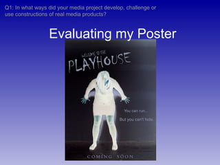
4. How I used, challenged and developed these conventions At the centre of my poster is the girl, who is strongly connoted to be the main character or victim. This connotation is made because she is the only figure in the poster, she is in the centre, and she stands out very clearly against the black background. However, in some ways I subverted this convention when I inverted the girl’s colours. Inverting the colours turned her skin blue and her hair white, which makes her seem inhuman. By dehumanising her, it becomes unclear whether she is a protagonist or an antagonist. Furthermore, this is reinforced as we do not see her face, which may link to another convention of not revealing the villain. Makes it clear who the main character (victim for horror movies) is.
5. How I used, challenged and developed these conventions By inverting the colours she now appears inhuman and glowing, with a pale shadow on a dark wall. All of this strongly suggests the supernatural. Her pose (stretched out, almost crucified, with her head down) implies that she is going to die or be struck, and that she is defenceless against it. The combination of these connotations is that she will die at the hands of something abnormal or supernatural. Posters for horror movies usually carry strong connotations of death. The dark background, the positioning of the girl (her head bowed, her body spread out, suggesting vulnerability and victimisation) tell the audience the film is a horror. The ‘Welcome to the Playhouse’ font is similar to font styles that drip blood, and the sinister tagline (‘you can run … but you can’t hide’) confirms the genre. Most posters will indicate what genre the movie is.
![[object Object],[object Object],[object Object],[object Object],[object Object]](data:image/gif;base64,R0lGODlhAQABAIAAAAAAAP///yH5BAEAAAAALAAAAAABAAEAAAIBRAA7)