

Recommandé
Contenu connexe
Tendances
Tendances (20)
En vedette
En vedette (16)
Similaire à How to plot a scatterplot
Similaire à How to plot a scatterplot (20)
Dernier
Dernier (20)
How to plot a scatterplot
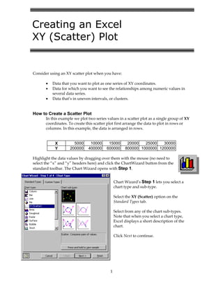
- 1. 1 Consider using an XY scatter plot when you have: •= Data that you want to plot as one series of XY coordinates. •= Data for which you want to see the relationships among numeric values in several data series. •= Data that’s in uneven intervals, or clusters. How to Create a Scatter Plot In this example we plot two series values in a scatter plot as a single group of XY coordinates. To create this scatter plot first arrange the data to plot in rows or columns. In this example, the data is arranged in rows. X 5000 10000 15000 20000 25000 30000 Y 200000 400000 600000 800000 1000000 1200000 Highlight the data values by dragging over them with the mouse (no need to select the “x” and “y” headers here) and click the ChartWizard button from the standard toolbar. The Chart Wizard opens with Step 1. Chart Wizard’s Step 1 lets you select a chart type and sub-type. Select the XY (Scatter) option on the Standard Types tab. Select from any of the chart sub-types. Note that when you select a chart type, Excel displays a short description of the chart. Click Next to continue. Creating an Excel XY (Scatter) Plot
- 2. 2 Step 2 asks you to identify the data you want to chart. If you selected the data range before starting the Chart Wizard, the correct range will already be filled into the “Data range” text box. Indicate whether your data series are arranged in rows or columns. The thumbnail sketch of your XY plot will vary depending on what you select here and helping you to make the correct choice. Click Next. Step 3 displays a 5-tab dialog box that lets you customize your plot. The changes you make on any of the tabs are reflected in the thumbnail sketch. When you’re finished customizing click Next to continue.
- 3. 3 Step 4 gives you a choice of where the Chart Wizard will create your plot. If you select “As object in:”, the Chart Wizard puts your chart in the middle of the current spreadsheet. (However, once it’s there you can move and size it as you like.) Click Finish to complete the XY plot and have it display on your spreadsheet. Manipulating the XY Scatter Plot To move it: Click once to select the chart. Put the mouse pointer (an arrow) inside the chart and hold down the left-hand mouse button. The arrow pointer turns into a four-headed arrow. Drag the chart to a new location. To size it: Click once to select the chart. Put the mouse pointer on a selection marker (a filled box) in any corner of the chart and drag in or out with the mouse to reduce or increase the chart size. To edit it: Click any element of the chart to select it. Then right-click with the mouse to see a pop-up menu of edit options. End Scatter Plot 0 200000 400000 600000 800000 1000000 1200000 0 5000 10000 15000 20000 25000 30000 X Axis YAxis