Mobile Friendly Search Engine Optimization
•
5 likes•789 views

Mobile responsive site have always been Google's favorite and with the upcoming update this will get even more confirm. This presentation will highlight certain recommendation that should be kept in mind while building a mobile friendly website.

Recommended
Recommended
More Related Content
What's hot
What's hot (20)
Similar to Mobile Friendly Search Engine Optimization
Similar to Mobile Friendly Search Engine Optimization (20)
More from ADG Online Solutions Pvt Ltd.
More from ADG Online Solutions Pvt Ltd. (13)
Recently uploaded
Recently uploaded (20)
Mobile Friendly Search Engine Optimization
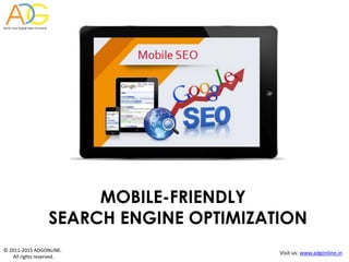
- 1. © 2011-2015 ADGONLINE. All rights reserved. Visit us: www.adgonline.in MOBILE-FRIENDLY SEARCH ENGINE OPTIMIZATION
- 2. © 2011-2015 ADGONLINE. All rights reserved. Visit us: www.adgonline.in Google Update- ‘Mobilegeddon’ • Google recently announced that it’s big update on April 21st will rank mobile-friendly web sites better in mobile search. • Google said “users will find it easier to get relevant, high quality search results that are optimized for their devices.” so it wants sites to be prepared for this change. • Apps that are indexed by Google through App Indexing will begin to rank better in mobile search.
- 3. © 2011-2015 ADGONLINE. All rights reserved. Visit us: www.adgonline.in Select Your Mobile Configuration 3 different configurations recognized by Google for building mobile sites: Configurations Does my URL stay the same? Does my HTML stay the same? Responsive Web Design Dynamic Serving Separate URLs
- 4. © 2011-2015 ADGONLINE. All rights reserved. Visit us: www.adgonline.in Select Your Mobile Configuration • Responsive Web Design: Serves the same HTML code and URL regardless of the kind of device. The layout changes based on the size and capabilities of the device. (Use meta name=“viewport” tag to tell the browser how to adjust the content) • Dynamic Serving: Server responds with different HTML on the same URL depending on the user agent requesting the page. (Use the Vary HTTP header to signal your changes depending on the user-agent. Detect user-agent strings correctly) • Separate URLS: Serves different codes to each device and on different URLs. Google does not favour any particular configuration as long as the page(s) or all page assets are accessible to all Googlebot user agents. You can hire a SEO agency for expertise in your mobile site design.
- 5. © 2011-2015 ADGONLINE. All rights reserved. Visit us: www.adgonline.in Responsive Web Design Dynamic Serving Separate URLs
- 6. © 2011-2015 ADGONLINE. All rights reserved. Visit us: www.adgonline.in Why Responsive Web Design Users find it easy to share and link to website’s content with a single URL. Reduces load time as no redirection is required to have a device- optimized view. It reduces the possibility of common mistakes that affects mobile sites. Makes it easier and efficient for Google to crawl, index and organize content. Requires less engineering time to maintain multiple pages for the same content. Google ranks URLs optimized for mobile higher in rank as far as mobile searches are concerned.
- 7. © 2011-2015 ADGONLINE. All rights reserved. Visit us: www.adgonline.in Mobile SEO Recommendation 1 •Make sure that the site resources such as images, CSS, Java scripts can be crawled by Google. For such insights use the “Fetch as Google feature” in Webmaster Tools. • Check and test site’s robots.txt in Google Webmaster Tools. 2 3 4 • Do a mobile-friendly test for the mobile pages to see if the system detects website as compatible for the mobile users. • In case of separate URLs for the mobile pages, make sure to test the URLs of both mobile and desktop to confirm that the redirect is recognized and crawlable.
- 8. © 2011-2015 ADGONLINE. All rights reserved. Visit us: www.adgonline.in Mistakes to Watch Out for and their Recommendations Faulty Redirects: For example, redirecting to the homepage rather than relevant content. Use Webmaster tools to find URL errors and fix them. 404 not found errors: Example, if a mobile user is detected and sent to a 404 page because of the device they are accessing on, keep them on desktop page. If you use serving , ensure that user-agent detection is correctly configured. Blocked URLs: When the site’s robots.txt explicitly disallows crawling by Googlebot for smartphones, investigate the server configuration if you see blocked URLs reported in Webmaster Tools. Unplayable video on mobile site: Likely to be a problem on IOS if video isn’t delivered through HTML5, possibly leading to short clicks. Use HTML5 standards for animations and video embedding that’s playable on all devices.
- 9. © 2011-2015 ADGONLINE. All rights reserved. Visit us: www.adgonline.in Mobile Site Design Recommendations •Touch screens can lead to accidental clicks if buttons are too big, too small, or in the path of scrolling. Design for the fat finger •Plugin may not be available on user’s phone, use HTML5 for special effects. Don’t use flash •It can be difficult and frustrating to close each one on mobile device, might lead to a high bounce rate. Don’t use pop-ups
- 10. © 2011-2015 ADGONLINE. All rights reserved. Visit us: www.adgonline.in Other Recommendations Few more design recommendation for SEO- friendly mobile site are: Optimize for Local Search Mobile Sitemaps Use Schema.org Structured Data Optimize Titles and Meta Descriptions
- 11. © 2011-2015 ADGONLINE. All rights reserved. Visit us: www.adgonline.in To get a better ranking in Google search engine, inculcate all the recommendations made for Search Engine Optimization of your mobile site. To conclude we would like to share few key facts : •Google loves mobile-friendly designs. •50% of local searches are carried out on mobile devices. •There are currently 4 billion mobile phones in use globally •A second delay in page response can result in 7% reduction in conversions. Conclusion
- 12. © 2011-2015 ADGONLINE. All rights reserved. Visit us: www.adgonline.in Making a website mobile responsive is very important to stay on top in Google search ranking keeping you ahead in competitive market. At ADG Online Solutions we provide expert services to make your website mobile responsive . You can call us at: 0129-4107527 or you can also mail us at: info@adgonline.in , marketing@adgonline.in
- 13. © 2011-2015 ADGONLINE. All rights reserved. Visit us: www.adgonline.in THANK YOU