JAJPUR CALL GIRL ❤ 82729*64427❤ CALL GIRLS IN JAJPUR ESCORTS
Evaluation
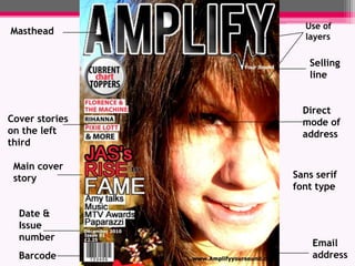
1. Use of layers Masthead Selling line Direct mode of address Cover stories on the left third Main cover story Sans serif font type Date & Issue number Email address Barcode
2. Date Colours used on front cover used on contents Header Page headers Sub lines Caption Main cover story
My magazine uses many conventions of a typical magazine. The masthead is bold and eye-catching and can clearly be seen from a distance and underneath the masthead is the selling line which says ‘your sound’ suggesting that the magazine is personal to the reader.The cover stories are all placed on the left third of the magazine, this is so they can be seen when stacked on a shelf against all other magazines.The main cover image dominates the page and the model is giving direct eye contact to attract the reader to the magazine. She has a welcoming facial expression and this attracts the reader towards the magazine.I have also used popular artists on the cover that the reader would be interested in to attract them towards the magazine, for example Florence and the machine.
On my contents page I have used Neat columns to place my text. All the columns and text within the columns are the same size to make the page look neat and professional.I have used large images on the contents page which relate to the stories inside the magazine, this breaks up the page into different sections and makes it look more interesting. The images also have captions with them that show what page the image relates to.I have also used a border around the page and this makes the page look more structured and professional like a real magazine.
I took inspiration for my contents page from this contents page from Q magazine. I have used a large image in the right hand corner of the page to show one of the main stories in the magazine
On my double page spread i have used a large image on the left page, relating to the article on the opposite page. I have placed the caption in the primary optical area so the reader can find out what the image is showing. I have used a pull quote that draws the readers attention into the article and the columns for the article are the same length and width which makes the page look neat. I think this is a sophisticated layout as there is not too much text, there bright images and the colours are simple and link back to the colours used on the contents and front cover keeping to the housestyle of the magazine. I have also included the magazines website in the bottom right hand corner at the end of the article so the reader will be attracted to go on the website.
My magazine represents different social groups by its house style. Throughout the magazine I have used the colours pink, black and white. These are feminine colours and represent the gender that the magazine is aimed at. The genre of my magazine is pop and the main cover image represents this genre successfully as the model is giving strong direct eye contact with a happy expression on her face to the reader. The model is smiling to entice the target audience to the magazine as pop is an upbeat style of music.
I used billboard magazine as the inspiration for my media product as billboard magazine is of a similar genre to mine. Because it is a pop magazine the colours used are bright and the model has a strong facial expression. However although they are both pop magazines, billboard magazine is aimed at and older audience of 18- 24 and is for both male and female audiences whereas my magazine is aimed at 16- 19 year old girls.
I would use Anderson merchandisers as the distribution company for my media product as they are a successful company and also are the distributors of Billboard magazine which is of a similar genre and style to my media product so they will have future experience with this type of magazine before.
The audience for my magazine is teenage girls aged between 16- 19. They will like chart music and artists like Rihanna and Beyonce for example. My magazine portrays its demographic as it uses popular artists on the front cover to attract the target audience. The house style of my magazine is sophisticated and uses bright eye-catching colours that bring the cover and contents page together. This reaches out to my target audience of older teenagers that are interested in popular female artists. I used pop artists such as Pixie Lott and Rihanna on the front cover and this would attract my target audience as they would be interested in these female singers.
I did a questionnaire and handed it out to people who I thought would be the typical audience for my magazine. I asked them questions like ‘do you prefer to listen to groups or solo artists the most?’ and the majority of people voted for solo artists so in my magazine I used more solos artist and included less about groups. I also asked them whether they preferred to listen to male or female artists and the majority preferred to listen to female artists the most so I included more female artists that male artists in my magazine.
I used Photoshop to manipulate my images. For my maasthead I went to dafont.com and found a suitable font for the magazine. I edited it on photoshop to make it look more bold and stand out on my front cover, by using bevel and emboss. I have also learnt how to use Blogger.com to upload. I used this website to upload different stages of my product as I went along. I uploaded the research which led up to the completion of my finished media product to show how I have successfully progressed through the making of my media product.
My ancillary project was a practice magazine before I began the making of my real one. I have improved a lot since my ancillary project as my skills on Photoshop have improved. On my ancillary project i did not use a border around the page like on my final magazine. The colours I used on my ancillary project do not represent anything whereas on my finished product I carefully chose the colours to represent my target audience. On the amplify magazine I have manipulated my images better on Photoshop and this makes it look more attractive than my ancillary project.