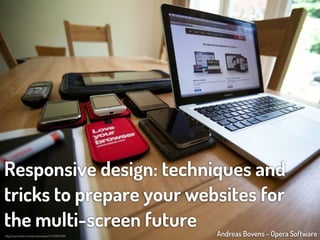
Responsive design: techniques and tricks to prepare your websites for the multi-screen future
•
132 j'aime•82,512 vues

Websites are viewed on all kinds of devices, in all kinds of browsers. In this presentation, I explain how you can adapt your site to these different environments, using modern browser hooks and techniques. I cover the various aspects (and some gotchas) of the viewport mechanism and media queries, and shed a light on how new CSS3 properties allow you to optimize images and videos for multiple screens.

Recommandé
Contenu connexe
Tendances
Tendances (20)
En vedette
En vedette (20)
Similaire à Responsive design: techniques and tricks to prepare your websites for the multi-screen future
Similaire à Responsive design: techniques and tricks to prepare your websites for the multi-screen future (20)
Plus de Andreas Bovens
Plus de Andreas Bovens (7)
Dernier
Dernier (20)
Responsive design: techniques and tricks to prepare your websites for the multi-screen future
- 1. Responsive design: techniques and tricks to prepare your websites for the multi-screen future Andreas Bovens - Opera Software http://www.flickr.com/photos/redux/7145995789/
- 2. Responsive design: techniques and tricks to prepare your websites for the multi-screen future Andreas Bovens - Opera Software http://www.flickr.com/photos/redux/7145995789/
- 4. “Patterns for Multiscreen Strategies” Coherence Syncronization Screen sharing By Precious http:/ /slidesha.re/kiip5y Device shifting Complementarity Simultaneity These patterns should help understand and define strategies for the multiscreen world.
- 5. Coherence Syncronization Screen sharing Device shifting Complementarity Simultaneity These patterns should help understand and define strategies for the multiscreen world. http:/ /slidesha.re/kiip5y
- 6. “A digital product or service looks and works coherently across devices. Features are optimized for specific device characteristics and usage scenarios.” Coherence http:/ /slidesha.re/kiip5y
- 7. Coherence http://slidesha.re/kiip5y
- 9. ?
- 10. small screen rendering aka single column view
- 14. zoom and pan
- 22. “Nice, but how can we control this zooming behavior?”
- 23. Let’s talk about the viewport mechanism
- 24. This is the viewport.
- 25. <meta ...> Using a "viewport" meta tag in the <head> of the page...
- 26. ...we can control page width & height, zoom level, etc.
- 29. This works in: with some exceptions ;-)
- 30. http:/ /www.opera.com/developer/tools/mobile/
- 31. HVGA portrait
- 32. HVGA portrait
- 33. HVGA portrait
- 34. HVGA portrait
- 35. HVGA portrait
- 36. HVGA portrait
- 37. HVGA portrait
- 38. HVGA portrait
- 39. HVGA portrait
- 40. HVGA portrait
- 41. HVGA portrait no viewport defined in <head>, so fallback to default of 980px, which is squeezed inside 320px.
- 42. HVGA portrait <meta name="viewport" content="width=320">
- 43. HVGA portrait <meta name="viewport" content="width=320">
- 44. HVGA portrait HVGA landscape <meta name="viewport" content="width=320">
- 45. HVGA portrait <meta name="viewport" content="width=device-width">
- 46. HVGA portrait <meta name="viewport" content="width=device-width">
- 47. HVGA portrait HVGA landscape <meta name="viewport" content="width=device-width">
- 48. HVGA landscape HVGA landscape 480px 320px × 1.5 zoom
- 49. HVGA portrait <meta name="viewport" content="initial-scale=1">
- 50. HVGA portrait <meta name="viewport" content="initial-scale=1">
- 51. HVGA portrait HVGA landscape <meta name="viewport" content="initial-scale=1">
- 52. HVGA portrait HVGA landscape <meta name="viewport" content="initial-scale=1"> (same result as width=device-width)
- 53. HVGA portrait HVGA landscape <meta name="viewport" content="initial-scale=0.5">
- 54. HVGA portrait HVGA landscape <meta name="viewport" content="initial-scale=2">
- 56. HVGA portrait <meta name="viewport" content="width=device-width"> + <div style="width: 600px">
- 57. HVGA portrait <meta name="viewport" content="width=device-width, initial-scale=1"> + <div style="width: 600px">
- 58. other settings maximum-scale=... , minimum-scale=... <meta name="viewport" content="initial-scale=1, maximum-scale=1.5"> user-scalable=yes|no <meta name="viewport" content="width=320, user-scalable=no"> height=... <meta name="viewport" content="height=device-height">
- 59. other settings maximum-scale=... , minimum-scale=... <meta name="viewport" content="initial-scale=1, maximum-scale=1.5"> user-scalable=yes|no <meta name="viewport" content="width=320, user-scalable=no"> height=... <meta name="viewport" content="height=device-height">
- 60. other settings maximum-scale=... , minimum-scale=... <meta name="viewport" content="initial-scale=1, maximum-scale=1.5"> user-scalable=yes|no <meta name="viewport" content="width=320, user-scalable=no"> height=... <meta name="viewport" content="height=device-height">
- 61. other settings maximum-scale=... , minimum-scale=... <meta name="viewport" content="initial-scale=1, maximum-scale=1.5"> user-scalable=yes|no <meta name="viewport" content="width=320, user-scalable=no"> height=... <meta name="viewport" content="height=device-height">
- 62. Important! Make sure to use commas, not semi-colons as delimiters between viewport values! <meta name="viewport" content="initial-scale=1; user-scalable=no"> <meta name="viewport" content="initial-scale=1, user-scalable=no">
- 63. caveats Android Browser doesn’t support user-scalable=no. IE interprets width=device-width as 320px. Safari on iPad always interprets width=device-width as 768px, although it’s 1024px wide in landscape mode. This can be overridden with initial-scale=1, which... triggers a zooming bug* on orientation change. * Patch: https:/ /github.com/scottjehl/iOS-Orientationchange-Fix
- 65. So, how to use this? Sniff for mobile browsers maybe?
- 66. So, how to use this? Sniff for mobile browsers maybe? Better don’t sniff.
- 74. Opera/9.80 (Macintosh; Intel Mac OS X 10.5.8; U; en) Presto/2.9.220 Version/12.00
- 80. So, avoid sniffing, but if you really have to, provide a way for users to make corrections, and remember their preference.
- 81. So, avoid sniffing, but if you really have to*, provide a way for users to make corrections, and remember their preference. * always ask yourself why the mobile site should be different from the desktop site
- 82. * always ask yourself why the mobile site should be different from the desktop site customer requir ements tim e restrictions budget limitations capabilities are different different layout needed
- 83. * always ask yourself why the mobile site should be different from the desktop site customer requir ements tim e restrictions budget limitations capabilities are different different layout needed
- 84. * always ask yourself why the mobile site should be different from the desktop site customer requir ements tim e restrictions budget limitations capabilities are different different layout needed capability detection
- 85. * always ask yourself why the mobile site should be different from the desktop site customer requir ements tim e restrictions budget limitations capabilities are different different layout needed capability detection viewport + media queries
- 86. Let’s talk about media queries
- 87. Media queries are conditional hooks for applying different CSS rules, depending on e.g. browser width or height, orientation, aspect ratio, etc.
- 88. Differently said, media queries allow you to optimize your site layout for all kinds of form factors. Via http://mediaqueri.es/
- 89. @media screen and (min-width: 400px) and (max-width: 800px) { article { /* css for browsers with width ≥ 400px and ≤ 800px */ } }
- 90. @media screen and (aspect-ratio: 16/9) and (orientation: landscape) { article { /* css for browsers with an aspect ratio of 16/9 and orientation is landscape */ } }
- 91. @media screen and (max-width: 800px) { article { /* css for browsers with width ≤ 800px */ } } @media screen and (max-width: 400px) { article { /* css for browsers with width ≤ 400px */ } }
- 92. @media screen and (max-width: 400px) { article { /* css for browsers with width ≤ 400px */ } } Remember that mobile browsers have a default viewport width (e.g. 980px). For your mobile specific media queries to work, you need to set the viewport!
- 94. default viewport. width=device-width. mobile specific media mobile specific media queries not applied. queries applied.
- 95. The viewport and media queries combo allows you to create just one responsive site that works everywhere.
- 96. Q: What do I start with, desktop or mobile? A: Do mobile first, and build up your desktop styles from there.
- 97. Q: Which devices, screen sizes should I design for? A: All of them! Use content breakpoints, instead of device breakpoints and you’ll get a long way.
- 98. http:/ /www.flickr.com/photos/33284937@N04/5445675024/
- 99. Dealing with high-PPI “Retina” screens
- 100. A pixel is not what it seems. Thus far, we’ve talked about pixels in terms of “CSS pixels”. One CSS pixel can be multiple device pixels.
- 101. HVGA portrait almost WVGA portrait
- 102. HVGA portrait almost WVGA portrait
- 103. almost WVGA portrait Browser pretends that 480px is 320px.
- 104. In most scenarios, you won’t have to worry about this. It just works.
- 105. However, if you want to control PPI related stuff, these are the things you can do:
- 106. almost WVGA portrait (1) Set the meta viewport’s target-densitydpi to device-dpi.
- 107. almost WVGA portrait (1) Everything is shown at 100%. One CSS pixel is equal to one device pixel.
- 109. almost WVGA portrait (2) Use special device- pixel-ratio media query to serve PPI-specific CSS.
- 110. almost WVGA portrait I’ve set the 1500×1500px background-image to repeat every 1000px, making it crispy again. The rest of the content is still scaled 150%.
- 112. caveats -o-max/min-device-pixel-ratio uses fractions instead of numbers. So 3/2, not 1.5. Watch out for max/min--moz-device-pixel-ratio.
- 113. max/min-device-pixel-ratio might be dropped, and we get a resolution media query instead. @media screen and (min-device-pixel-ratio: 3/2) { body {background-size: 250px;} } would become: @media screen and (min-resolution: 1.5dppx) { body {background-size: 250px;} }
- 114. almost WVGA portrait (3) Use high-res images to preserve crispiness.
- 116. http:/ /www.w3.org/community/respimg/
- 117. You will be able to specify multiple image sources: <picture> <source media="(orientation: landscape)" srcset="long.jpg 1x, long2.jpg 2x"> <source media="(orientation: portrait)" srcset="tall.jpg 1x, tall2.jpg 2x"> <img src="fallback.jpg" /> </picture>
- 118. You already can specify multiple video sources: <video> <source type="video/webm" src="small.webm" media="all and (max-width: 480px)"> <source type="video/webm" src="large.webm" media="all and (min-width: 481px)" > </video>
- 119. Sidenote about another responsive image technique: object-fit and object-position allow you to crop images
- 120. simple resize
- 122. http:/ /dev.opera.com/articles/view/css3-object-fit-object-position/
- 124. Why do all this viewport stuff with <meta> tags? Isn’t this something for CSS?
- 125. http:/ /dev.w3.org/csswg/css-device-adapt/
- 126. <meta name="viewport" content="width=device- width, initial-scale=1, user-scalable=no"> becomes @viewport { width: device-width; zoom: 1; user-zoom: fixed; }
- 127. <meta name="viewport" content="width=device- width, initial-scale=1, user-scalable=no"> becomes @-o-/-ms-viewport { width: device-width; zoom: 1; user-zoom: fixed; }
- 128. http:/ /dev.opera.com/articles/view/an-introduction-to-meta-viewport-and-viewport/
- 129. Responsive design: techniques and tricks to prepare your websites for the multi-screen future Andreas Bovens - Opera Software http://www.flickr.com/photos/redux/7145995789/
- 130. Responsive design: techniques and tricks to prepare your websites for the multi-screen future nt prese Andreas Bovens - Opera Software http://www.flickr.com/photos/redux/7145995789/
- 131. Thank you! @andreasbovens Dosis font: http:/ /www.impallari.com/dosis Glyphicons: http:/ /glyphicons.com/glyphicons-licenses/ Corkboard background: http:/ /psd.tutsplus.com/freebies/texture/corkboard-texture-pack/
Notes de l'éditeur
- \n
- \n
- \n
- \n
- \n
- \n
- \n
- \n
- \n
- \n
- \n
- \n
- \n
- \n
- \n
- \n
- \n
- \n
- \n
- \n
- \n
- \n
- \n
- \n
- \n
- \n
- \n
- \n
- \n
- \n
- \n
- \n
- \n
- \n
- \n
- \n
- \n
- \n
- \n
- \n
- \n
- \n
- \n
- \n
- \n
- \n
- \n
- \n
- \n
- \n
- \n
- \n
- \n
- \n
- \n
- \n
- \n
- \n
- \n
- \n
- \n
- \n
- \n
- \n
- \n
- \n
- \n
- \n
- \n
- \n
- \n
- \n
- \n
- \n
- \n
- \n
- \n
- \n
- \n
- \n
- \n
- \n
- \n
- \n
- \n
- \n
- \n
- \n
- \n
- \n
- \n
- \n
- \n
- \n
- \n
- \n
- \n
- \n
- \n
- \n
- \n
- \n
- \n
- \n
- \n
- \n
- \n
- \n
- \n
- \n
- \n
- \n
- \n
- \n
- \n
- \n
- \n
- \n
- \n
- \n
- \n
- \n
- \n
- \n
- \n
- \n
- \n
- \n
- \n
- \n
- \n