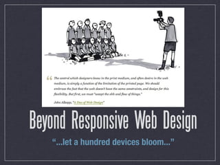
Responsive Web Design, as laid out by Ethan Marcotte, is about a whole lot more than just media queries. I look at the three elements of responsive web design, statistics about mobile web browsing, and offer tips on how to best design sites for responsiveness.
N.B.: Several slides are lifted wholesale from Bryan Rieger's excellent "Rethinking the Mobile Web" presentation, be sure to check it out!
3. Responsive Web Design
One HTML file
+ multiple devices and displays
______________________________
a range of custom experiences
4. Responsive Web Design
In keeping with the fundamental ideas of the Web:
Access by anyone, on any device
Separation of content and presentation
Progressive enhancement /
Graceful degradation
5. ETHAN MARCOTTE (@BEEP), “ON BEING RESPONSIVE”
“A responsive design is
composed of three
distinct parts:”
7. Flexible / fluid grids
Break up the site’s layout into modules
that can be moved and resized as
needed
Size modules proportionately using ems
or percentages (or both)
target ÷ context = result
8. 1. A flexible grid.
2. Flexible images. Or more specifically,
images that work in a flexible context.
9. Flexible / fluid images
overflow: hidden
max-width: 100%
JS solutions to load an appropriately-
sized image
10. 1. A flexible grid.
2. Flexible images. Or more specifically,
images that work in a flexible context.
3. Media queries.
11. Media queries
Ever make a print stylesheet before?
<link rel=”stylesheet”
href=”#” media=”screen” />
<link rel=”stylesheet”
href=”#” media=”print” />
12. Media queries
More in-depth rules for when styles apply
<link rel=”stylesheet” href=”#”
media=”screen and (min-device-width: 640px)” />
Can be used within a stylesheet too
@media screen and (orientation:landscape) {
#content { ... }
}
13. Media queries
height aspect-ratio resolution
width device-aspect-ratio scan
device-height color grid
device-width color-index
orientation monochrome
23. “Pinch-to-zoom
makes any site usable
on iPhone/Android”
“Viewport browsing
still works on
Blackberry”
“Only people with
smartphones use the
mobile web anyways”
31. World population, 2010: 6.9 billion
1.96 billion global Internet
connections (28.7% of the world:
42% Asia, 24% Europe, 13% NA)
5.1 billion mobile subscriptions
(over 4 billion use 2G GSM)
SOURCES: INTERNETWORLDSTATS.COM, BUDDE.COM.AU
32. 1.3 billion mobile Internet users
Almost 1/3 of Internet users
access only via mobile (including
almost 25% of U.S. users)
Only 21% of mobile users have 3G
access
33. 1.96 billion Internet connections...
minus 1.3 billion mobile users...
equals about 500 million
broadband Internet connections
worldwide
36. The Jakarta effect
Capital of Indonesia, ~9.6 million
people
$100/month ADSL vs.
~$17/month unlimited mobile data
Proximity to China = cheap Shanzhai
(“bandit”) phones
37. The Jakarta effect
~2 million BlackBerry users
Largest Twitter user base worldwide
#2 Opera Mini user base worldwide
#3 Facebook user base worldwide
40. Desktop before mobile is backward!
Mobile devices are less powerful than
desktops
Mobile bandwidth is more expensive
So why are we sending more (and
more complicated) code for mobile
than desktop?
42. No support for media queries
is the first media query
Media queries don’t work on most
mobile devices
Most desktop browsers support media
queries (and are powerful enough to
use them without slowing down)
Old desktop browser = less
complicated site!
45. Avoid unnecessary data transfer
display: none still uses bandwidth
Load images as progressive
enhancement instead through media-
queried stylesheets
46. Use JS for progressive enhancement only
Mobile devices are less powerful
Animation takes a lot of processing
Frameworks are big downloads
47. Use JS for progressive enhancement only
So, avoid JavaScript for mobile
whenever possible
Use CSS3 animation instead
Amazon, FB, and Google all launched
with no JS in their original designs
58. “The choice is not between using
media queries and creating a
dedicated mobile site; the choice
is between using media queries
and doing nothing at all.”
- Jeremy Keith, “A responsive mind”