
Recommandé
Contenu connexe
Tendances
Tendances (18)
En vedette
En vedette (11)
Similaire à Contents page progress
Similaire à Contents page progress (20)
Plus de aslihan_s
Dernier
Dernier (20)
Contents page progress
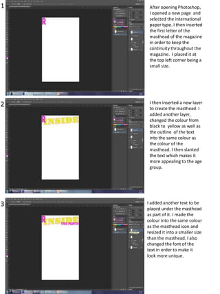
- 1. 1 2 3 After opening Photoshop, I opened a new page and selected the international paper type. I then inserted the first letter of the masthead of the magazine in order to keep the continuity throughout the magazine. I placed it at the top left corner being a small size. I then inserted a new layer to create the masthead. I added another layer, changed the colour from black to yellow as well as the outline of the text into the same colour as the colour of the masthead. I then slanted the text which makes it more appealing to the age group. I added another text to be placed under the masthead as part of it. I made the colour into the same colour as the masthead icon and resized it into a smaller size than the masthead. I also changed the font of the text in order to make it look more unique.
- 2. 4 5 6 After creating the look, I decided that I didn’t like the font of the masthead of the contents page. Therefore, I re-typed the text and changed the font of the text into yellow again. This was better. I then thought that instead of leaving the masthead as the text it includes, I should change it into ‘what’s inside’ with the same font and resize it into an appropriate size that it would fit into the space. The font makes the magazine makes it more appealing and girly than if I kept the previous font. Using the select tool I selected the inner gap of the letters and filled them in with the same colour as the masthead icon.
- 3. I then resized the icon at the top left corner and then filled the hole in yellow as to look like it continues through the icon. At this point I also added a rectangular shape to go behind the masthead of the contents page. I filled the shape with the same but a different colour tone, a bit lighter than the logo icon. Having to place an image on the contents page I began with opening a photograph I took on Photoshop in order to edit the background of the image. I used quick select tool to fill in the colour of the background to make it easier to remove the background which I successfully did. But the background remained for one of the section which was the arm. The choice of selecting this image out of the all images, is because as her hands are on her hips it puts forward a feminine act. I then removed the background in the gap and then inserted the new version of the image onto the contents page. I resized and positioned it where appropriate. I positioned it at the center of the page as it would directly attract the audience that are young.
- 4. I went carefully round the hair again in order to make the edges look smooth and natural which I therefore used a mixture of tool, which were clone tool, polygon lasso tool and smoothened it up. I used the same tools where there was hardness. Here I also added a feature story and positioned it below her arm across her body which makes it subjective to her. i edited the text by double clicking on the layer and changed the colour into the same colour as her top and the style of the text, after that I changed the font. I continued to change the style of the text by making the outline of the text darker. After I added the text, I looked at the piece I created so far and I hadn't liked the image I used therefore, I opened another page on Photoshop and selected a different image of the same girl: as shown on the left. I then placed the text on top of the image and resized it accordingly. I remained the image at the center of the magazine, in order to grab the interest of the audience. At this stage I also, rotated the second section of the text of the feature story as it gives a different affect to the magazine. It makes it look more funky and teenage like.
- 5. I then added a secondary image as it is conventional to have as much images as possible. This is because the audience is aimed at younger audience, they would prefer visual context instead of writing. I placed the image at the top left corner below the section of the masthead and resized it into a smaller frame. I zoomed in into the image and using the quick select tool I selected the dull background and filled the colour into a bright pink colour, in order to create a link throughout the magazine. I then rotated the image to the left.
- 6. I then added another secondary image and then saved this version.
- 7. I then added a selfie of myself as part of the editors comment and then added text beside the image. I added a few text layers in order to place it around the image. I changed the font into a girly type. At first I was going to use the font type below my selfie but I realized it wouldn’t be appropriate. I deleted the text below the selfie and then made all the text the same font, size and colour and then positioned it around the selfie.
- 8. This is the screenshot of what I have done up to now. At this stage I changed the colour of the text.
- 9. Here, I added the page number and placed it at the bottom right corner of the page. I then made the colour into the same colour as the colour of the top of the main image. I then added an outline to the text using outer glow and drop shadow in order for the page number to stand out and show that it is the page number of the page. The colour I used as the outline noise shadow is brighter and softer than the fill colour of the text. The effect makes the text look lively and conventional towards pop magazine. I also increased the noise levels of the outline and. I added the satin effect to the page number making it look effective by being lively and Just beside it. I added another text just beside the page number and used the same effect as the page number. The text was the website address of the magazine. So that it is made available for those that prefer it online. It also allows the magazine to widen the audience as it is more accessible. I decided that I was going to add the website address on each page at beside the page number in order to remind the audience about the accessible link.
- 10. I then resized and relocated the text to a better appropriate size and position of the page. I placed it mid-length beside the page number. This was the stage of what I got up to so far. I added another text with the same text and then edited it by double clicking on the layer and used outer glow to add effect to the text and make it more appealing to wards both the genre and the audience.
- 11. Here I edited the text I previously created and then as shown below I moved it to where the previous text was. After placing the text onto the image, I added another text and then used the same effect with the previous text to replace it with the previous text I had created.
- 12. Thereafter, I thought of adding the girl’s name on the feature as part of the story so I put together the text ‘I’m a girl, I gossip!’ and ‘And so what’ which allowed more space for me to place the name of the girl. Here, I added a new next which was the name of the girl. After inserting the text I, deselected the layer and then double clicked on the layer to add effects to the text, which I did using stroke and outer glow. The colours I used for both effects where different but matched the colour scheme of the magazine. for the stroke I used yellow and the outer glow I used a grey tone. I filled in the text with pink same colour as the other text on this feature.
- 13. Here, I rotated the same text to the left because it makes it look more funky and attractive to the audience. I then selected the speech text to place on the feature story. I edited the speech marks using stroke which I did in yellow. I then selected the heading of the page and then added the stroke effect and used the darker but lighter pink tone.
- 14. I then selected the text ‘THIS MONTH’ and added the stroke effect using a bright blue colour. Which makes it more appealing to the target audience as it is bright. Here, I resized my selfie and nudged it to free it from the overlapping.
- 15. I then transformed the text to make it smaller than the number text Here, I selected the text ‘THIS MONTH’ and made it smaller and then re-positioned it overlapping slightly the heading. After that I placed it behind the main image of the page.
- 16. I then selected the feature story on top of the main image and resized it into a smaller size. I then selected the speech marks and resized them to math the size of the feature story appropriately. After resizing I looked at the page and then decided that I didn’t like the photograph being at the center of the page as there are other important things to include. Therefore, I selected the main image and then moved it across to the bottom right corner of the page as well as the feature story. I then moved the page number and the website address to the right and slightly resized it.
- 17. I then selected the speech marks and her name and positioned it on top of the bottom part of the image. I also resized the website address and relocated the page number.
- 18. Again, after making those changes I realized I didn’t like the location of the image so I duplicated the image and then flipped the image and located it on the right. At this stage, I decided to use the image on the left above and place it on the left.
- 19. After deciding on the location of the image I changed by thought and used the version on the right. I made the text suitable for the image and resized some of the text. Again, after making those changes I realized I didn’t like the location of the image so I duplicated the image and then flipped the image and located it on the right. I placed the text suitably on top of the image on the left. Again I resized each text of the caption for the image by the transform controls
- 20. I added the front cover of the magazine I created and slanted it to the left because it is part of the pop convention of most magazine such as ‘I <3 pop’ After inserting the front cover I went back to writing the editors comment which I needed to finish.
- 21. After finishing editors comment I moved the text alongside with the image to the right and the front cover to the left. I moved the text ‘THIS MONTH’ upwards to allow more space for the editors comment section, which also allowed the text to look part of the masthead of the contents page.
- 22. I then slightly rotated the masthead to the left as it looks more conventional to the genre of pop. I then made the text size of the editors comment larger and resized it for better positioning. Then, focusing on the front cover added an arrow in order to show the page numbers of the feature story. I also added text for the page number of the feature story. By double clicking on the layer I added the stroke effect using a green tone colour and then filled the text in a pink tone colour
- 23. Going back to the arrow I used the stroke effect to add colour to the text, which I used a pink tone and I then created another arrow and placed the text below the arrow to show the page number of the feature story.
- 24. I then adjusted the shape using warp tool and changed the position of the shape in order to make it look appealing to the target audience. I then positioned it at the side of the front cover magazine to show the page number of the feature story.
- 25. I then turned the shape around and positioned it suitably so that it was in slight touch to the number and feature story. I didn’t like look of it so I changed it once more again. Do I turned it round and repositioned it.
- 26. After that I made some more of the arrows as to express the page number of the feature story. I rotated them differently in different angles. Here I also from the editors comment made the word ‘free’, bold in cap locks and larger than the rest of the text with more space to it, which allows it to stand out and grab the audience’s attention that are teenagers as they favour free things than having to pay. I resized the text several time in order to gain the appropriate size to the space available.
- 27. At this stage I added more page numbers to show direct page numbers of the feature story. Alongside with that I also had to change the shapes as to match the shape and text appropriately together. I also considered the image on the bottom left and inserted another page number for that. I added the text and then rotated it to a slant. I continued to add page numbers for the feature stories. I removed the page number of the image on the bottom left hand side as I was going to start again.
- 28. I finished doing the page numbers and placing the shapes for the front cover feature stories. So, I started again doing the page number for the image. I inserted the text and wrote number ’30’. I went through number of process. I rotated the number and resized it. On the same text I amended the look of the number and changed the outline colour into red and the fill colour into white but kept the position the same.
- 29. I then finished adding the page numbers and shapes for the feature stories and moved onto other feature stories which I presented at the bottom of the page in columns. I added text to one of the numbers showing what the feature story will be about. To do this looking at existing examples I realized that I had to resize the text to fit it in with the size of the number.
- 30. I continued to add feature stories and resized them into suitable size. I then added an image I took and placed it on the bottom right. I did this because as it is a girls music magazine it would be conventional to boys included. His facial expressions make it appropriate for the magazine audience. After inserting the image I added a circle shape. I changed the fill colour into purple and used drop shadow option using the linear burn of blending mode, so that it looked more appealing and attractive. I then made more amendments to the shape in order to make it more appealing. This time selecting the drop shadow and using the quality I changed the contour of the image which made it look slightly darker in the outside of the image.
- 31. Looking at the image I inserted, I realised that there were white patches around his hair. Therefore I zoomed in into the certain part and using the clone tool I covered the white patches. After that was fulfiled I realized looking at the version there were white patches around his beard. Therefore, I zoomed in again and using the clone tool I covered the patches. This was the final look of the image after making the adjustments.
- 32. I then zoomed out of the image after making the amendments and continued to make further progress. I then moved on to making the feature stories. I added text added then wrote the text in. I then changed the font colour of the text. I also changed the colour of the feature story page numbers. I formed a pattern so that the colour of the numbers were not the same, matching the genre of the magazine I continued to add feature stories and change the colours of each text and feature story number. I added text to type in the sub heading of the feature stories in columns. After typing the text, I double clicked on the layer on the layer bar and added the stroke effect and adjusted the level of it. I made the colour of the stroke into pink and the fill colour into bright blue. I finally placed it above the feature story columns
- 33. I enlarged the sub heading and fitted into appropriate size. This is the look so far.
- 34. I added another text to add a feature story and then after adding the text I changed the colour. I changed the size of the text to fit it appropriately on to the area. Here I made the website text larger in order to make it seeable.
- 35. I added more feature stories and made it fit to size that was available. To do this I used the transform options given around the text. After that I changed the colour into the order of the pattern. Looking at the overall cover so far I noticed that I should make the circle large and suitable in size and appropriate for the image layered onto. I did this by the use of the swap mode. I used the transformation points and changed the shape.
- 36. I continued to add feature stories and as I did I changed the size and the colour of the text. Adding more feature stories I continued to change the colour and the size.
- 37. Here I transformed the size of the page number make it smaller so that I could fit the feature story. So far this is what I have done
- 38. At this point, I added another shape to place behind the first word of the masthead. I did this because it looks more attractive and conventional with the use of colours and the layout. I then added another shape on top of the previous shape I created. I adjusted the form of the shape by using the warp mode.
- 39. After creating the shape I tried new layers on the shape such as colour bridge. Using the transform points I rotated the shape to a slant. I used bevel and embass, stroke and drop shadow to create a different look. I also added text inside the shape.
- 40. Here I tried to change the form of the shape, which I did this by the use of warp mode. This allows me to adjust the shape from different points of the shape. Here I made more developments of the shape overall. This time I made adjustments to the text inside the shape. I added colour to the text by double clicking on the layer, selected stroke and then adjusted the level of the stroke. I changed the stroke colour into pink tone, which works very well with purple background. This is conventional to pop music magazine.
- 41. I selected the layer, which was the shape I created, and made more amendments to it adding more effects that relate to the convention of pop genre. I used bevel and emboss using the structure of outer bevel and increased the size and depth slightly. Within bevel and emboss I used shading effect too, I changed the angle into zero degrees and selected the use global light. This gave the shape more effective effect. I changed the highlight mode under shading into screen. After fulfilling the shape acting as a plug I moved onto making changes to the contents page showing the page numbers for the feature stories. I used the brush tool but customized it so that the shape was the way I wanted it to be. Using the customized brush tool I drew a scribble in order to place behind the feature story numbers. The purpose in doing the scribbles was that it makes it more teenage related and more funky. I changed the colour into red as it makes it look more conventional and eye catching.
- 42. After creating the shape I tried new layers on the shape such as colour bridge. I used bevel and embass, stroke and drop shadow to create a different look.
- 43. As shown on the left, I have put a ring around the music note that I have inserted as part of the masthead of the page. I added stroke, satin and drop shadow effect as it makes it look conventional. The satin effect gives the shape a 3d and music effect as it reflects onto a musical disc. I then added the same graphic again but at a different location. This time I placed it on where I placed a third image on the right hand side. I enlarged it in order to see clearly the effect I am placing on the graphic
- 44. Here I added another music note shape and placed it on top of the music note that is part of the masthead which makes it more musical and conventional. But I resized the second shape which preferably looks better. At the bottom of the page I added social media logos just above the website. This is because social media has a huge impact of promoting the music magazine.
- 45. I relocated the icons into suitable size in the space available near to the feature story as it is part of the feature story. After relocating the icons I moved onto the making the image on the bottom right corner more conventional and added speech bubble, which makes this section more appealing to audience. I then realised that the speech bubble should be replaced in which I replaced it with a different shape, which was more conventional. I filled the shape in blue, which was part of the masthead. I then added an image of a perfume of 1Direction and resized it to a suitable size. The purpose of the image I used of the perfume is to make it more appealing to my targeted audience as they would be attracted to 1D merchandise. I used the image from google as I didn’t have the item.
- 46. To make it more conventional I added shapes and text. First I added a rectangle shape and rotated it to the right and then filled the colour into yellow, which makes it more eye catching. I added text, ‘1D’ and changed the font into a similar font to the actual font associated with One Direction. I changed the font colour into blue as it would be conventional. I placed the text on top of the shape and placed the shape just beside the perfume bottle. I then added another shape below the previous shape and rotated it to the left, but brought it forward as it looks conventional. I filled the text with the same colour, green and centered the text. I then added the number of the feature story. I changed the font into a more funkier font and made the colour of the text yellow as it is conventional and more eye catching. I rotated the text which makes it more appealing to audience.
- 47. So far this is what the product looks like.
- 48. Looking at the produced piece I realized that the feature story doesn’t suit the images so I took new images. I opened Photoshop of the front cover and replaced the second existing image with the new image I created. I then replaced the old version of the front cover and replaced it with the new version. I went through a number of steps (see front cover process).
- 49. I researched different fonts. Using 1001fonts.com I looked at different fonts and was indecisive in which font to use. However, I had to decide so I considered using the one above.
- 50. I wanted to use this font, so I saved it as an image and opened it on Photoshop in order to remove the background, which took a while.
- 51. After removing the background of the text I added the text onto the content page just below the ‘editors comment’. To do this I had to resize the existing text in the location. I resized it several times and replaced my signature. The reason for why I chose this font is because it’s similar to hand written text and looks funkier. I resized the text below the signature as well as the signature in order to fit the text appropriately. I filled the text into a purple tone colour as it fitted the colour tone in the image which is the editor, me.
- 52. This is the final look of the contents page.
- 53. I resized all of the layers in order to get the best fit of each. I changed the layer order of the text on the bottom left hand side, placing the speech marks forward. Here I added a line in order to divide the main feature stories and minor feature stories. It also looks more conventional and professional.
- 54. This is the final version of the contents page