
Recommandé
Contenu connexe
Tendances
Tendances (19)
En vedette
En vedette (17)
Similaire à Double page spread – stages of production
Similaire à Double page spread – stages of production (20)
Plus de bethhupchurchh
Plus de bethhupchurchh (20)
Dernier
Dernier (20)
Double page spread – stages of production
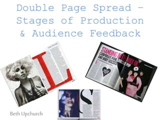
- 1. Double Page Spread – Stages of Production & Audience Feedback Beth Upchurch
- 2. Stage 1–Choosingthe right picture I reallylikedthispicturefromthe startandI reallywantedtouse itfor myDouble PageSpread,Icarried outaudienceresearchon the pictureandthemajorityof responsesI receivedwerepositive (see next slideforaudience research).However,tomake the picturemoreeffectiveandto broadcastmyPhotoshopskillsI decidedtocolourpopthephotoas itmadetheguitarwhichisa key partofmusicandsuitsmygenreto stickout,alongwiththeleaves.
- 3. Stage 2–Creatingthe DPS& Title After I chose the main image for my double page spread I added a title which I chose from a list of fonts and thought the name really suited my genre well and effectively. After getting some Audience Feedback (orange speech bubbles), I was confident thatthis made my Double Page spread look more professional and effective. “LittleBirdis a great name touse as its originaland innovative!” “Thecolourpoppingworks very well hereandmakes the guitar standout which resemblesthatthis magazine is clearlya music magazine!” “LittleBirdreallystands outonthebackground andisagreatsizeand font” “The colourpoppingis greatandshowsgood Photoshopskills! However,thewhite backgroundistooplain”
- 4. Stage 3–Creatingthe DPS • ThenextstageincreatingmyDPSwasaddinga backgroundtoitas theaudience feedbacktoldme thatthewhitebackgroundonitsownwas tooplain.I hada look atthevariety ofdifferenttoolsonPhotoshopandfounda leafeffectandtriediton thewhitebackgroundandI reallylikedtheeffectthatitcreatedanditmademy DPSlooka lotmore professional,thecoloursoftheleavesfitwithmycolour schemeas wellwhichisan addedbonus. “Wow! Ilovethe background, it is really effective & professional” Theleaveslooklike theyare comingfromthemainimage ontheleftwhichworks reallywelland clearlylinks thetwo pages” “Having a background like this really highlights youruse of Photoshop skills” “The2 pages link well together and don’t cause much confusion”
- 5. Stage 4 – Creating the DPS The next stage in creating my DPS was adding the text, secondary images, pull quote, page numbers, intro text, exclusive & anchoring the image. I based my Double Page Spread layout partly on Q’s double page spread (see next slide) but gave it my own personal touch. The colour scheme runs through the magazine from the front cover with the pink, cream & light blue on the page. Also, the text fits around the image and is separated into columns. “You’ve used clear conventions of a DPS such as columns & pull quotes which look very professional!” “I love the album cover at the bottom left, it looks genuine and this is seen in many popular magazine DPS’.” “There is a lot of text, but it is all organised well & the columns make it clear!” “This is looking really good yet the left hand side has hardly anything on it, compared to the right hand side”
- 6. What influenced you to create your DPS the way you have done? The top magazine DPS is from Q and I really liked how there was a secondary image in the middle of the text on the right, separating the text so it doesn’t become block text, I took this idea & added it to my DPS. The bottom magazine DPS is from NME magazine and I liked how there was the main image on the left and the title also, I will consider doing that to my DPS as my left hand side looks a bit bland! I also liked the pull quote on the right, so that influenced me to put one onto my DPS.
- 7. Audience Feedback As you can see here I uploaded my DPS draft onto Facebook (one of the biggest social media sites) to receive audience feedback, see the next slide for the responses.
- 8. Audience Feedback: I received lots of positive comments and you can see from the 38 likes at the top that a lot of people like the look of my DPS. I got some constructive criticism such as moving my ‘Exclusive’ box to the left hand side which is what I have done and it does look a lot better so the audience feedback was really helpful!