
Recommandé
Contenu connexe
Tendances
Tendances (18)
En vedette
Similaire à Evaluation 1
Similaire à Evaluation 1 (20)
Dernier
Dernier (20)
Evaluation 1
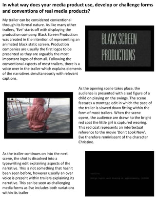
- 1. In what way does your media product use, develop or challenge forms and conventions of real media products? My trailer can be considered conventional through its formal nature. As like many other trailers, ‘Eve’ starts off with displaying the production company. Black Screen Production was created in the intention of representing an animated black static screen. Production companies are usually the first logos to be presented as they are arguably the most important logos of them all. Following the conventional aspects of most trailers, there is a voice over in the trailer which explains elements of the narratives simultaneously with relevant captions. As the opening scene takes place, the audience is presented with a sad figure of a child on playing on the swings. The scene features a montage edit in which the pace of the trailer is slowed down fitting within the form of most trailers. When the scene opens, the audience are drawn to the bright red coat the little girl is captured wearing. This red coat represents an intertextual reference to the movie 'Don't Look Now'. Eve therefore reminiscent of the character Christine. As the trailer continues on into the next scene, the shot is dissolved into a typewriting edit explaining aspects of the narrative. This is not something that hasn't been seen before, however usually an over voice is present within trailers explaining its narrative. This can be seen as challenging media forms as Eve includes both variations within its trailer
- 2. The trailer continues on going back and forth featuring Even, then aspects of the storyline and followed by other film companies in which the trailer was associated with. This is in line with many other film trailers as you would typically see the production & distribution company’s features towards the beginning of the trailer. This is so that the audience will be able to recognise these companies from an early stage from the opening of the trailer. The audience is then brought back to the attention of Eve. She is seen pictured singing along to the nursery rhyme 'Ring a Ring o' Roses'. Paying close attention to the lyrics of the nursery rhyme, the song starts off with a mellow and cheerful tone. However coming towards the end, it states 'they all fall down' which is then meant to indicate the role that Eve plays in the movie. Since the team chose to represent a little girl as the monster character for our horror film alone breaks many conventions. Monsters in this genre of movies are typically viewed as big, strong males. This is done as it brings more fear towards the viewers. Using a little girl is a challenging aspect to bring forward as they are not seen as the most threatening human beings. However, taking this into consideration, we figured that if this little girl was capable of super-natural powers, then it would compensate for the change of character. Also, it is also typical of the monster within horror movies to be concealed wearing a mask. An obvious reason for this is to hide the identity of the killer, but also adding tension and mystery to the film. It makes the audience question who could be the possible suspect. We have decided not to follow this convention as it is very unlikely that the audience would assume that the little girl was the killer from the first impression. This is because Eve plays a binary opposite role in which she has an element of innocence and evil.
- 3. When the trailer reaches the montage edit in which the scene is dissolved into an empty swing, the scene is transformed into black and white. This has connotations of loneliness and emptiness. All forms of life is removed from the image, suggesting that the little girl is dead. This shot is also reminiscent of the scene featuring the benefactor. The man is pictured in black and white as he explains to the kids why they should stay away from the woods. Using the idea of semiotics, this visual link makes the audience be under the impression that the benefactor is responsible for the girl’s death. The montage edit helped to create and define a form of visual language thus allowing the make the point come across. As that scene comes to an end, we are then taken to the first proper aspect of the narrative. The same montage edit was used to bring this scene forward thus making the trailer formulaic. This maintains the tone of the film that was set from the beginning. The audience is introduced to the group of friend and are filmed walking together, the atmosphere is viewed with an element of tranquillity. This brings us to the Equilibrium stage of the movie from Todorov’s theory of narrative. Todorov believes that there should be a beginning, middle and ending to each narrative. The stages of Todorov’s theory go as follows; equilibrium – disruption – recognition – attempt to solve the problem – new equilibrium. Eve fits under some aspects of Todorov’s theory. As pictured, the equilibrium stage begins when the group of friends are seen walking together enjoying a friendly chat and a joke around. The atmosphere is calm and a sense of contentment can be recognised. The ambience is then destroyed when the scene cuts to one of the friends running away in fear. The recognition stage kicks in at a slow pace when the group of friends being to piece together that Eve could be the only possible suspect. The last part of Todorov’s theory however does not apply to my film narrative as the equilibrium is not restored.
- 4. Just before the disruption stage of Todorov’s theory, there is a shot of Eve hiding behind a tree. She is she captured looking down on the floor which is supposed to represent a feeling of unhappiness. We used make-up in order to make Eve appear to look solemn/ dead. This makes the scene appear to be more effective as the audience should begin to feel unsettled, thus affecting their emotions and feelings towards Eve's character. We are then brought to a high angled shot of the sexual active character – Crystal-Lake. This name was given to her as an intertextual reference to Camp Crystal-Lake from the movie 'Friday the 13th'. This shot reinforces Laura Mulvey’s theory of the Male Gaze. This theory suggests that the camera is placed in the prospective of an heterosexual male, thus subjecting the woman. Placing the sexually active girl in a loose fitted top then having the camera gaze down at her as she runs subjectifies her as the shot becomes voyeuristic to male viewers. The shot contain jagged edges which is a reminiscent style throughout the film. When the audience is taken to an over-the-shoulder shot from behind a car the semantic code is shifted. The audience is now placed into the view of the killer. In each scene of the trailer, you question who's point of view is the story being told. In this case, the audience can instantly sense that they are in the POV of the killer due to the angle of the camera. Since the camera is placed in a low perspective, only the killer (Eve) could be levelled with the tail light of the car.
- 5. When the title of the movie Eve shows up, there is a binary opposite within the logo. The title is written in a childish manner which symbolises innocence. However, when the red shadow appears, the innocence is over-powered by the dark, devilish side to the character. This is the same representation that the character empowers throughout the whole film. When the title of the movie Eve shows up, there is a binary opposite within the logo. The title is written in a childish manner which symbolises innocence. However, when the red shadow appears, the innocence is over-powered by the dark, devilish side to the character. This is the same representation that the character empowers throughout the whole film. My trailer also features scenes which are very reminiscent to German Expressionism. For instance when Eve is seen on the swings, the shadows of the trees create a psychological landscape. It fits in with the theme of the trailer as elements of the trailer show a broken or fractured situation. It highlights the feeling and atmosphere that was present when Eve went missing then presumed dead. The jagged edges within the trailer show that there is no real route in the story. It can also relate to the concept of cubism (The Haywain). Playing close attention to the form of the trailer, you can see that it conforms to the pace of many other trailers on the market. The pace of the trailer begins slow and steady as it begins to explain the narrative. As the storyline builds, the momentum begins to kick in and thus maintaining a fast paced montage sequence. Once the montage edit then reaches its climax, it brings the trailer to an end then revealing its end card.
- 6. Moving on to the magazine cover and poster for my magazine, there are aspects which are conventional and some aspects which I have chosen to challenge. Starting off with the poster that I designed for my trailer, I knew that the mode of address had to match that of the trailer. This is so that the ancillary text would be easily recognised and people could link a relationship between the two products. Comparing my poster with existing horror posters, you can see that I have stuck with the typical convention of having the killer as the main image. Typically however you would find that the killer represented in horror movies are big, strong, masculine men. This is because they can be easily feared amongst the crowd. However, for my film, the killer remains to be an ‘innocent’ young girl and so at first glance, those who observe the poster may not instantly think that the killer within the movie would be the little girl. Nonetheless a give-away that the little girl could be the killer however is the way in which I have represented her. Using powerful photo-editing tools, I used an effect in which was designed in a way to make it seem like the little girl was crying blooded tears. I used red as this has many negative connotations such as death and danger. This is also a very strongly representative colour within the horror genre. I had also edited my main image using the brush tool to darken off the edges of the photograph to give it a vignette effect. This effect makes the main image stand out and draws your attention right to the middle of the poster. This effect is also strongly used within the horror genre. The black border that surrounds the main image adds a sense of fear and mystery to the character. The colour black is used as it also generates connotations of fear, horror, death and mystery. Following more of the conventions present on movie posters I included the name of the directors, editors, cast and crew etc. You can spot this on the bottom of the poster, aligned to the middle. This is an extremely typical convention found on virtually every movie poster. I chose to set the font colour to white as it helped the text to stand out clearly and also this is the typical colour you would find on pre-existing posters. It was also important to include the production and distribution logos as well as the age rating as this helps to make the audience aware of the vital information of the movie. Another convention that you would find on most movie poster is the release date of the film. It is also done in a decent sized font so that the audience know when they can expect to find the movie out in the cinemas. I have also included the use of a tagline for my poster as I felt it added a sort of suspense to the film. With regards to my magazine cover, this ancillary text was slightly different. Due to the fact that I used a pre-existing magazine I had to abide by their mode of address. I chose to use Fangoria as it is a magazine dedicated to feature horror films. The font colour and design was also similar to my own media product. Keeping in line with Fangoria’s mode of address, I decided to include the film strip that is found on most of their magazines.
- 7. Within the film strips you would find feature stories in which I have also included. The film strip makes the magazine appear slightly tacky on Fangoria’s magazines; however they do this on purpose as it fits in with their mode of address. Also since the magazine is aimed at a young audience, the addition of the featured stories allows the audience to connect with the magazine. It also means that they will not get bored easily as the magazine is crammed full of information. One important convention that is usually present on magazine front covers are top banners. These are used to provide additional information and are present within the magazine. It is also designed in a way that would attract an audience. I followed this convention as since my product is also aimed at a young audience, adding a top banner that is also visually please would mean that I would catch their attention. Not only that but since they are purchasing a horror magazine, I have chosen to include the ‘5 greatest teen horrors’ as a feature within my magazine. Another aspect I have included to help attract an audience is the use of an additional incentive. On most of Fangoria’s magazine covers, you would find this in either a bubble or small banner. I have chosen to use a small banner and within it I have included a buzz word (FREE) thus helping to draw an audience to my magazine. Other vital aspects I have included on my magazine is the barcode, issue number and price. These are included on every magazine as they are all essential in the transaction part of the magazine. I have placed the barcode in an area of the magazine that I thought was unobtrusive as it is not something that is visually appealing. It is important to have the price on the magazine so that customers know how much they have to pay for the product.