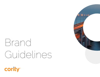
2. 2 Cority | Brand Guidelines
Table of Contents
Who We Are
Logo
Logo Application .....................................................................................................................................................
Colors
Fonts & Tyography
Primary ............................................................................................................................................................................
Secondary ....................................................................................................................................................................
Brand Elements
Cority Ring ....................................................................................................................................................................
Cority Circle .................................................................................................................................................................
Iconography ................................................................................................................................................................
Photography
General Industry ......................................................................................................................................................
Cority Ring ....................................................................................................................................................................
Portrait .............................................................................................................................................................................
Questions
3
4
5
8
9
10
11
12
13
15
17
18
19
20
21
22
3. 3 Cority | Brand Guidelines
Core values in action.
Cority is trusted by leading
organzations, because its actions
exemplify the core values that are
critical to mutual success – customer
centricity, quality, and integrity
Comprehensive solution.
Cority offers the most comprehensive
and secure software andservices
solution. Cority’s expert-led, agile
deployment methodology and focus
on user adoption and proactive client
success combine to deliver clients
superior ROI.
Deep expertise.
At the core, Cority are EHSQ
experts. Cority’s solution is designed,
deployed, and supported by EHSQ
experts. This enriches its solution,
reduces project risk, and helps to
ensure program success. Cority’s
vision drives them to constantly
innovate to meet not only today’s
challenges, but also the demands that
tomorrow will bring.
Who We Are
4. 4 Cority | Brand Guidelines
To ensure the Cority logo remains
a strong representation of our
company, we must present it in a
consistent and careful manner
across all channels of communication.
In most cases, the registered
trademark symbol should be included
with the logo.
The full color logo against a white
background is preferred. It should be
used whenever possible, across print,
web, and on screen.
Logo
TM
5. 5 Cority | Brand Guidelines
In order to preserve the visual impact
of the logo, always maintain the
appropriate space around the mark
as shown to the right. At minimum,
the equivalent to the size of the Cority
“c” should be observed around each
side of the logo.
To maintain legibility, the logo should
never be scaled down smaller than 1’’
wide in size. The preferred web size is
at minimum 100 pixels in width.
Clear Space
Minnimun Size
TM
TM TM
1 inch 100 px
Logo Application
6. 6 Cority | Brand Guidelines
There are three alternative
treatments for the Cority logo. They
should be used when the preferred
treatment is not a viable option.
The preferred treatment for the
mark is always in full color against a
white background, but it can also sit
against a solid Cority primary color
background, or when necessary,
against a full black background. No
other colors or photography should
be used behind the mark.
When the logo is on a solid color the
dot of the “i” should always be white.
TM
TM
Logo Application
TM
TM
7. 7 Cority | Brand Guidelines
Logo Application
cority
TM
TM TM
TM
TM
DO NOT distort or change proportions DO NOT reduce opacity
DO NOT place at an angle
DO NOT change the brand colors
DO NOT recreate the font
DO NOT place on an image or texture
DO NOT add drop shadow DO NOT use without TM symbol
TM
TM
8. 8 Cority | Brand Guidelines
#F78E1E
RGB: R/247, G/142, B/30
CMYK: C/0, M/53, Y/100, K/0
Pantone 152 C
Pantone 152 U
#FAAD61
RGB: R/250, G/173, B/97
CMYK: C/0, M/37, Y/70, K/0
Pantone 715 C
Pantone 715 U
#255EAD
RGB: R/37, G/94, B/173
CMYK: C/89, M/68, Y/0, K/0
Pantone 293 C
Pantone 293 U
#5D9DF5
RGB: R/93, G/157, B/245
CMYK: C/58, M/33, Y/0, K/0
Pantone 652 C
Pantone 652 U
#4F504F
RGB: R/79, G/80, B/79
CMYK: C/65, M/57, Y/56, K/35
Pantone 7540 C
Pantone Black 6 U
#BBBBBE
RGB: R/187, G/187, B/190
CMYK: C/0, M/1, Y/0, K/31
Pantone Cool Gray 4 C
Pantone Cool Gray 4 U
#BBBBBE | 20%
Color is one of Cority’s most powerful
brand indicators and should be used
with purpose, consideration, and
consistency. The palette has been
broken into two tiers —a primary and
secondary structure. The primary set
—orange, blue, and dark gray are used
extensively for broad applications of
color, iconography, and visual support.
The secondary palette consists of
lighter colors meant to support the
primary colors and bring depth to the
brand.
PRIMARY
SECONDARY
Colors
9. 9 Cority | Brand Guidelines
Cority’s official brand fonts are Raleway
and Open Sans are Cority’s fonts.
Raleway should be used for headlines
and subheads and Open Sans for
quotes and body copy.
Raleway’s elegant simplicity carries
the values of our brand. It’s strong,
confident verticals pair with an open
and clean feel that reflects Cority’s
unique aesthetic.
Primany headlines above 40px use the
Light weight of Raleway type system
Primary headlines 40px and below use
the Regular weight of Raleway
For primary headlines use the following
primary colors only:
Fonts & Typography
Primary Headline
Small Primary Headline
10. 10 Cority | Brand Guidelines
Raleway and Open Sans are used in
the materials created by corporate
marketing, including brochures,
data sheets, whitepapers, and other
collateral.
Use for headlines only. If headline is below 40px use Raleway Regular.
Use for subheadlines and hyperlinks and usually in dark blue or gray.
Use for body copy and should almost always be dark gray. Exceptions can be made for captions, pull quotes, and other
typographic elements.
Fonts & Typography
Raleway Light
Raleway Bold
Open Sans Regular
abcdefghijklmnopqrstuvwxyz
abcdefghijklmnopqrstuvwxyz
abcdefghijklmnopqrstuvwxyz
Primary
11. 11 Cority | Brand Guidelines
When Raleway and Open Sans are
not available in an application, such
as PowerPoint, Word document, and
Google Docs, Calibri Light, Bold and
Regular should be used as substitutes.
Use for headlines only.
Use for subheadlines and hyperlinks and usually in dark blue or gray.
Use for body copy and should almost always be dark gray. Exceptions can be made for captions, pull quotes, and other
typographic elements.
Fonts & Typography
Calibri Light
Calibri Bold
Calibri Regular
abcdefghijklmnopqrstuvwxyz
abcdefghijklmnopqrstuvwxyz
abcdefghijklmnopqrstuvwxyz
Secondary
12. 12 Cority | Brand Guidelines
Bold, friendly, integrated. These are
the tenants of the Cority brand. These
values are brought to life through the
use of Cority’s brand elements. With
rounded elements, bright colors and
human-centric visuals, we present
ourselves with a bold aesthetic that
wlecomes our customers.
Brand Elements
This is a Rights-Managed
photo. Must be purchased.
13. 13 Cority | Brand Guidelines
One of the core brand elements is the
Cority Ring. It is most commonly used
as an aesthetic feature that employs
textured images related to Cority’s
business solutions. The Cority Ring
must always have a transparent center
and be placed over white and/or gray.
The transparent center should never
hold content such as text, icons, or
images.
Secondarly, the Cority Ring can be
used as a solid ring utilizing a single
Cority brand color. This ring should be
used strategically and at a smaller size.
It should never be used to frame or
overlay an image.
Cority Ring should always be
proportioned at 1x in thinkness
compared to 1.5x diameter of
the transparent inner circle.
Brand Elements Cority Ring
1x
1.5x
An image inside of the ring
should never include people
as the primary object. See
page 20 for examples of
appropiate imagery
14. 14 Cority | Brand Guidelines
Brand Elements Cority Ring As a central brand element, the Cority Ring should
always be used in the header. It creates a interesting
aesthetic and protects the legibility of the primary
headline typeface, Raleway.
The Cority Ring should bleed off the page at 1/2 or
3/2 ratio. Exceptions to this rule should be made
using best judgment.
The Cority Ring must always have
a transparent center and be
placed over white and/or gray.
It should never hold content such
as text, icons, or images.
In select cases the blue dot of the “i” in
Cority can be used as the period of a short
primarily headline. This should be used
sparingly on items such as large headers
and social media graphics.
15. 15 Cority | Brand Guidelines
The Cority Circle serves as a secondary
brand element with multiple uses and is
meant to assist other brand elemtents.
Image in Cority Circle
Do not crop off hands, faces, or devices.
Place the photo in the circle to create a
focal point.
Text in Cority Circle
In this case, the circle must be either
20% light gray (dark gray text) or
Cority orange (white text). Maintain, at
minimum, 15 pixels between the text
and the edge of the circle. Use best
judgment when placing text within the
Cority Circle. Character count of text
must be below 150.
Portrait within Cority Circle
Roughly 90% of the portrait should
remain within the Cority Circle and
approximately 10% of the portrait
should break out of the shape. Use best
judgment when selecting images.
Brand Elements Cority Circle
Cority exemplifies
the core values
that are critical to
mutual success
This is a Rights-Managed
photo. Must be purchased.
16. 16 Cority | Brand Guidelines
Brand Elements Cority Circle
TM
Environment Suite
Cority’s Environmental Suite helps centralize and streamline
the collection of key corporate environmental data.
The software helps companies meet Environmental Management Systems (EMS)
requirements. We developed the software in collaboration with environmental
professionals, to develop many out-of-the-box workflows. Equally, you can configure
to adapt to your organization’s unique standards and processes. The software helps to
prioritize and manage risk and to analyze, trend, and report relevant data. This can be
provided to users from the C-suite to the shop level.
Roughly 90% of the portrait
should remain within the
Cority Circle.
Above is an example of
how the Cority Circle can
assit and enhance the
other brand elements.
This type of circle should
primarly use the 20% light
gray and underlay the
Cority Ring or other strong
elements to bring balance.
Portrait images should
always be front-facing and
confident. This style should
only feature people – no
exceptions. See page 21 for
appropiate imagery options.
This is a Rights-Managed
photo. Must be purchased.
17. 17 Cority | Brand Guidelines
Brand Elements Iconography
Occupational
health
Portal
Industrial
Hygiene
Business
Intelligence
Safety
Analytics
Environmental
Admission
inventory
Quality
User Community
18. 18 Cority | Brand Guidelines
Photography
Cority’s brand consists of three main
imagery categories:
The first is general industry imagery
that support subject matter and brand
storyline. The second is Cority Ring
imagery, which should include simple
images that relate to Cority’s industry.
The third is portrait imagery, which
includes forward-facing industry people
who overlay the Cority Circle. The
following pages will further define the
characteristics of each category.
Always Avoid
Images of paper or people using paper-
based processes.
Cluttered or overly busy imagery.
20. 20 Cority | Brand Guidelines
Photography
The Cority Ring emphasizes the
cohesion of Cority’s solutions through
its shape and use of recognizable
industrial elements. These rings provide
a window into the different industries
Cority touches and evoke some of the
ideals central to Cority’s brand: safety,
ingenuity and innovation.
Suggested items include, but are not
limited to, safety equipment, building
materials, constructed spaces and work
sites. Vibrant colors close to the brand
are recommended. Avoid portrait-style
or people-centric photography.
Cority Ring
21. 21 Cority | Brand Guidelines
Photography
Portrait style of imagery is essential
becuase it connects the customer
with the Cority Brand. These images
are intended to be cut out from their
surroundings to further engage with
the reader. Use the following guidelines
when selecting portrait-style imagery:
Select forward-facing industry people,
making eye contact with the viewer.
Individuals only -- no groups or objects.
Characteristics of the portrait should
include: Confident, authentic, and
trustworthy.
Do not apply filters, color overlays, etc.
Should be open, clear and natural-
looking.
Be diligent when cutting out portraits
from a full image. The edges should be
percise and focused.
Portrait
This is a Rights-Managed
photo. Must be purchased.
22. Questions?
If you have questions regarding
the Cority brand or any materials
you are creating please contact:
Lorem Ipsum Administrative
janedoe@cority.com
Jane Doe