Website workout - notes
•
1 like•444 views

Web design for conversion - slides and notes from Web Directions "what do you know" talk 30 Aug 2012 in Brisbane. Tips for improving conversion rates - making your website more effective by converting website visits into actions that achieve goals. This presentation is more about psychology than technology - common sense pointers about how to reach out to your target audience and use good design and copywriting to encourage people to act. The slides without the notes are also uploaded on Slideshare: http://www.slideshare.net/cazazz/website-workout-design-for-conversion

Recommended
More Related Content
What's hot
What's hot (20)
Viewers also liked
Viewers also liked (7)
Similar to Website workout - notes
Similar to Website workout - notes (20)
More from Carolyn King
More from Carolyn King (9)
Recently uploaded
Recently uploaded (20)
Website workout - notes
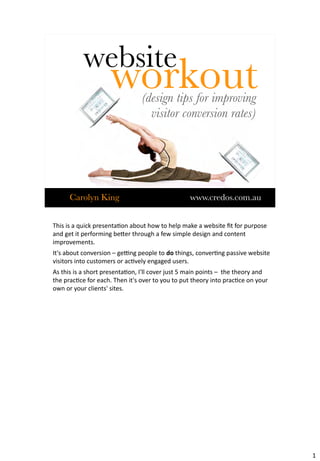
- 1. website workout (design tips for improving visitor conversion rates) Carolyn King www.credos.com.au This is a quick presentaton about how to help make a website ft for purpose and get it performing beter through a few simple design and content improvements. It's about conversion – getting people to do things, convertng passive website visitors into customers or actvely engaged users. As this is a short presentaton, I'll cover just 5 main points – the theory and the practce for each. Then it's over to you to put theory into practce on your own or your clients' sites. 1
- 2. 1 Get motivated • • • Fitter website = $$$ Small changes make a big difference Set goals and track them • Improving conversion rates is quicker and cheaper than SEO effort Firstly, why is website conversion so important? Like any exercise regime, it helps to have motvaton, so you stck at it and recoup the benefts. The main beneft of increasing conversion is making your website more proftable, recouping return on investment. And it's easy – much easier than marketng and SEO. You get to see quick results too. You have to be clear about your website's goals though, so you can see where you're making a difference. When we talk about conversion, we mean convincing people to do things like: Buy a product or service Contact the company Visit the shop/premises Provide informaton Join a mailing list Recommend or tell friends about the brand Download a document Send a request Change their opinion/behaviour Etc Most of those are goals you can defne, measure and track. You can then see about convertng more site visitors into achieving the goals.
- 3. 1 1000 visitors X 5% conversion = 50 sales 2000 visitors X 5% conversion = 100 sales 1000 visitors X 10% conversion = 100 sales Website conversion is really important and cost effectve – just do the maths. If a website has 1000 visitors, of whom 5% are converted to acton (for example buying something), that would result in 50 sales. To double the sales, you could try to double the number of visitors to the site, get an extra 1000 people through the door. That would take a lot of SEO and marketng work, and probably a lot of tme and money. OR you could double the sales buy doubling the conversion rate. So of the 1000 visitors that come through the door, all you need to do is get another 50 of them to act. You can do that by improving conversion in lots of small ways. It's a no-brainer really.
- 4. 2 Carrot • quick/easy • right price • better than • • • or stick? problems/challenges performance costs or effort alternatives • risks & unknowns • useful • procrastination • rewarding • competition • etc... • etc... When you're trying to get people to do something – convert website visitors from passive visitors to actve customers – you have to nudge them a litle. Give them a reason for doing it. You can do that by extolling the virtues of what you're promotng, or by showing how you address issues or needs the user has. Usually you have to do both. Afer all, people don't buy products or services. They buy answers to their needs. If they have a health problem, they might buy some medicaton or exercise equipment. But equally they might buy some professional advice. They may go online to do one thing, and end up doing another. It's the web designer's job to recognise what the needs are, show how you can answer those needs, convince the user that your website is the best way to do that, and push them over the line to achieve a benefcial result.
- 5. 2 Incentives Imperatives These are all examples from websites promotng internet security sofware. The top two use the carrot – the good things you'll get as a result of using the product. The botom two use the stck - if you don't get this product, think what will happen! The Macafee example (botom right) goes one step further – almost making the offer into a global cause you should fght for. Both the positve and negatve approach appeal to emotons in different ways, and both are valid. Know which approach to use when. If you use the negatve approach, make sure your product or service can answer a negatve with a positve.
- 6. 3 Stand in their shoes, not yours • address you (the user) • focus on needs & benefits (not facts & features) • use emotions before logic • anticipate concerns • talk their language A classic mistake many corporate websites make is to talk about themselves. The website is for the target audiences, not the company execs. Think about what the users want or expect, what's on their mind, what concerns or barriers there may be, and what you want them to do as a result of visitng the site. Use their language, not your jargon. Address them personally, make it about what they need, their desires, their concerns, the benefts to them. It is a mistake to assume people are logical – most decisions are infuenced by emotons more than facts, even when they're shopping for widgets. That includes negatve emotons like fear, worry, stress or pride as well as positve emotonal states like satsfacton, friendship, caring/sharing, etc. You can use that knowledge to infuence behaviour and direct people towards preferred goals.
- 7. It's about... 3 ...you (not us) benefits emotions The top two extracts are from Apple and Microsof, both talking about cloud computng. The Apple version is all about YOU, the user, while the Microsof version is about US, the company. Which one would appeal to you more? Which can you relate to? Which makes you want to fnd out more? The next example (from Apple) show how to sell benefts – rather than saying “long life batery” Apple turns it round to say why that will make your life beter. The last example from Apple engages your senses and emotons, making you want to keep going and engage with the brand, transferring positve thoughts associated with the product.
- 8. 4 Call them to action • • • use active language (verbs, pronouns) be bold (ask/command politely) suggest urgency, instant gratification • draw attention (sparingly) • right time and place • have an action on every page Examples of actve language... ”See how this product works” rather than “product informaton” “Join us now” rather than “membership applicaton” Addressing the user... “Your kids will love you for it” rather than “benefts for families with children” “Tell me more” rather than “further informaton” Being bold... “Get the facts now” rather than “would you like to know more?” “Don't take our word for it! Hear what customers say” rather than “testmonials” Draw atenton – make acton calls stand out, by paring down other content and using design devices sparingly. Colour, size, space, positoning and 3D effects all help to make actons stand out. Don't distract users from the goal. Right tme/place... Don't expect calls to acton like “subscribe to updates” or “give us feedback” to work on a home page. The user hasn't even got to know you at that stage! Treat everyone as an “undecided” - you have to convert apathy into interest and warm them up a litle before expectng them to commit. Put calls to acton in context – at logical decision points – and make sure every page has a relevant acton, even if it is just taking them further along the path towards a fnal goal.
- 9. 4 Sign up for a FREE trial Start sending files within minutes Contact our team now and see how we can save you money Try it for yourself – it's free Limited stock – buy now Browse Help me find the right product More info Contact us, we're here to help Read more Download the full article Click here Product brochure Yes, send me updates Submit Tell me about special offers Calls to acton that use actve language and address the user directly are more likely to be successful. Even more so if the call includes benefts that you'll get as a result of clicking the link. The butons at the lef are passive – they don't really urge you to do anything. Who goes to a website to “browse”? People always want to do something. What happens if you “click here”? There's no reason to venture into the unknown. Why should I “submit”? I may prefer to be reassured about what sending a form means. Generally a call to acton should provide for one of these things: 1. What I want to get 2. What I want to do 3. What I want to know 4. What I want to happen 5. Where I want to go A user is more likely to follow a call to acton if it provides what they need and they know what will happen when they click.
- 10. 5 • • • Remove hurdles reduce distractions less navigation, no dead ends address reasons not to buy/act • provide reassurance at decision points • improve usability & accessibility It's easy for people to fnd reasons not to do things. Just ask my teenage daughter! When you're on a website, procrastnaton is just a mouse click away. If you're directng people down a path to acton, you need to remove (or at least lower) any hurdles that are in the way. Removing distractons is a good technique. A web page that focuses on one goal will have far more impact than one with numerous panels, offers, butons and images relatng to other wonderful things elsewhere on the site. One way to do this is to review your web page and remove everything that isn't essental to the core offer or desired acton. Be ruthless. If you're faced with 20 different choices you're likely to come away with nothing at all. If you have just 3 to choose from, deciding is much less hard work. Reduce the number of offers. Reduce the number of navigaton optons. Always give people a clear path to follow. You can use a “squeeze page” - it's job is to force people down just one path to an end goal, using repeated calls to acton. Ofen websites fall at the last hurdle, as evidenced by the rates for shopping cart abandonment, or stats that show people ofen spend tme on a site without completng any goals. This is usually because there is something stopping them committing – ofen as simple as not knowing what delivery cost or tmescales will be, not knowing what guarantees they get, or not being sure the product or service is right for their needs. Another show-stopper can be accessibility or usability – the contact details aren't easy to fnd, the enquiry form doesn't work on a mobile, the contrast is too low to read, or the website is too slow. No mater how great the product/service or the creatve design, if the website isn't highly usable, it isn't ft for purpose, and it won't convert.
- 11. 5 simplicity... Here's an example of reducing distractons and providing clear, minimal choices. The website navigaton is almost non-existent (it's actually down in the footer area) so you have to focus on the offer. The 3 choices are clear and the benefts are pared down to the bare essentals. From here, a user is quite likely to click on one of those three butons and sign up for one of the services.
- 12. 5 reassurance... These shopping cart examples show how to antcipate resistance points and proactvely address potental concerns. The “buy now” buton includes menton of money back guarantee, and shows the credit card symbols for extra reassurance. The line of text about delivery shows that express and internatonal delivery is available, removing the barrier for impatent or overseas customers. The buy now panel botom lef shows the item ordered is in stock – another potental reason not to buy is removed. The grey help panel explains the terminology for a specialist product, as does the sizing chart for the Tshirt site botom right – the risk of ordering the wrong thing ofen prevents people committing. These are all small but very important details that can make or break conversion, partcularly for e-commerce transactons.
- 13. 5 usability... easy to find phone number mobile friendly avoid low contrast like this A few examples relatng to usability and conversion... Conversion is not just about online sales – a valid goal may be to get people to call the business. If you use a 1300 number, that can be tracked, and there are smart systems now that let you link that to web stats. Make sure the phone number is clearly visible – the top right of a page is becoming an accepted place to look for one. Make sure the website displays on mobile devices correctly – preferably start with the mobile version and use responsive design techniques to optmise it for other devices and resolutons. If the website, or some of it, doesn't work properly on mobiles you'll miss out on conversions and annoy people into the bargain. Basic usability and legibility can be another barrier to conversion, for example low contrast or small text that;'s hard to read. Remember not everyone has 20-20 vision or is viewing the site in perfect lightng conditons. If they can't read it, they won't go further.
- 14. Fitness round-up 1 Set clear goals 2 Answer needs & provide incentives 3 Address the audience directly 4 Provide clear, inviting calls to action 5 Remove barriers to conversion To summarise, focus on what you're trying to achieve and who you're trying to convert. Then you can address them via the website, answer their needs, call them to acton and try to remove any barriers that may be in the way.
- 15. Carolyn King email info@credos.com.au | web www.credos.com.au | twitter @CredosAssoc 15