SlideShare a Scribd company logo
1 of 19
What makes website look good? Is it the color choices? Is it the visual layout? Is it the grouping of information? Is it the consistency throughout the site? Repetition PROXIMITY Alignment Contrast
[object Object],[object Object]
Proximity Proximity Proximity Proximity Proximity Proximity Alignment Alignment Alignment Alignment Repetition  Repetition  Repetition  Repetition  Repetition Contrast Contrast
[object Object],[object Object],[object Object],[object Object]
Proximity How to get it: Squint and count the number of elements on a page. Limit yourself to between 3 and 5 elements. What to Avoid: Avoid corners and the middle of the page. Avoid equal amounts of white space between all elements Force relationships between headings and content Don’t put unrelated content elements together
Proximity Proximity Proximity Proximity Proximity Proximity Alignment Alignment Alignment Alignment Repetition  Repetition  Repetition  Repetition  Repetition Contrast Contrast
[object Object],[object Object],[object Object],[object Object]
Alignment How to get it: Always align elements on the page, even those that are far apart. What to Avoid: Don’t center some text and left align other text. Avoid centering anyway!
Proximity Proximity Proximity Proximity Proximity Proximity Alignment Alignment Alignment Alignment Repetition  Repetition  Repetition  Repetition  Repetition Contrast Contrast
[object Object],[object Object],[object Object],[object Object]
Repetition How to get it: Choose design characteristics (type face, color, size, cartoon style, picture style) and repeat them. Find existing repetitions and strengthen them by contrast or uniqueness. Accent the repetition. Think black hat, black shirt, black pants, black shoes, white corsage.  What to Avoid: Don’t keep repeating if it is becoming annoying. Don’t repeat mistakes. Don’t repeat phrases. Avoid  R A N S O m   N O T i n g
Proximity Proximity Proximity Proximity Proximity Proximity Alignment Alignment Alignment Alignment Repetition  Repetition  Repetition  Repetition  Repetition Contrast Contrast
[object Object],[object Object],[object Object],[object Object]
Contrast How to get it: Be bold! Use color, size, and space to differentiate between content Break the rules when it works! This goes for all four elements. What to Avoid: Avoid wimpy contrast! Yellow and white don’t go together.  Avoid two different fonts that look alike. Calibri and Arial.
Proximity Proximity Proximity Proximity Proximity Proximity Alignment Alignment Alignment Alignment Repetition  Repetition  Repetition  Repetition  Repetition Contrast Contrast
What makes website look good? Is it the color choices? Is it the visual layout? Is it the grouping of information? Is it the consistency throughout the site? Repetition PROXIMITY Alignment Contrast
Is it the color choices? Is it the visual layout? Is it the grouping of information? Is it the consistency throughout the site? Proximity Alignment Repetition Contrast What makes a website look good?
[object Object],[object Object],Contrast Repetition Alignment Proximity

More Related Content

Similar to Group7 elements-of-design-97-03

4 principles of visual presentation design
4 principles of visual presentation design4 principles of visual presentation design
4 principles of visual presentation design
Asta Waikwan
 
Pubs chap 1 5
Pubs chap 1 5Pubs chap 1 5
Pubs chap 1 5
yh00061
 
Good And Bad Design Overview
Good And Bad Design OverviewGood And Bad Design Overview
Good And Bad Design Overview
rebachin
 
Lesson 1 Proximity And Alignment
Lesson 1 Proximity And AlignmentLesson 1 Proximity And Alignment
Lesson 1 Proximity And Alignment
Jeff Taylor
 
Chapter 1 Class PP Notes
Chapter 1 Class PP NotesChapter 1 Class PP Notes
Chapter 1 Class PP Notes
cmurphysvhs
 
www.amazon.com and www.bn.comContrastContrast simply means diffe.pdf
www.amazon.com and www.bn.comContrastContrast simply means diffe.pdfwww.amazon.com and www.bn.comContrastContrast simply means diffe.pdf
www.amazon.com and www.bn.comContrastContrast simply means diffe.pdf
apexsports101
 

Similar to Group7 elements-of-design-97-03 (20)

4 principles of visual presentation design
4 principles of visual presentation design4 principles of visual presentation design
4 principles of visual presentation design
 
The Joshua Tree Epiphany
The Joshua Tree EpiphanyThe Joshua Tree Epiphany
The Joshua Tree Epiphany
 
Crap design
Crap designCrap design
Crap design
 
Pubs chap 1 5
Pubs chap 1 5Pubs chap 1 5
Pubs chap 1 5
 
Principles of Design
Principles of DesignPrinciples of Design
Principles of Design
 
Design handout
Design handoutDesign handout
Design handout
 
Good And Bad Design Overview
Good And Bad Design OverviewGood And Bad Design Overview
Good And Bad Design Overview
 
Crap design for e learning
Crap design for e learning Crap design for e learning
Crap design for e learning
 
September 16th Digital Rhetoric and Writing: C.R.A.P.
September 16th Digital Rhetoric and Writing: C.R.A.P.September 16th Digital Rhetoric and Writing: C.R.A.P.
September 16th Digital Rhetoric and Writing: C.R.A.P.
 
Graphic design slideshow
Graphic design slideshow Graphic design slideshow
Graphic design slideshow
 
Dtp Design Elements
Dtp Design ElementsDtp Design Elements
Dtp Design Elements
 
Repetition Lecture
Repetition LectureRepetition Lecture
Repetition Lecture
 
Design Overview
Design OverviewDesign Overview
Design Overview
 
Introduction to Design (Yearbook Class)
Introduction to Design (Yearbook Class)Introduction to Design (Yearbook Class)
Introduction to Design (Yearbook Class)
 
Best communication design practices when using “Shape Tools” for visual prese...
Best communication design practices when using “Shape Tools” for visual prese...Best communication design practices when using “Shape Tools” for visual prese...
Best communication design practices when using “Shape Tools” for visual prese...
 
Lesson 1 Proximity And Alignment
Lesson 1 Proximity And AlignmentLesson 1 Proximity And Alignment
Lesson 1 Proximity And Alignment
 
Chapter 1 Class PP Notes
Chapter 1 Class PP NotesChapter 1 Class PP Notes
Chapter 1 Class PP Notes
 
Basic principles of grapics and layout
Basic principles of grapics and layoutBasic principles of grapics and layout
Basic principles of grapics and layout
 
Chapter6 pages
Chapter6 pagesChapter6 pages
Chapter6 pages
 
www.amazon.com and www.bn.comContrastContrast simply means diffe.pdf
www.amazon.com and www.bn.comContrastContrast simply means diffe.pdfwww.amazon.com and www.bn.comContrastContrast simply means diffe.pdf
www.amazon.com and www.bn.comContrastContrast simply means diffe.pdf
 

Recently uploaded

Jual Obat Aborsi Hongkong ( Asli No.1 ) 085657271886 Obat Penggugur Kandungan...
Jual Obat Aborsi Hongkong ( Asli No.1 ) 085657271886 Obat Penggugur Kandungan...Jual Obat Aborsi Hongkong ( Asli No.1 ) 085657271886 Obat Penggugur Kandungan...
Jual Obat Aborsi Hongkong ( Asli No.1 ) 085657271886 Obat Penggugur Kandungan...
ZurliaSoop
 
The basics of sentences session 3pptx.pptx
The basics of sentences session 3pptx.pptxThe basics of sentences session 3pptx.pptx
The basics of sentences session 3pptx.pptx
heathfieldcps1
 
Salient Features of India constitution especially power and functions
Salient Features of India constitution especially power and functionsSalient Features of India constitution especially power and functions
Salient Features of India constitution especially power and functions
KarakKing
 

Recently uploaded (20)

Jual Obat Aborsi Hongkong ( Asli No.1 ) 085657271886 Obat Penggugur Kandungan...
Jual Obat Aborsi Hongkong ( Asli No.1 ) 085657271886 Obat Penggugur Kandungan...Jual Obat Aborsi Hongkong ( Asli No.1 ) 085657271886 Obat Penggugur Kandungan...
Jual Obat Aborsi Hongkong ( Asli No.1 ) 085657271886 Obat Penggugur Kandungan...
 
The basics of sentences session 3pptx.pptx
The basics of sentences session 3pptx.pptxThe basics of sentences session 3pptx.pptx
The basics of sentences session 3pptx.pptx
 
FSB Advising Checklist - Orientation 2024
FSB Advising Checklist - Orientation 2024FSB Advising Checklist - Orientation 2024
FSB Advising Checklist - Orientation 2024
 
Salient Features of India constitution especially power and functions
Salient Features of India constitution especially power and functionsSalient Features of India constitution especially power and functions
Salient Features of India constitution especially power and functions
 
Unit-V; Pricing (Pharma Marketing Management).pptx
Unit-V; Pricing (Pharma Marketing Management).pptxUnit-V; Pricing (Pharma Marketing Management).pptx
Unit-V; Pricing (Pharma Marketing Management).pptx
 
Interdisciplinary_Insights_Data_Collection_Methods.pptx
Interdisciplinary_Insights_Data_Collection_Methods.pptxInterdisciplinary_Insights_Data_Collection_Methods.pptx
Interdisciplinary_Insights_Data_Collection_Methods.pptx
 
How to setup Pycharm environment for Odoo 17.pptx
How to setup Pycharm environment for Odoo 17.pptxHow to setup Pycharm environment for Odoo 17.pptx
How to setup Pycharm environment for Odoo 17.pptx
 
SOC 101 Demonstration of Learning Presentation
SOC 101 Demonstration of Learning PresentationSOC 101 Demonstration of Learning Presentation
SOC 101 Demonstration of Learning Presentation
 
Google Gemini An AI Revolution in Education.pptx
Google Gemini An AI Revolution in Education.pptxGoogle Gemini An AI Revolution in Education.pptx
Google Gemini An AI Revolution in Education.pptx
 
Accessible Digital Futures project (20/03/2024)
Accessible Digital Futures project (20/03/2024)Accessible Digital Futures project (20/03/2024)
Accessible Digital Futures project (20/03/2024)
 
Sociology 101 Demonstration of Learning Exhibit
Sociology 101 Demonstration of Learning ExhibitSociology 101 Demonstration of Learning Exhibit
Sociology 101 Demonstration of Learning Exhibit
 
80 ĐỀ THI THỬ TUYỂN SINH TIẾNG ANH VÀO 10 SỞ GD – ĐT THÀNH PHỐ HỒ CHÍ MINH NĂ...
80 ĐỀ THI THỬ TUYỂN SINH TIẾNG ANH VÀO 10 SỞ GD – ĐT THÀNH PHỐ HỒ CHÍ MINH NĂ...80 ĐỀ THI THỬ TUYỂN SINH TIẾNG ANH VÀO 10 SỞ GD – ĐT THÀNH PHỐ HỒ CHÍ MINH NĂ...
80 ĐỀ THI THỬ TUYỂN SINH TIẾNG ANH VÀO 10 SỞ GD – ĐT THÀNH PHỐ HỒ CHÍ MINH NĂ...
 
General Principles of Intellectual Property: Concepts of Intellectual Proper...
General Principles of Intellectual Property: Concepts of Intellectual  Proper...General Principles of Intellectual Property: Concepts of Intellectual  Proper...
General Principles of Intellectual Property: Concepts of Intellectual Proper...
 
2024-NATIONAL-LEARNING-CAMP-AND-OTHER.pptx
2024-NATIONAL-LEARNING-CAMP-AND-OTHER.pptx2024-NATIONAL-LEARNING-CAMP-AND-OTHER.pptx
2024-NATIONAL-LEARNING-CAMP-AND-OTHER.pptx
 
Micro-Scholarship, What it is, How can it help me.pdf
Micro-Scholarship, What it is, How can it help me.pdfMicro-Scholarship, What it is, How can it help me.pdf
Micro-Scholarship, What it is, How can it help me.pdf
 
Spatium Project Simulation student brief
Spatium Project Simulation student briefSpatium Project Simulation student brief
Spatium Project Simulation student brief
 
SKILL OF INTRODUCING THE LESSON MICRO SKILLS.pptx
SKILL OF INTRODUCING THE LESSON MICRO SKILLS.pptxSKILL OF INTRODUCING THE LESSON MICRO SKILLS.pptx
SKILL OF INTRODUCING THE LESSON MICRO SKILLS.pptx
 
HMCS Vancouver Pre-Deployment Brief - May 2024 (Web Version).pptx
HMCS Vancouver Pre-Deployment Brief - May 2024 (Web Version).pptxHMCS Vancouver Pre-Deployment Brief - May 2024 (Web Version).pptx
HMCS Vancouver Pre-Deployment Brief - May 2024 (Web Version).pptx
 
ICT Role in 21st Century Education & its Challenges.pptx
ICT Role in 21st Century Education & its Challenges.pptxICT Role in 21st Century Education & its Challenges.pptx
ICT Role in 21st Century Education & its Challenges.pptx
 
Wellbeing inclusion and digital dystopias.pptx
Wellbeing inclusion and digital dystopias.pptxWellbeing inclusion and digital dystopias.pptx
Wellbeing inclusion and digital dystopias.pptx
 

Group7 elements-of-design-97-03

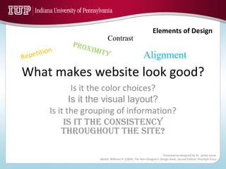
  • 1. What makes website look good? Is it the color choices? Is it the visual layout? Is it the grouping of information? Is it the consistency throughout the site? Repetition PROXIMITY Alignment Contrast
  • 2.
  • 3. Proximity Proximity Proximity Proximity Proximity Proximity Alignment Alignment Alignment Alignment Repetition Repetition Repetition Repetition Repetition Contrast Contrast
  • 4. Proximity Proximity Proximity Proximity Proximity Proximity Alignment Alignment Alignment Alignment Repetition Repetition Repetition Repetition Repetition Contrast Contrast
  • 5.
  • 6. Proximity How to get it: Squint and count the number of elements on a page. Limit yourself to between 3 and 5 elements. What to Avoid: Avoid corners and the middle of the page. Avoid equal amounts of white space between all elements Force relationships between headings and content Don’t put unrelated content elements together
  • 7. Proximity Proximity Proximity Proximity Proximity Proximity Alignment Alignment Alignment Alignment Repetition Repetition Repetition Repetition Repetition Contrast Contrast
  • 8.
  • 9. Alignment How to get it: Always align elements on the page, even those that are far apart. What to Avoid: Don’t center some text and left align other text. Avoid centering anyway!
  • 10. Proximity Proximity Proximity Proximity Proximity Proximity Alignment Alignment Alignment Alignment Repetition Repetition Repetition Repetition Repetition Contrast Contrast
  • 11.
  • 12. Repetition How to get it: Choose design characteristics (type face, color, size, cartoon style, picture style) and repeat them. Find existing repetitions and strengthen them by contrast or uniqueness. Accent the repetition. Think black hat, black shirt, black pants, black shoes, white corsage. What to Avoid: Don’t keep repeating if it is becoming annoying. Don’t repeat mistakes. Don’t repeat phrases. Avoid R A N S O m N O T i n g
  • 13. Proximity Proximity Proximity Proximity Proximity Proximity Alignment Alignment Alignment Alignment Repetition Repetition Repetition Repetition Repetition Contrast Contrast
  • 14.
  • 15. Contrast How to get it: Be bold! Use color, size, and space to differentiate between content Break the rules when it works! This goes for all four elements. What to Avoid: Avoid wimpy contrast! Yellow and white don’t go together. Avoid two different fonts that look alike. Calibri and Arial.
  • 16. Proximity Proximity Proximity Proximity Proximity Proximity Alignment Alignment Alignment Alignment Repetition Repetition Repetition Repetition Repetition Contrast Contrast
  • 17. What makes website look good? Is it the color choices? Is it the visual layout? Is it the grouping of information? Is it the consistency throughout the site? Repetition PROXIMITY Alignment Contrast
  • 18. Is it the color choices? Is it the visual layout? Is it the grouping of information? Is it the consistency throughout the site? Proximity Alignment Repetition Contrast What makes a website look good?
  • 19.

Editor's Notes

  1. Intro Slide Talk about the slide Key points: The slide is busy, your eye can not follow the flow of information and just all around BADLY designed.
  2. Those four elements are CONTRAST, REPITITION, ALIGNMENT, and PROXIMITY. Think about the various forms of media you come across on a daily basis: print media such as magazines covers, posters, flyers, electronic media such as Adobe Flash, Powerpoint, and Websites, to visual media such as movie promotions and television commercials. Every piece of media is going to contain some aspect of design as such as those presented by Robin Williams. When you think about TV commercials, there is a strategy to how certain things are positioned and aligned on the set. You will notice repetition in images and dialog. You will notice contrast in special effects or even prop layouts. GREAT Media is NOT just put together on a whim… GREAT Media has a well thought out strategy and execution plan. Just like a Great Website should have. Let’s review the elements you have discussed earlier in the course but this time we are going to add some more detail.
  3. Read the four elements to the audience
  4. Why are there so many words “spelling” PROXIMITY all grouped together?
  5. Be conscious of where your eye is going… Where did you start looking? What path did you follow? Remember the opening slide? Do you remember where you eyes were trying to go? There is was NO grouping of related items on that first slide at all. Let’s take a look at some tips on how to achieve proximity…
  6. Discuss slide
  7. Does alignment mean you have to use an actual line? Click to next slide
  8. Supporting commentary: An actual line may be used as a graphic to make a bolder statement. Remember it all comes back to where is your eye going? Let’s take a look at some best practices on how to achieve strong and bold alignment features… Click to next slide
  9. Notice anything “consistent” with the way repetition is being presented?
  10. Many times you are using elements of repetition in your work: Headline being all the same size and weight, half in margin from the bottom, or the same bullet through the piece… Let’s push the idea of repetition further and create a visual key by… Click to the next slide
  11. Review slide with viewers…
  12. When is comes to CONTRAST, you want to make something STRIKING that draws your readers or website surfer to your page…
  13. Contrast is not to confuse your viewer or create a focus that is NOT the focus… Let’s take a look at how you develop AWESOME contrast… Click to the next slide
  14. Review slide with viewer…
  15. We have REVIEWED and discussed in detail what defines the four elements of design. Now let’s see how we can put these four elements into ACTION… Click to the next slide…
  16. Remember the opening slide…. Now you know about proximity? There is no grouping of similar items for unity. Alignment? What alignment? Remember, never center unless is it absolutely necessary. Repetition? There is not one uniform aspect of clarity Contrast? Non existent… How could we make this slide much more attractive? Click to the next slide
  17. Do you need the element of design at work? Note the proximity by placing the elements of design in one grouping. Alignment, strong visual focus by using right alignment leaving a clean white space for the eye to view and relax. There is repetition that is consistent when it comes to color and font styles. And how about that contrast? The gray bar causes you to focus but not loose interest or sight of the what else is happening on the page… Applying the elements is much simpler than it looks… Click to the next slide
  18. A matrix has been developed to have you start really looking a media and websites from a designers standpoint. Each quadrant contains an element. Your task is going to brain storm by writing down the aspects of a website you like or dislike according to the element in the quadrant… The next steps are to download the Elements Matrix word document and view five separate websites over the next week. Then you will be presented with a quiz where your mastery of the elements is going to be tested… This exercise is designed to help you see who really put the time into how their website was designed… Remember, EVERY great Website site had to be planned and executed strategically…