USPS® Forced Meter Migration - How to Know if Your Postage Meter Will Soon be...
Decisions for Digipak and advert
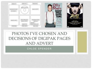
1. C H L O E S P E N D E R
PHOTOS I’VE CHOSEN AND
DECISIONS OF DIGIPAK PAGES
AND ADVERT
2. MAIN PICTURE FOR
DIGIPAK AND ADVERT
For the main image, I have decided to try and merge these
pictures together by cutting out certain features from each picture
and piecing them together. I feel like this will produce a very
creative and effective outcome which is unique to all the other
Digipaks and Adverts I’ve seen that are already out there. The
reason I think this will work so well is because of the main
characters curly hair as it fills out the picture and her look shows
off a rebellious vibe which will tie in to the music video.
On both I’m going to include all the typical conventions including
the artists name and album name. As the songs on the album
involve swearing and may involve offensive language, I will also
have to put an ‘parental advisory explicit lyrics’ logo on them for
legal reasons. On the Poster Advert I will need to include the
release date of album, any social media you can access the
songs on eg Spotify and ITunes and the ratings of the album from
music magazines. I will need to incorporate the website on the
advert as well incase they need to visit the website for any extra
information.I am going to try and incorporate the pink onto the
main picture of both the digipak and advert. I could do this
through the colour of the font or I could outline the segments of
the cut up picture
3. PAGES 2 & 3 (LYRICS)
Usually on digipaks they tend to have all the song
lyrics plus picture pages but as I’m only limited to 6
pages I wanted to make use of the space on the
digipak as best as possible. Therefore I have
decided to create two lyric pages instead of one
and having a single picture on the other. I want to
carry on with my theme by manipulating the image
to create an abstract montage image. I am going to
do this by taking the bottom left image and
duplicating it to create a stepped image to a centre
point to create a perspective image. With the other
image I am going to take a more simple but
effective approach. I’m going to do this by cutting
the main character, ‘Karla’, out and put the bottom
left image with the smoke behind her. I want to do
this as I want to incorporate the theme of pink
smoke into all of the pages. I am going to make the
digipak as colourful as possible.
4. PAGE 4 & 5 (LIST OF SONGS & CD DISK)
Page 4- My aim for this page is to keep the original
picture on the left as the background. This is quite a
powerful image as the main characters face still
comes through the smoke which has an interesting
effect. Her eye is directly looking at the camera which
draws in the audiences attention. I will include the
name of the artist (MO) and the list of songs over the
pink smoke so you are still able to see the detail of
her face. On this I will also ensure all the codes and
conventions are included, for example the barcode,
copyright information, logos of the record company,
and website of album and record company
Page 5- On the CD disk on going to take the pink smoke from the picture above and put it on
my Disk to carry on the colour scheme. Again I’m going to include the name of the artist and
album name which will link the music video and ancillary tasks together as there’s a continuous
theme of pink. I will also ensure there in copyright information on the cd. This section of the
digipak is the most simple as normally not much tends to go on the CD disk.
5. PAGE 6 (THANKS AND SOCIAL MEDIA)
The last segment on the digipak is for all the social
media links such as the website link, Facebook,
Twitter, Instagram and Youtube. Also on this page
mentions to family, friends and record label tend to
be included to credit the help, support and work of
others. My idea for this page was to have the
current picture on the left as the background
image. I could adapt this picture to enhance the
pink smoke and the background behind the main
character to make it more eye catching and
vibrant.
I have decided I’m going to have all the
information for this page surrounding the artist on
the page as it will draw the audiences eye towards
the main character and . The most intriguing
aspect of this picture is that the artist is making
direct eye contact with the audience which draws
them in.